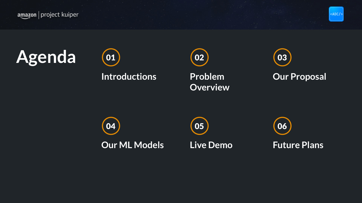
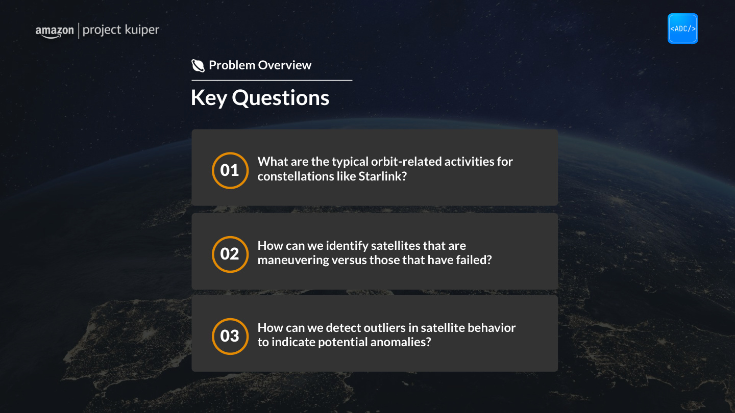
Leading Visual Design on 2 Satellite Telemetry Dashboards and 2 Slide Decks That Amazon's Engineering Team Adopted
Role
Product Designer
Visual Lead
Organization
App Dev Club
× Amazon Kuiper
Team
16 people
2 designers
How do you help aerospace analysts catch satellite errors before they cause system-wide problems?
Overview
Challenge
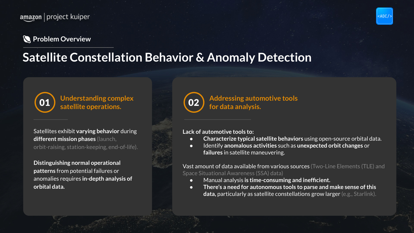
Analysts had to manually scan telemetry and ML outputs across thousands of low Earth orbit satellites, a slow, disjointed workflow that made it hard to catch errors.
Strategy
Partnered with Amazon engineers as visual lead to build a dashboard framework. We converted charts into clear data layouts, testing the interface directly against real engineering workflows.
Result
Built a working prototype presented to Yash, who specifically named the interface clarity and the pitch materials. The final designs and documentation were handed off to Amazon's engineering team to build out.
Adopted
Handed off to Amazon's engineering team to build
25
Slide handoff deck built from scratch
2
Dashboard systems designed: General & Anomaly
Outcome and deliverable counts from the project's actual handoff materials.
Amazon Kuiper needed a way for analysts to make sense of telemetry and ML output across a growing satellite constellation.
Meet Yash
UMD's App Dev Club paired 16 students with Amazon Kuiper for a semester, and our team was brought in to design and prototype a solution.
Yash, a satellite operations engineer on Kuiper's team, worked directly with that telemetry day to day, so everything we knew about the real workflow, its pressure points, and what "useful" would look like came from him.
I led visual direction and dashboard architecture as one of two designers.
My role
The vast majority of my team was ML engineers, backend developers, product leads. My focus was data visualization for anomaly detection. I worked directly with engineering to figure out how to put ML outputs on screen in a way analysts could actually read, and I built every pitch deck and presentation the team used.
Before we touched a single frame
The team sent a reading list before our first meeting, none of which I'd encountered before, so I spent a week with all of it before anything got sketched.
I found engineers manually scanning dozens of graphs across multiple tools just to catch one anomaly.
Workflow Inefficiencies
At Amazon, the monitoring team's job is to track things like satellites drifting off expected paths, satellites moving between parking and operational orbit, and potential collision risks across the constellation. This is a lot of data to manage at once.
Catching any of those meant engineers had to compare orbital elements one by one: load the data, pull up the graphs, look for anything that doesn't fit, and investigate. All by hand.
Original User Flow
01
Data Collection
Manual TLE downloads, one file at a time
Repetitive, error-prone
02
Pre-Processing
Scripts to clean and normalize orbital data
Ad-hoc, inconsistent
03
Monitoring
Static charts in Excel or Python
Manual anomaly spotting
04
Decision Making
Subjective judgment on severity
No confidence metrics
05
Reporting
Static reports sent via email
No real-time sharing
The whole process had the same issue at every stage: too many manual steps between the data and a decision.
The goal was to surface anomalies automatically so analysts could spend their time understanding and responding to problems, not hunting for them.
Knowing Yash couldn't represent every real user, we mapped the three roles actually using the tool.
User Roles & Requirements
Primary user
Satellite Operations Analyst
Monitors constellation health daily and responds to anomalies
Pain points
—Manually scanning dozens of graphs to find a single anomaly
—No single view showing which issues need attention first
—Context-switching across multiple tools slows every investigation
Domain expert
Kuiper Engineer (Yash)
Identifies patterns in satellite data to anticipate collision courses and flag operational risks
Pain points
—Tools that sacrifice precision for usability lose engineer trust
—No direct path from ML anomaly detection to analyst action
—Anomaly responses aren't documented for future reference
Stakeholder
Amazon Product Manager
Needs constellation health summaries and anomaly status for leadership, relayed to us secondhand through Yash
Pain points
—No high-level snapshot of overall system health
—Status reporting requires manual extraction from technical tools
—Hard to communicate anomaly severity to non-technical stakeholders
Before formally starting the design process, I researched the workflow and built a stakeholder pitch.
Process
When we asked engineers to walk us through their process (load telemetry, compare graphs, look for patterns, investigate), we found most of the time was spent finding anomalies, not understanding them. The interface needed to flip that.
User Flow · Anomaly Review, Dashboard MVP
Amber-marked nodes are where automatic flagging replaced manual scanning
What used to take a full manual scan is now a confidence check. The MVP collapsed the first three steps of the original five-step flow into one.
As we continued to talk to Yash and learn more about his process, four things kept coming up.
Usability
Existing tools had a steep learning curve. Nobody wanted to fight the interface to find a problem that might already be urgent.
Clarity + Focus
Dashboards needed to lead with flagged anomalies and satellite status, not bury them inside raw data.
Customization
Operators needed granular signal detail. Mission managers wanted high-level summaries. The same tool had to serve both without compromise.
Interactivity
Static charts weren't enough. Users wanted to zoom, filter, and hover.
Benchmarking high-density interfaces
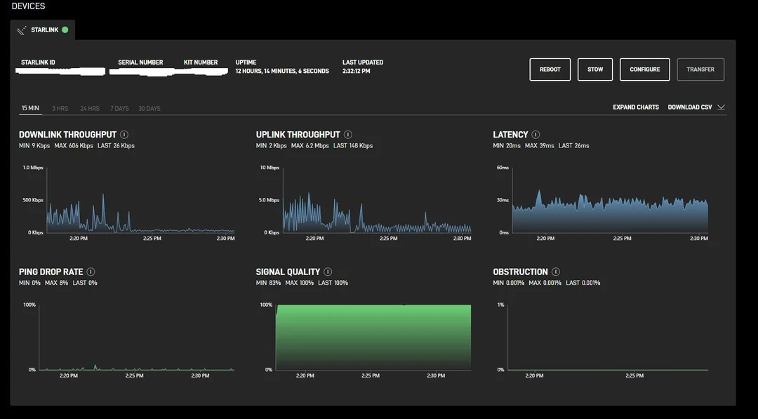
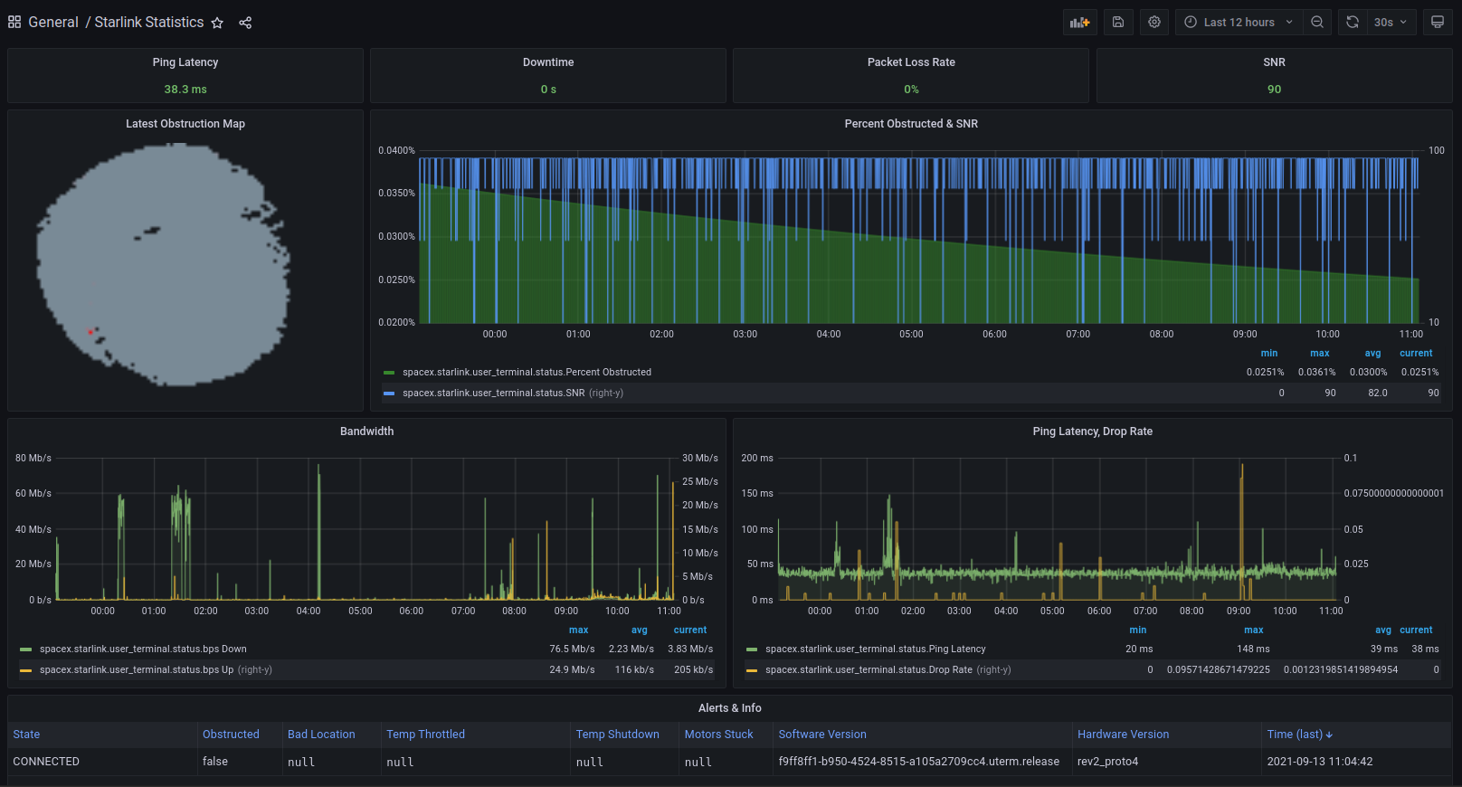
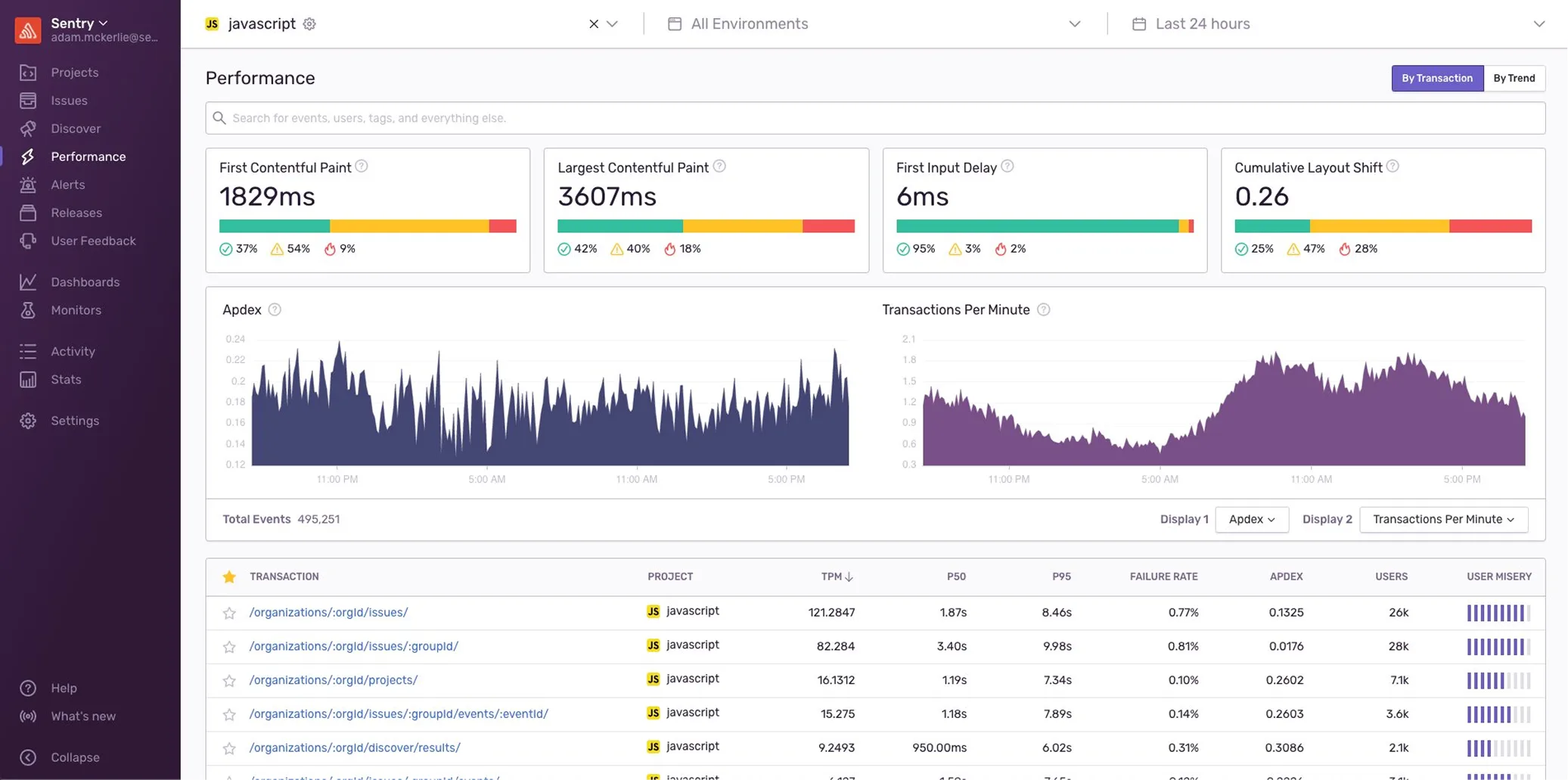
For reference, I looked at high-density dashboards in finance and analytics, as well as existing satellite platforms, including SpaceX's Starlink dashboards and traditional orbital monitoring tools.
Existing Starlink Dashboards
What worked
+High-density data for expert users
+Seamless data export integrations
What was missing
—Cluttered layouts that buried critical signals
—No at-a-glance status.
—Limited interactivity; charts you couldn't manipulate
—Designed for experts; excluded non-technical users
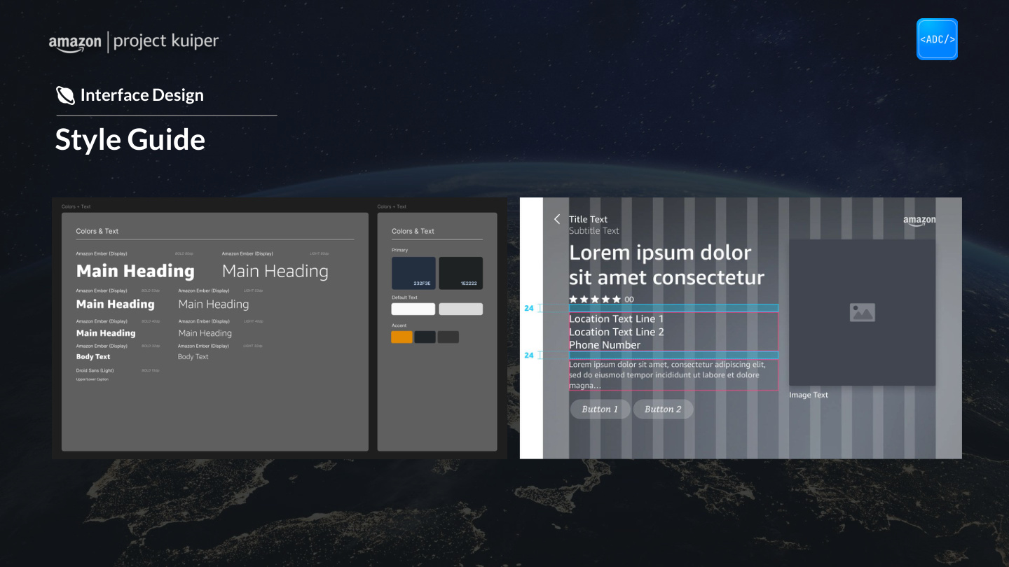
Identifying the original style guide
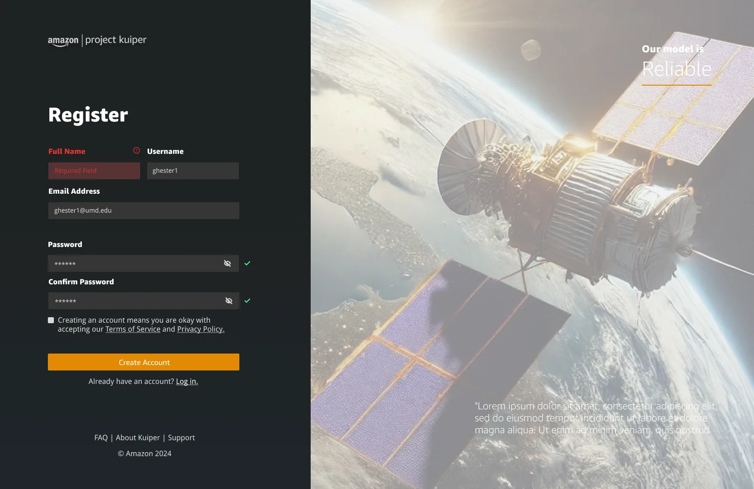
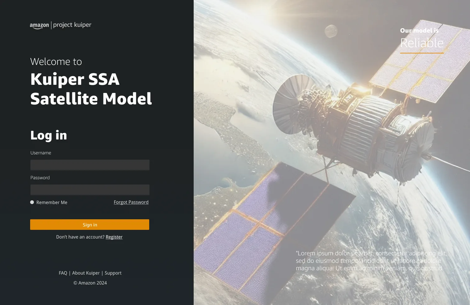
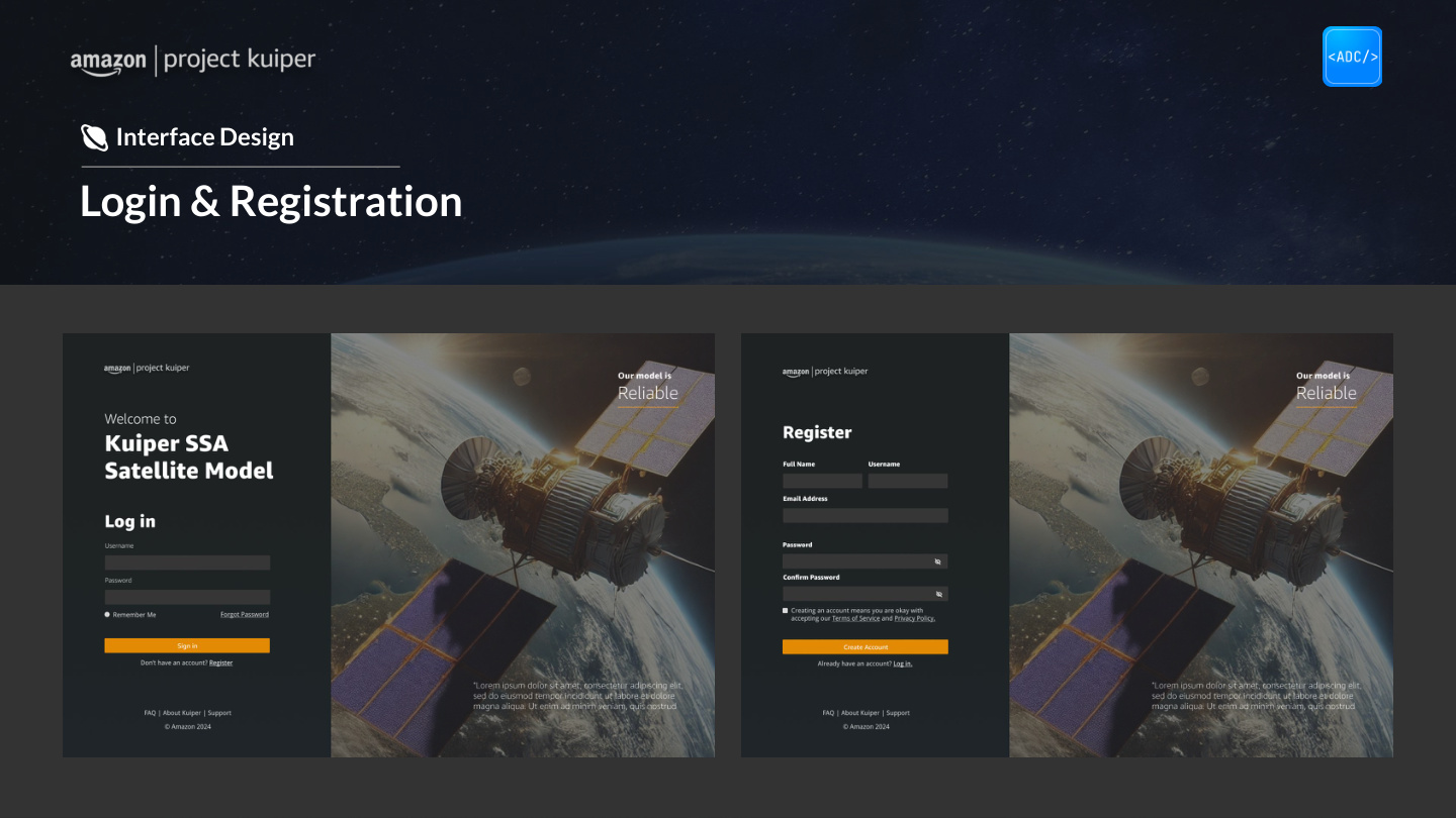
Before any wireframes, we needed a visual foundation. We pulled Amazon's Alexa style guide and while engineers were working on identifying a clear backend process, I built a mock login page to feel out whether that language actually fit what we were making.
After we regrouped with engineers, we settled on three goals that shaped the build.
Concepting
Scalability
Handle a growing constellation without the interface becoming unreadable.
Anomaly Detection
Make unusual behavior visible at a glance. No digging required.
Intuitive Control
Work for both technical analysts and mission managers without a learning cliff.
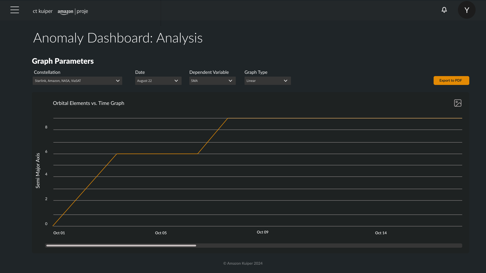
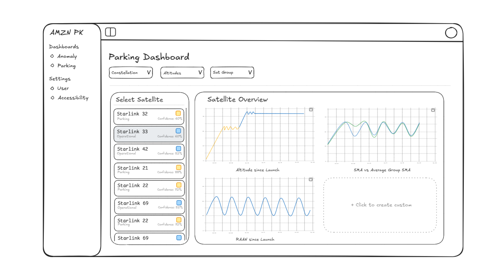
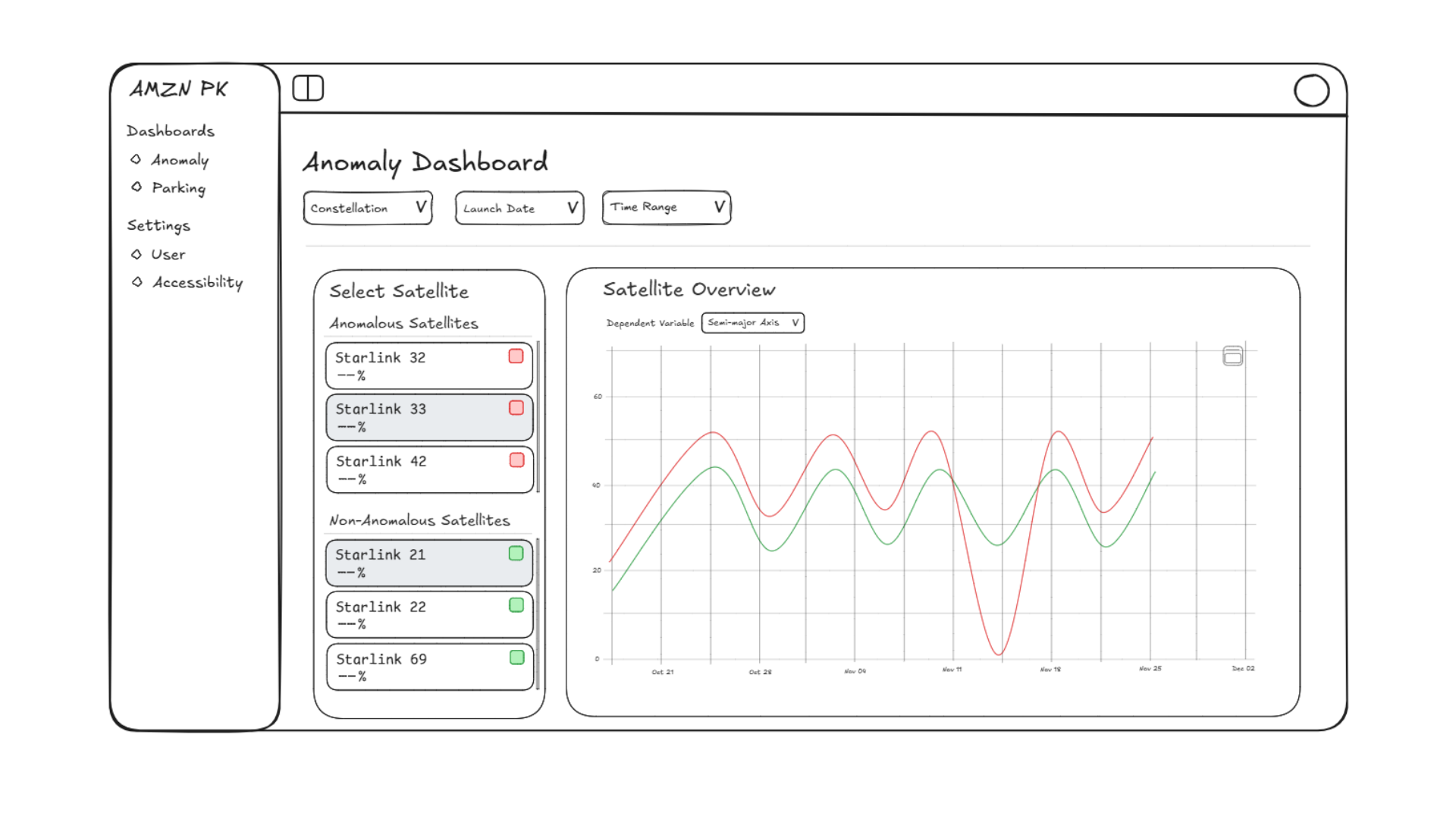
From these three goals, two concepts emerged: a General Dashboard as the primary entry point (satellite health, performance metrics, system alerts) and an Anomaly Dashboard as the focused tool for detecting, diagnosing, and addressing specific issues within specific sattelites.
Working with the codesigner
My co-designer and I spent a lot of time thinking about the clarity of our visualizations. I found the most useful question wasn't "does this look right," rather "would someone trust this at a quick glance when something's wrong."
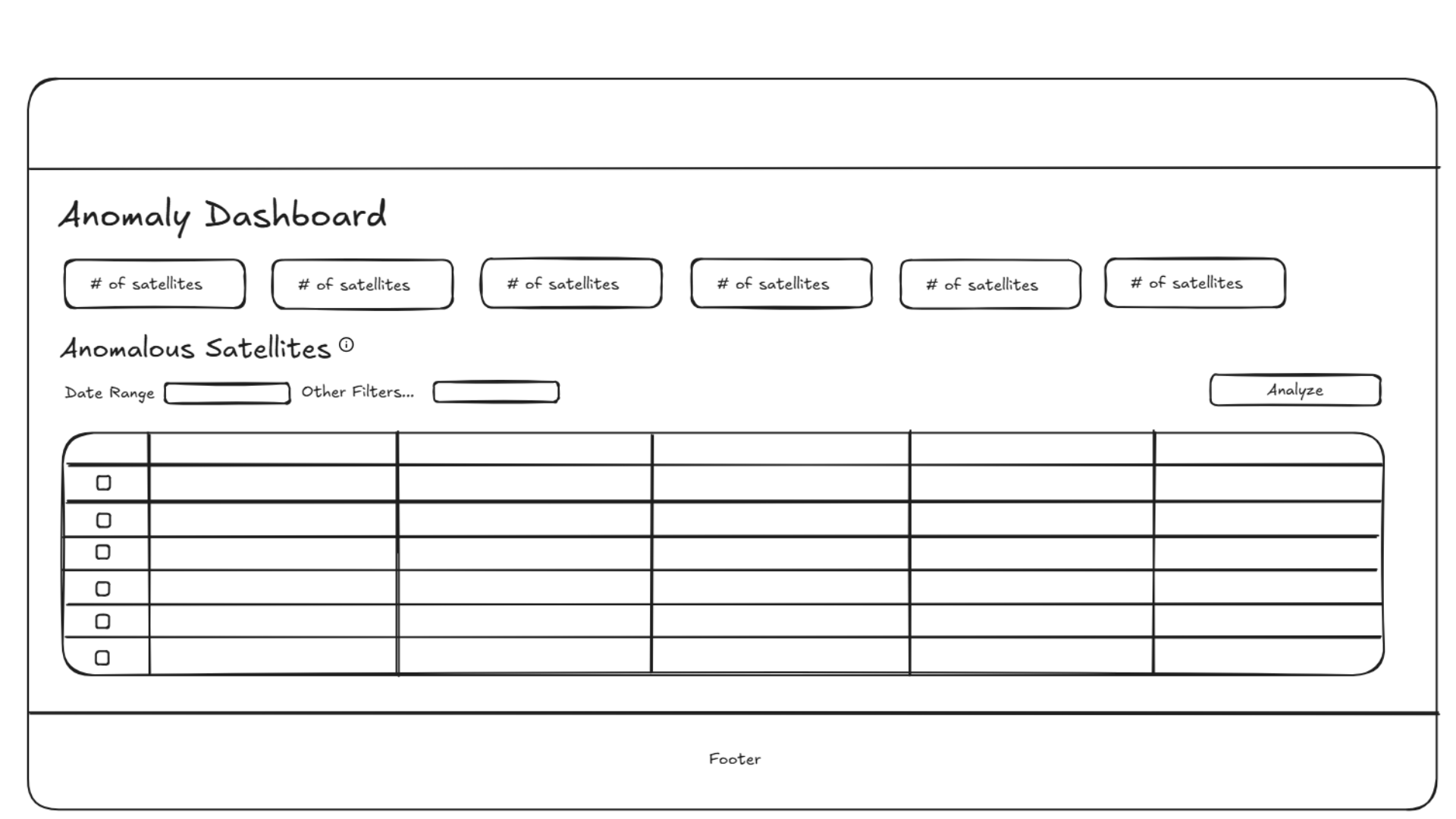
In the lo-fi, that meant moving information into clean quadrants with large headers for easy glancing, then modularizing the more intricate components underneath so engineers could shape those to whatever they judged most useful.
Yash's feedback allowed us to iterate on our designs and tune them to our target user.
Validating
We ran three feedback sessions with Yash where we found out which visualizations were confusing, and how close we actually were to the real analyst workflow.
Three main things came back from those sessions.
01
Flexibility
Users wanted to see multiple graphs at once to compare variables. The layout needed to be more modular: something they could rearrange on the fly.
02
Satellite Comparison
Teams needed to toggle between satellites being compared without navigating away. Context switching was already the problem; the fix couldn't reintroduce it.
03
At-a-Glance Visibility
A gap remained between non-technical users and the volume of data visible on open. The entry view needed a stronger summary layer before anything else loaded.
Designing the pitch deck
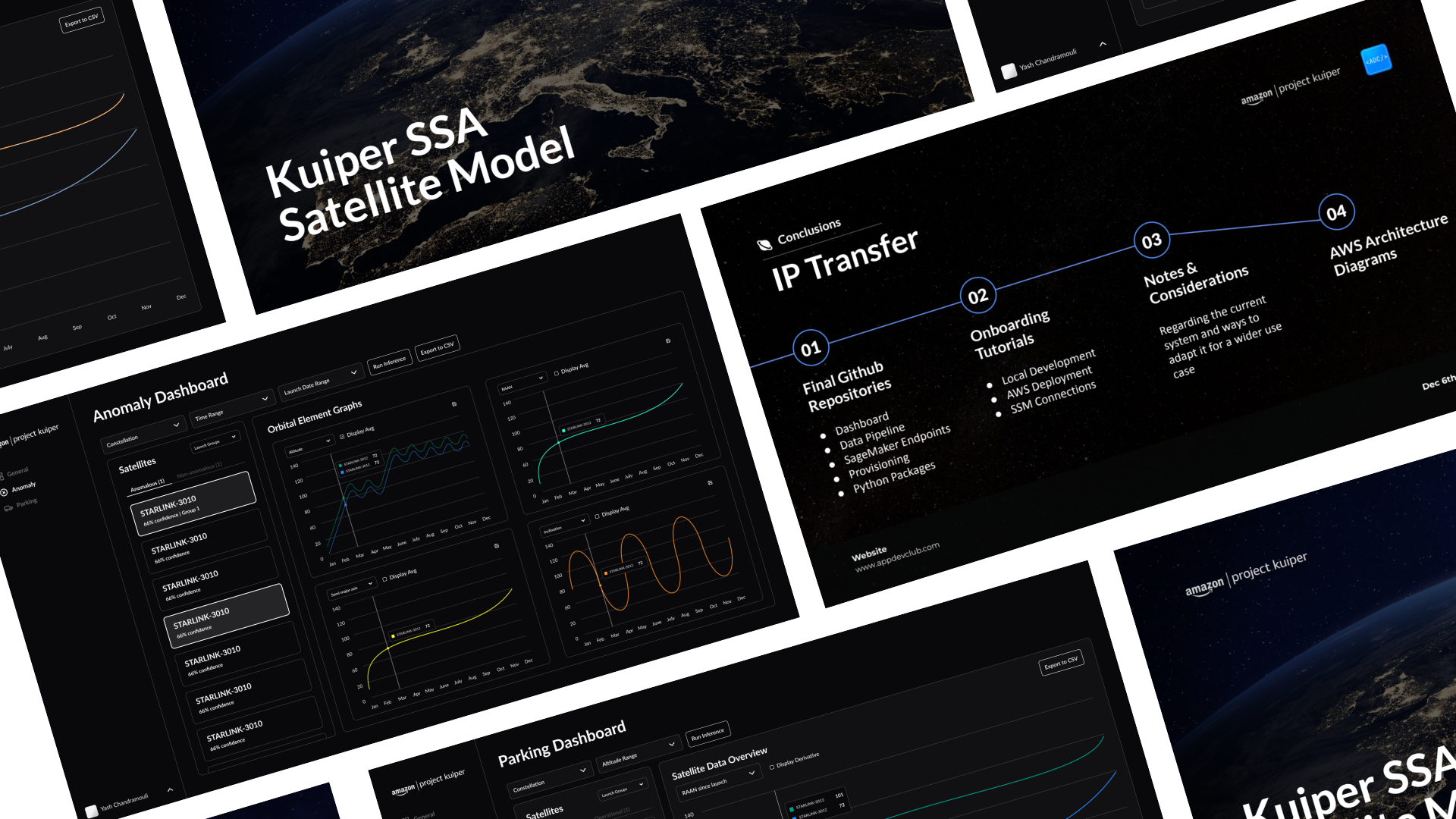
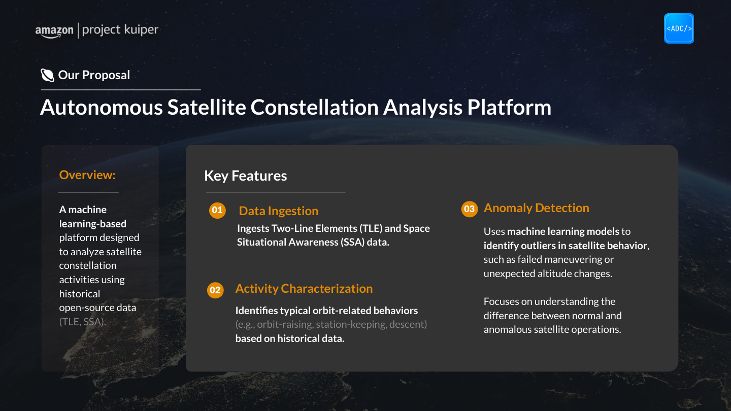
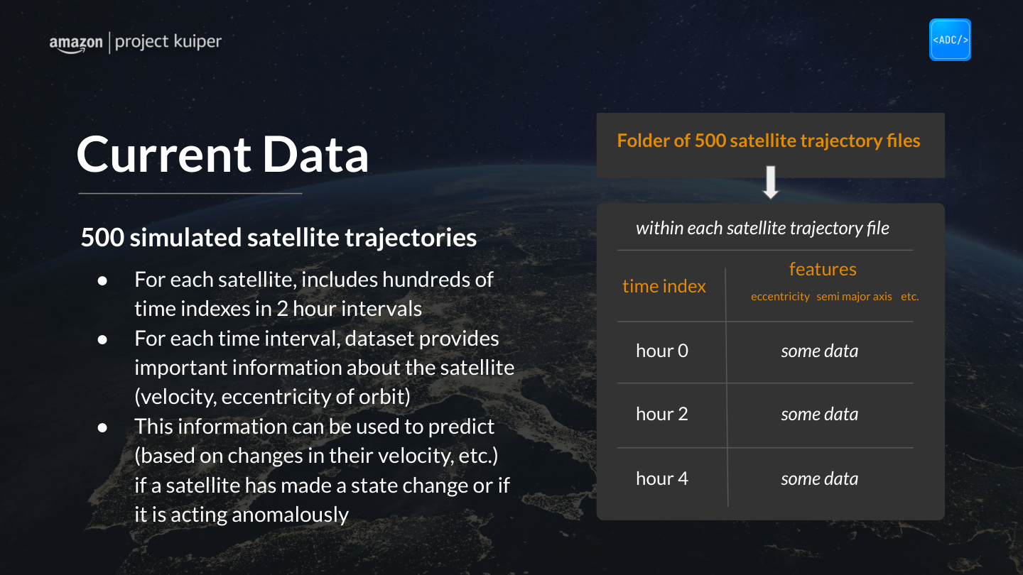
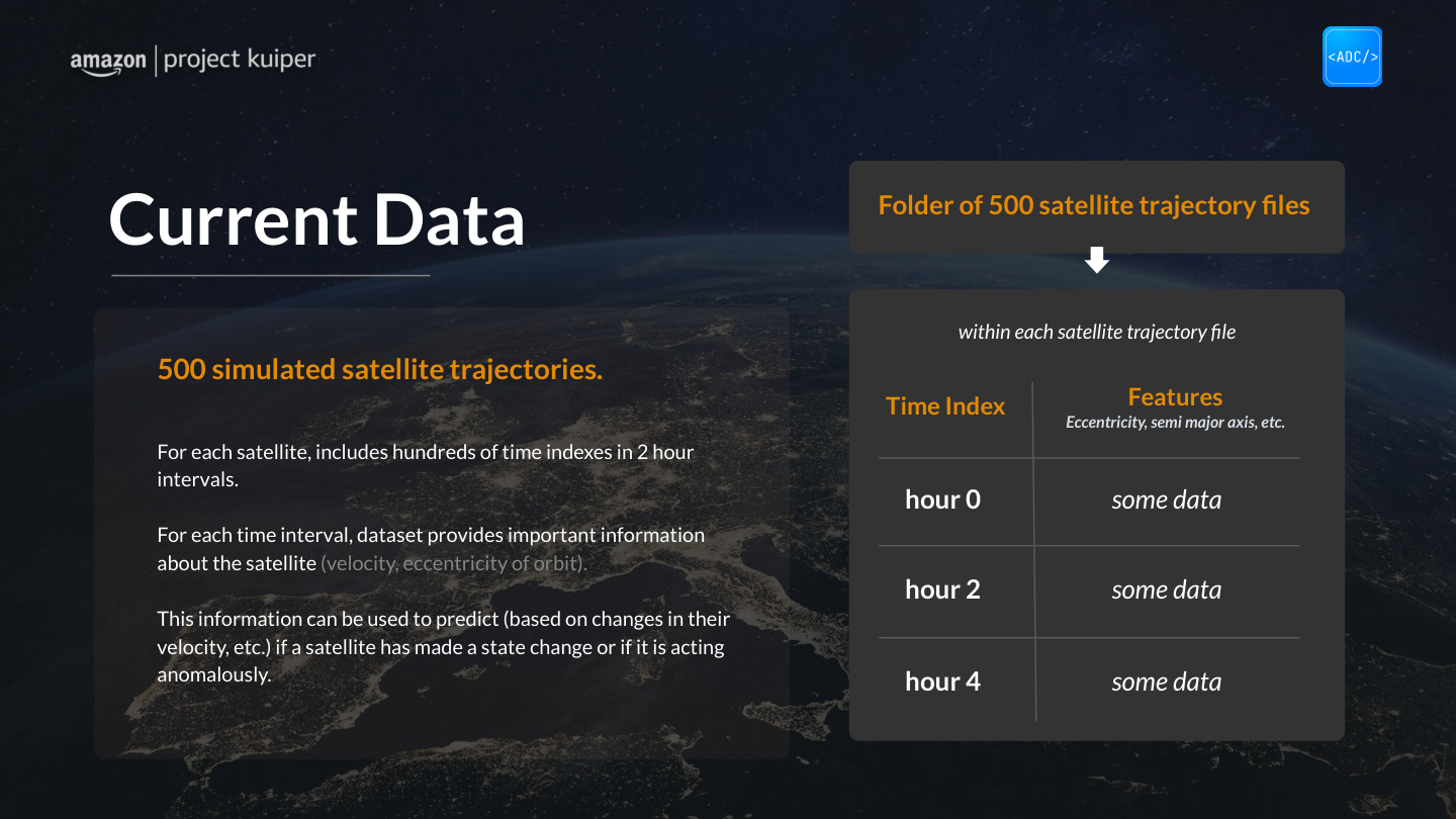
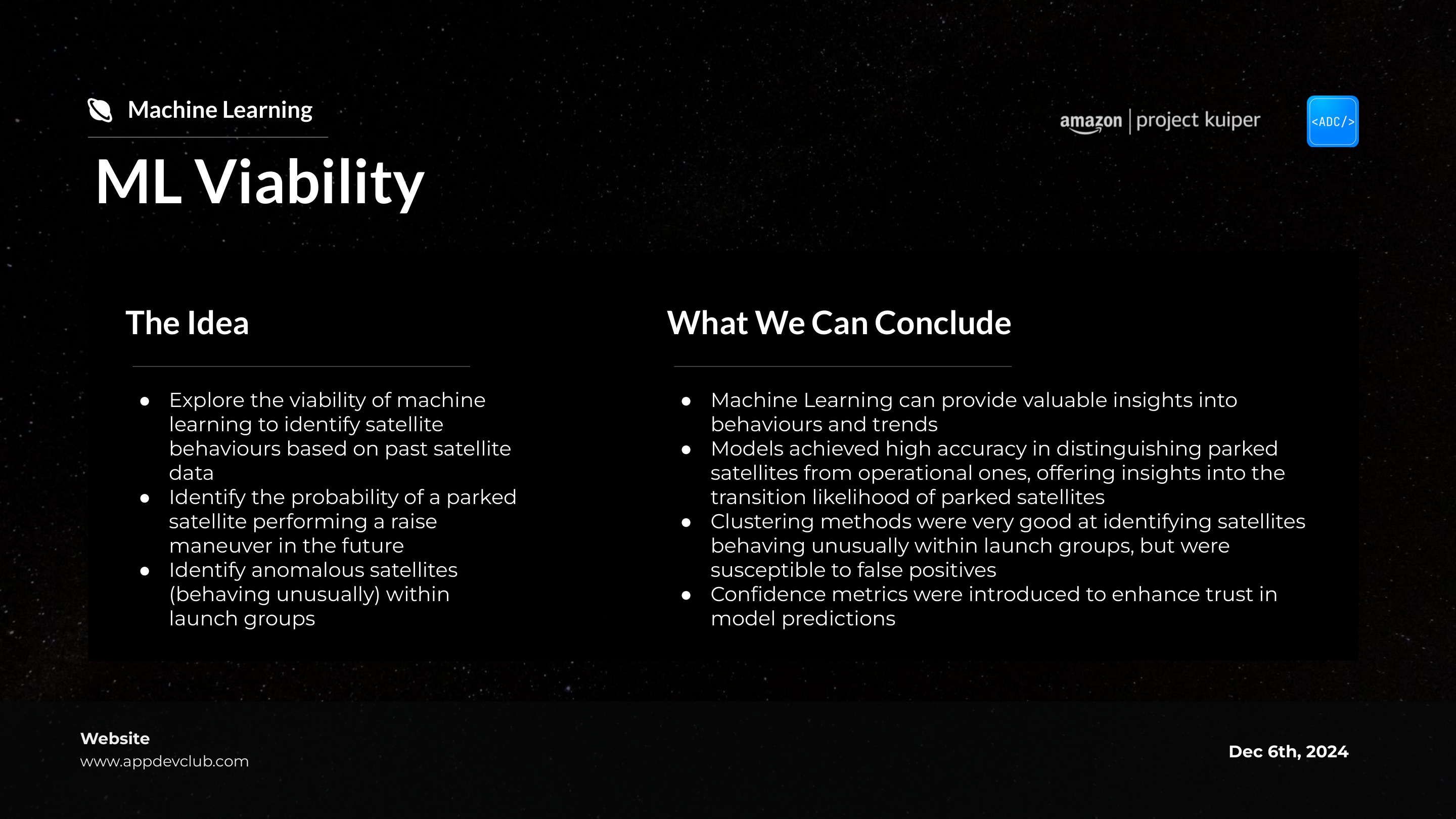
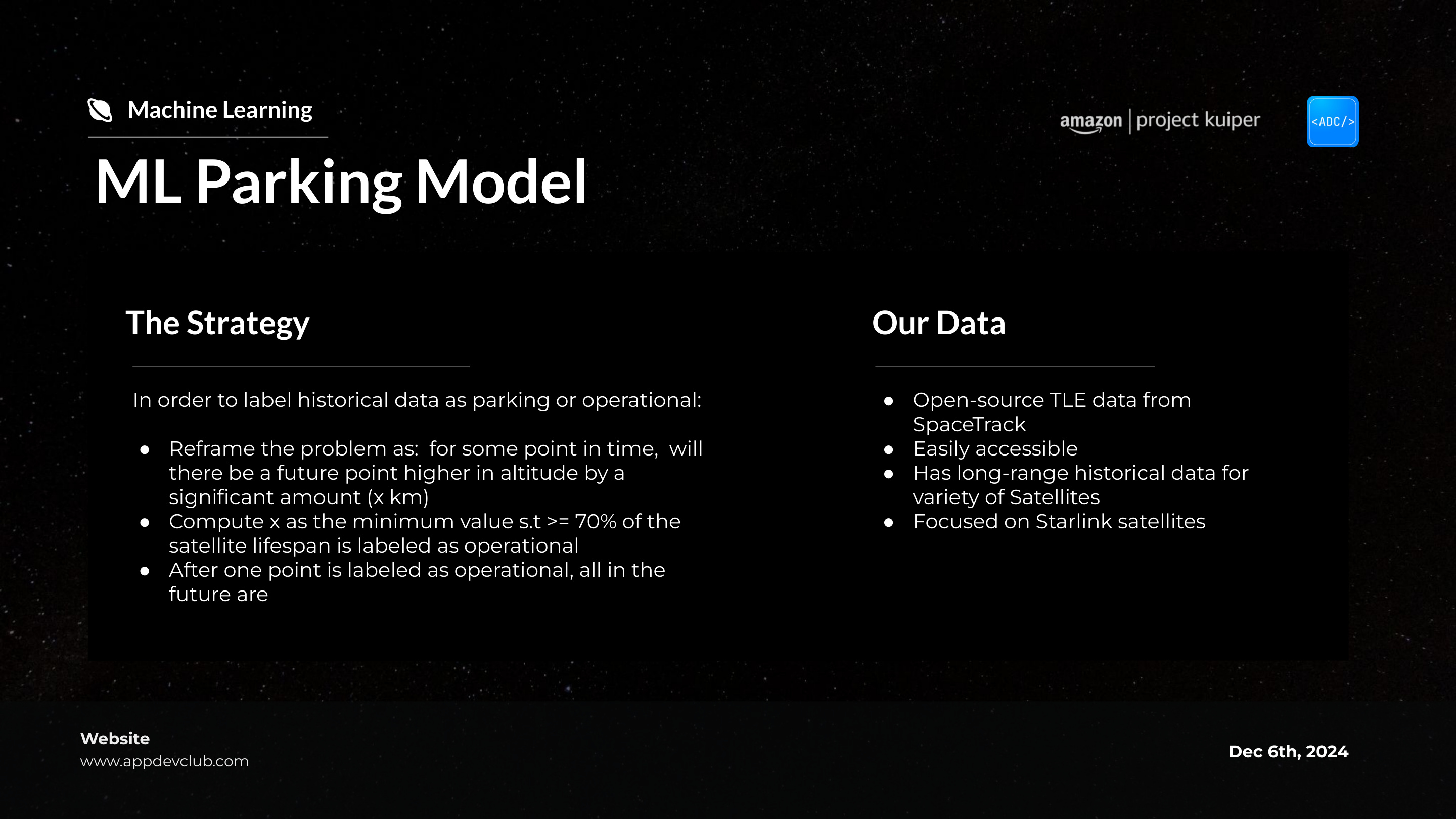
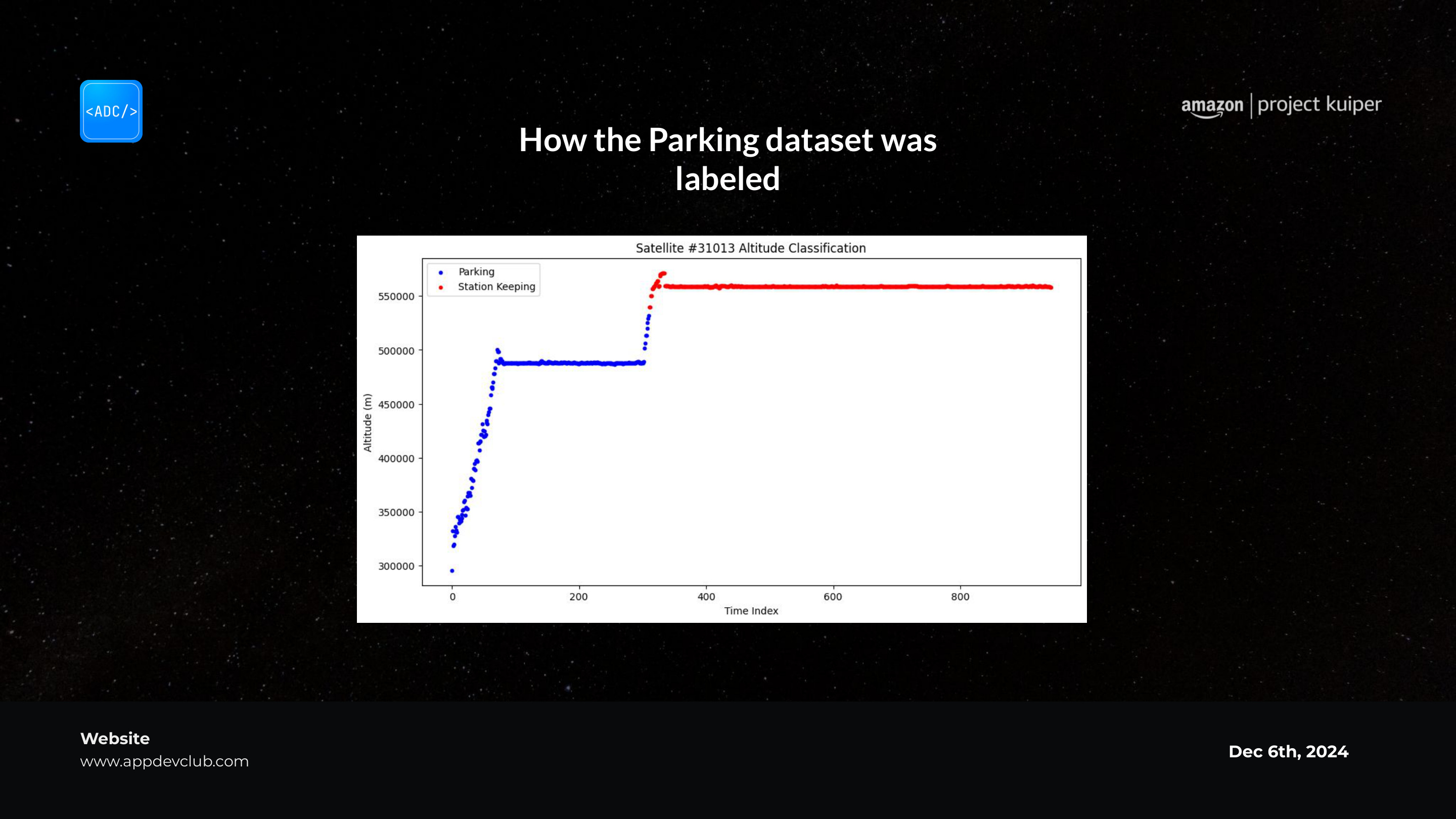
I designed the pitch deck from scratch to bring Yash through the early designs. I wasn't just showing work, I was building the package Yash would use to react to it, and that would represent our professional capability as a student group.
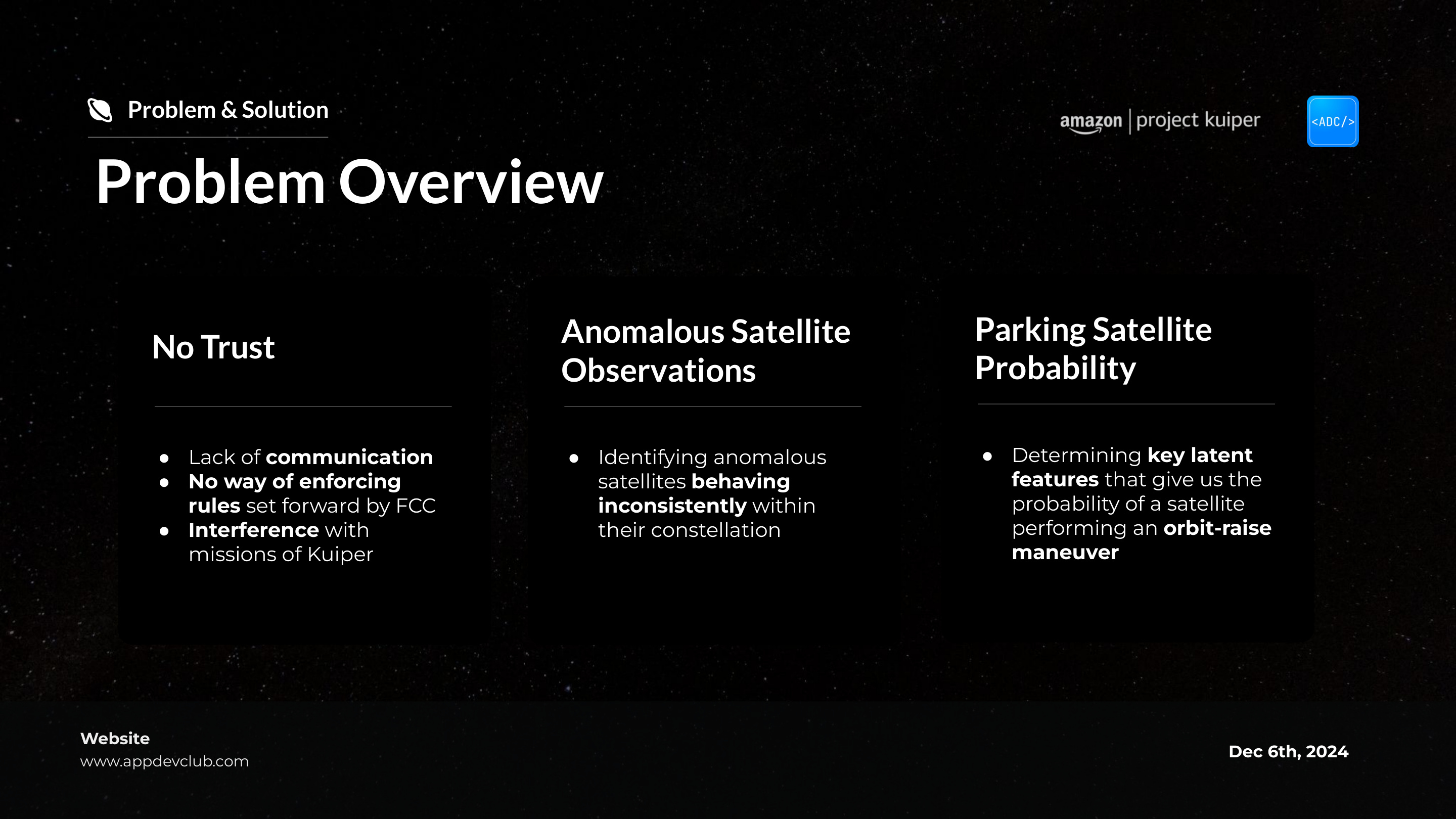
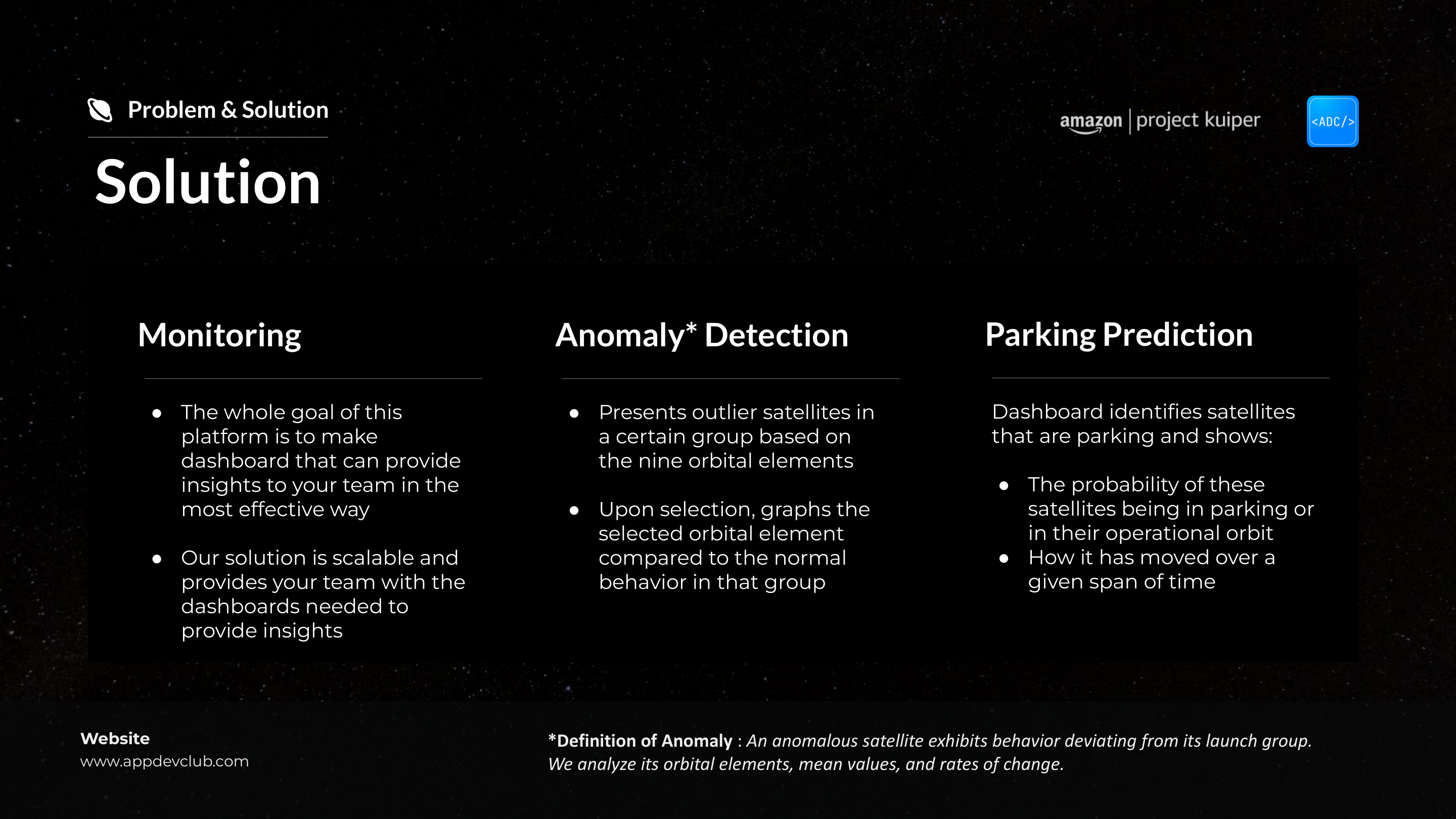
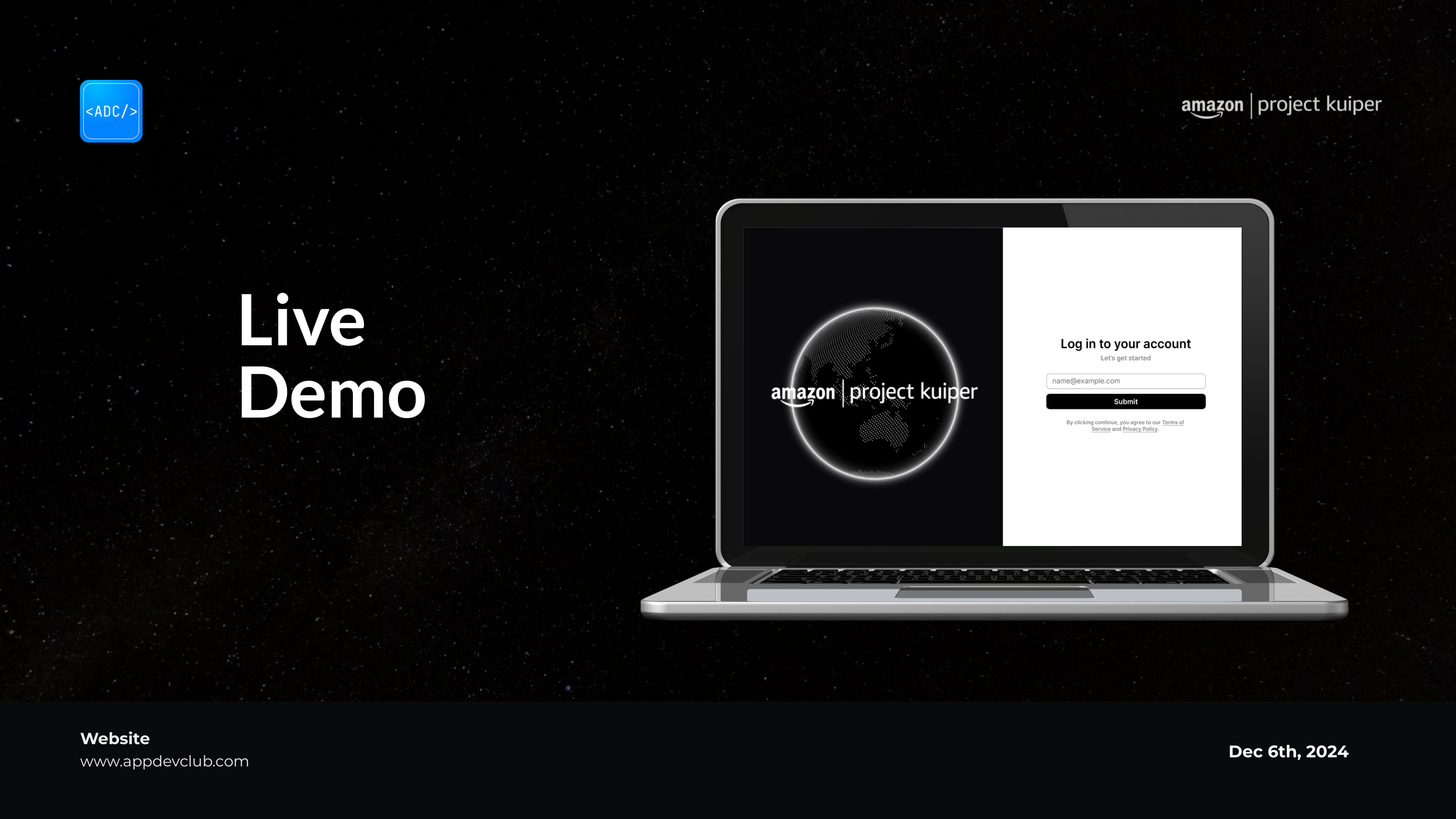
Pitch deck designed from scratch.
Yash's feedback sent us back to the drawing board, rebuilt into four modules.
Design decisions
It was useful, and it was also hard to hear: what we'd built was too tied to Amazon's visual system, and more complex than our engineers could actually ship in the time we had; so we rebuilt the information architecture from the ground up.
01
Dashboard
System Health Summary
Anomaly Alerts
Quick Navigation
02
Telemetry Monitoring
Signal Graphs
Anomaly Highlighting
Signal Filters
03
Investigation Panel
Selected Signal Details
Related Telemetry Signals
Historical Comparison
04
Report Generation
Summary Export
Anomaly Documentation
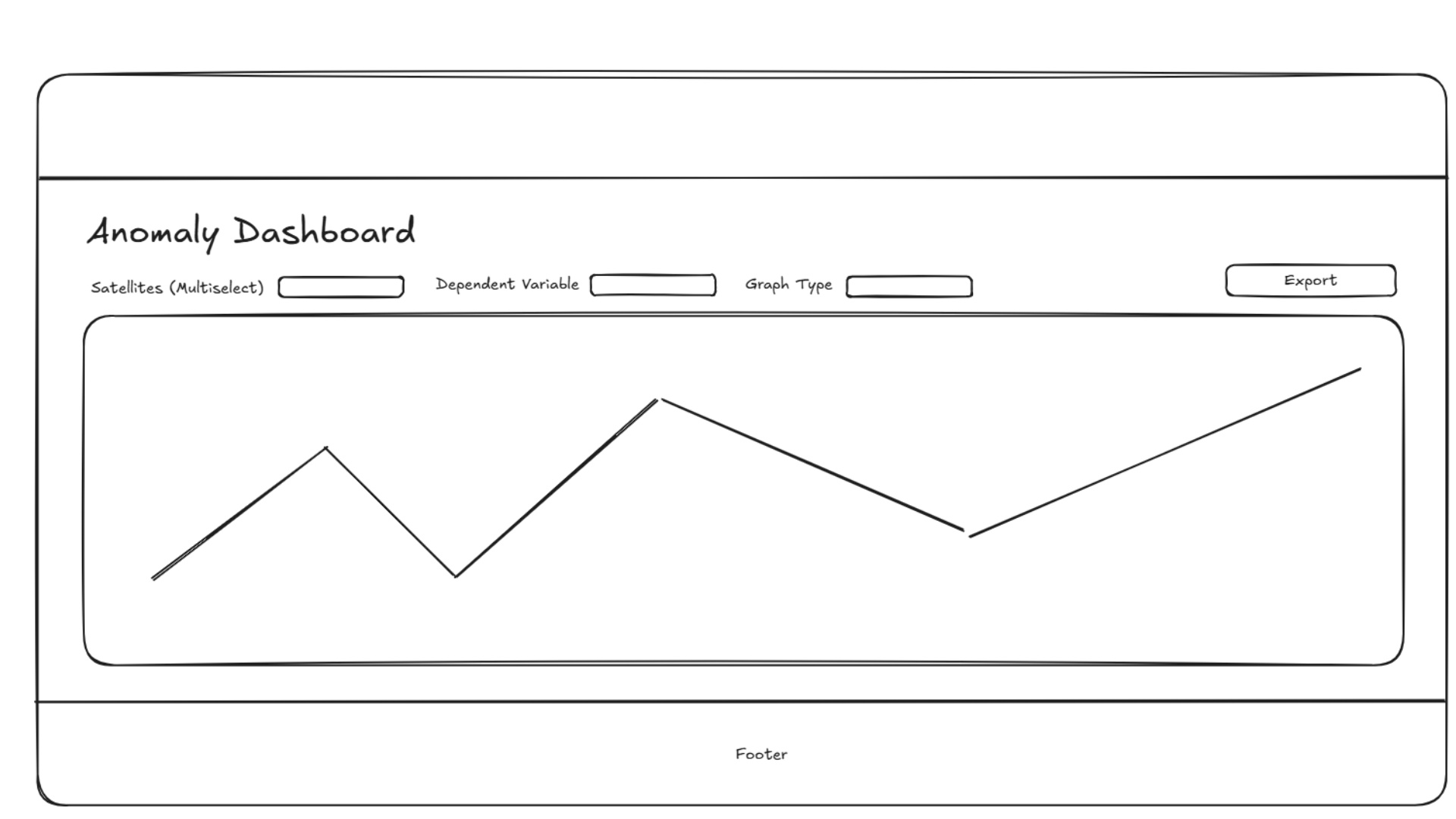
Revised low fidelity dashboards.
Mapping the full journey meant tracing exactly where an analyst's attention should land first, and what happens after.
User journey
The dashboard was rebuilt around one continuous workflow: open the tool, find the issue, investigate it, file a report. Every stage maps to a specific pain point from the old manual process. Since we knew this product would end up being built on by engineers after us, we wanted to make sure we had developed a solid foundation with clear logic.
01
Open Tool
Scan many graphs
3 instant summary metrics
02
Identify Issues
Manually scan dozens of graphs
Anomaly alerts surface automatically
03
Prioritize
Hard to determine severity
Ranked by severity with red signals
04
Investigate
Slow navigation between graphs
Drill-down panel with focused telemetry
05
Decide Action
Context scattered across tools
Related signals shown in context
Knowing the telemetry data was already dense meant settling on a darker interface where color is used sparingly.
Style
We settled on a scheme much darker, but with intentional color, since the data is already dense; every decision traces back to one constraint: the interface can't add to the noise.
Color system
Backgrounds
PAGE#0b0b0f
PANEL#111118
CARDS#1a1a24
ACTIVE#24243a
Semantic accents
BLUEPrimary / focus
TEALSecondary data
AMBERData line 3
ORANGEWarning / flagged
REDCritical / error
Typography
SF Pro Display, Helvetica Neue · Mono: DM Mono, Fira Code
General Dashboard
Section header · 18px · 700
Satellite Data Overview
Panel header · 14px · 500
1250
Metric value · 28px / tabular nums
STARLINK-3010 · 66% confidence
Body / label · 10px · 300–400
Components
Status badges
NominalAnomalousParkingCriticalInactive
Buttons
Metric cards
Satellites
25
TLEs tracked
1250
Anomalous
3
Navigation
General
Anomaly
Parking
Part 03
Final frames
Immediate system status
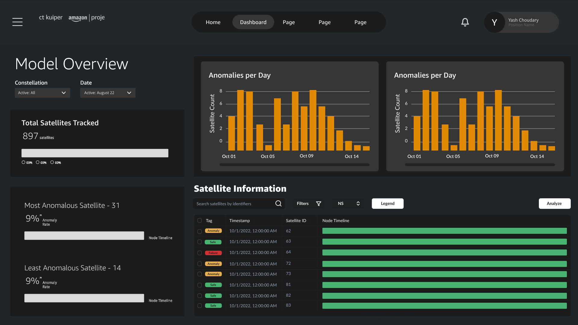
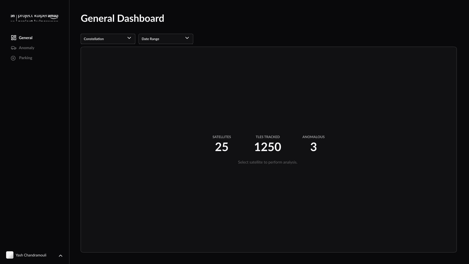
The version we landed on opens on three plain numbers, running, flagged, under review, so the most important question gets answered the moment you open it.
Anomaly Drill-Down
General Dashboard — Summary Metrics
Scannable Progress Elements
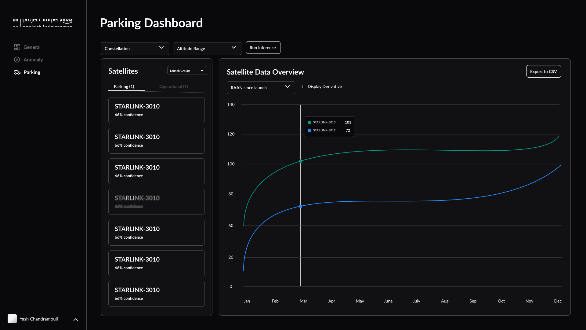
An earlier iteration used horizontal progress bars to represent each orbital element's value; length is faster to parse than digits across hundreds of rows, but those bars were also harder components to implement. The view we landed on instead reads the values of all of the original bars translated into a single plotted view: more easily scannable and more buildable, with constraints we were working in.
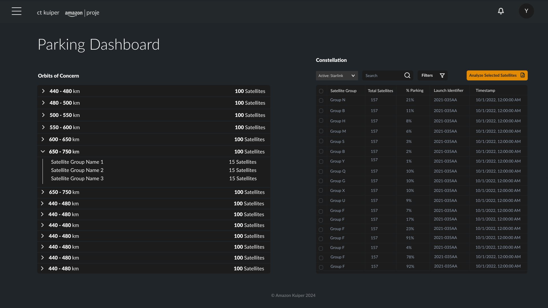
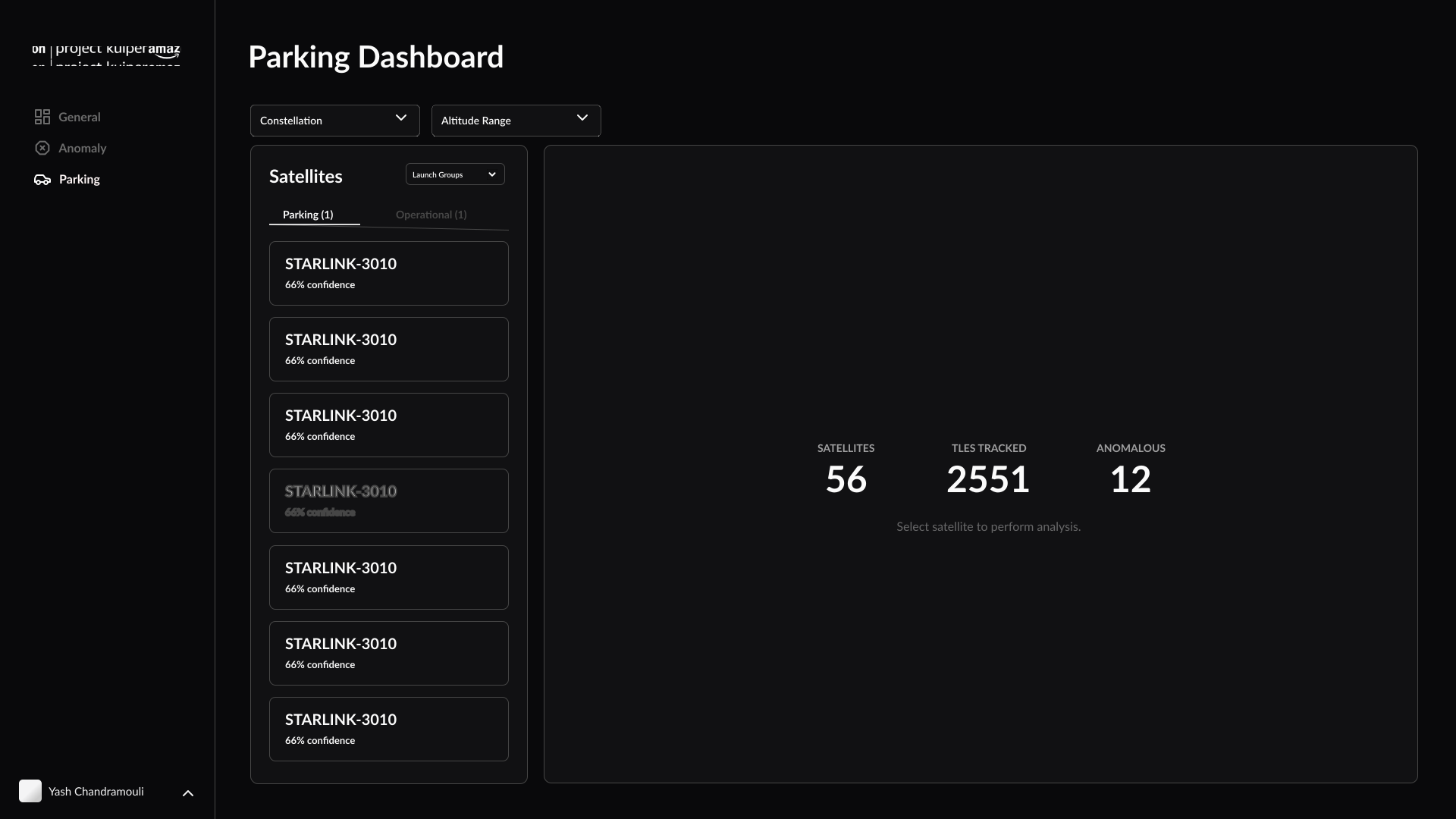
Parking Dashboard — Satellite List
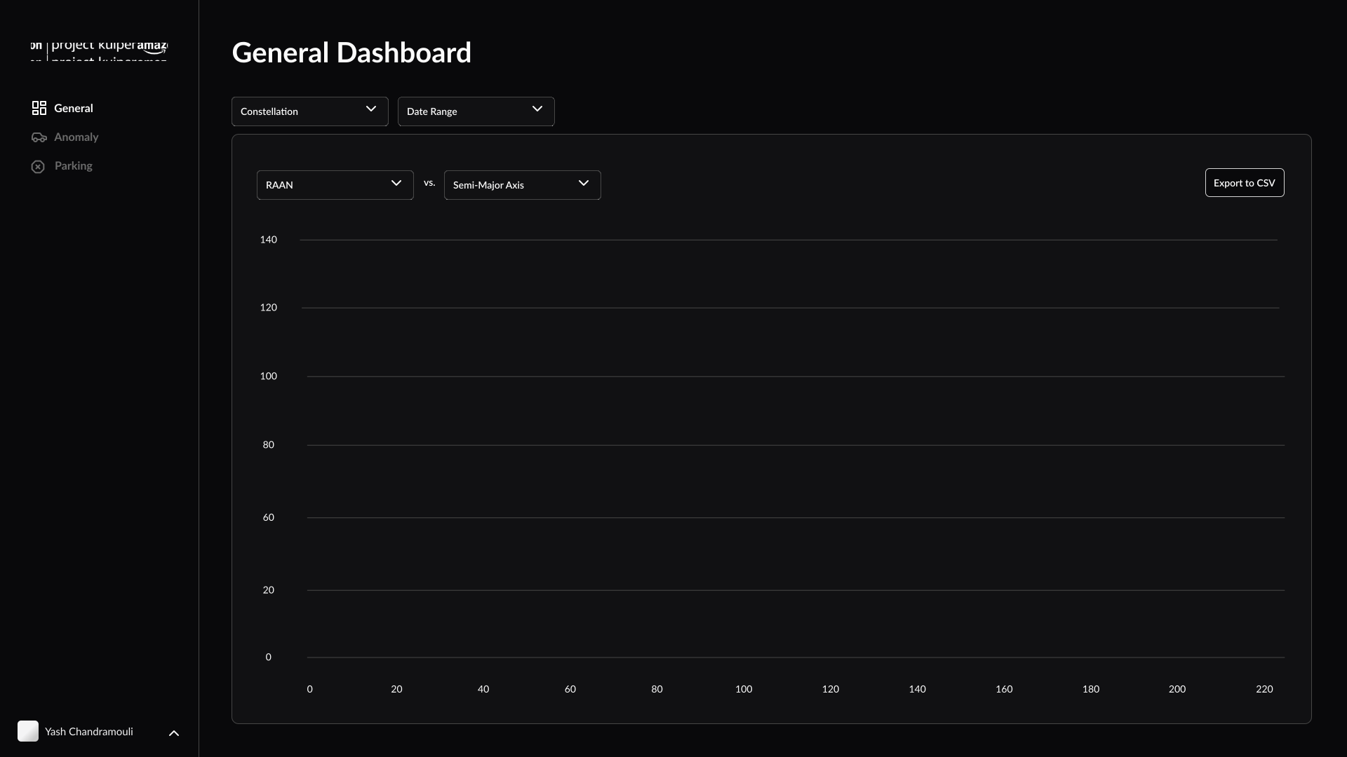
General Dashboard — Scatter Plot
Modular information layers
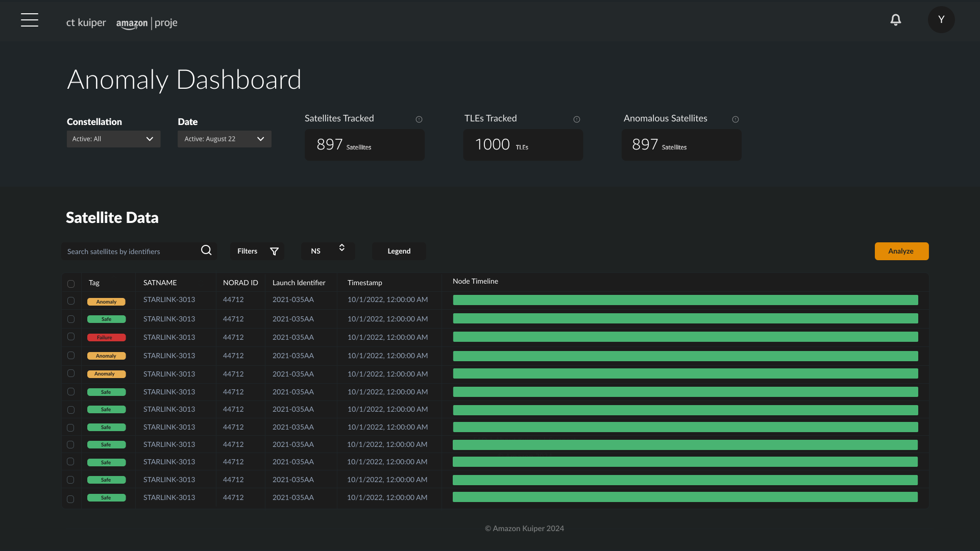
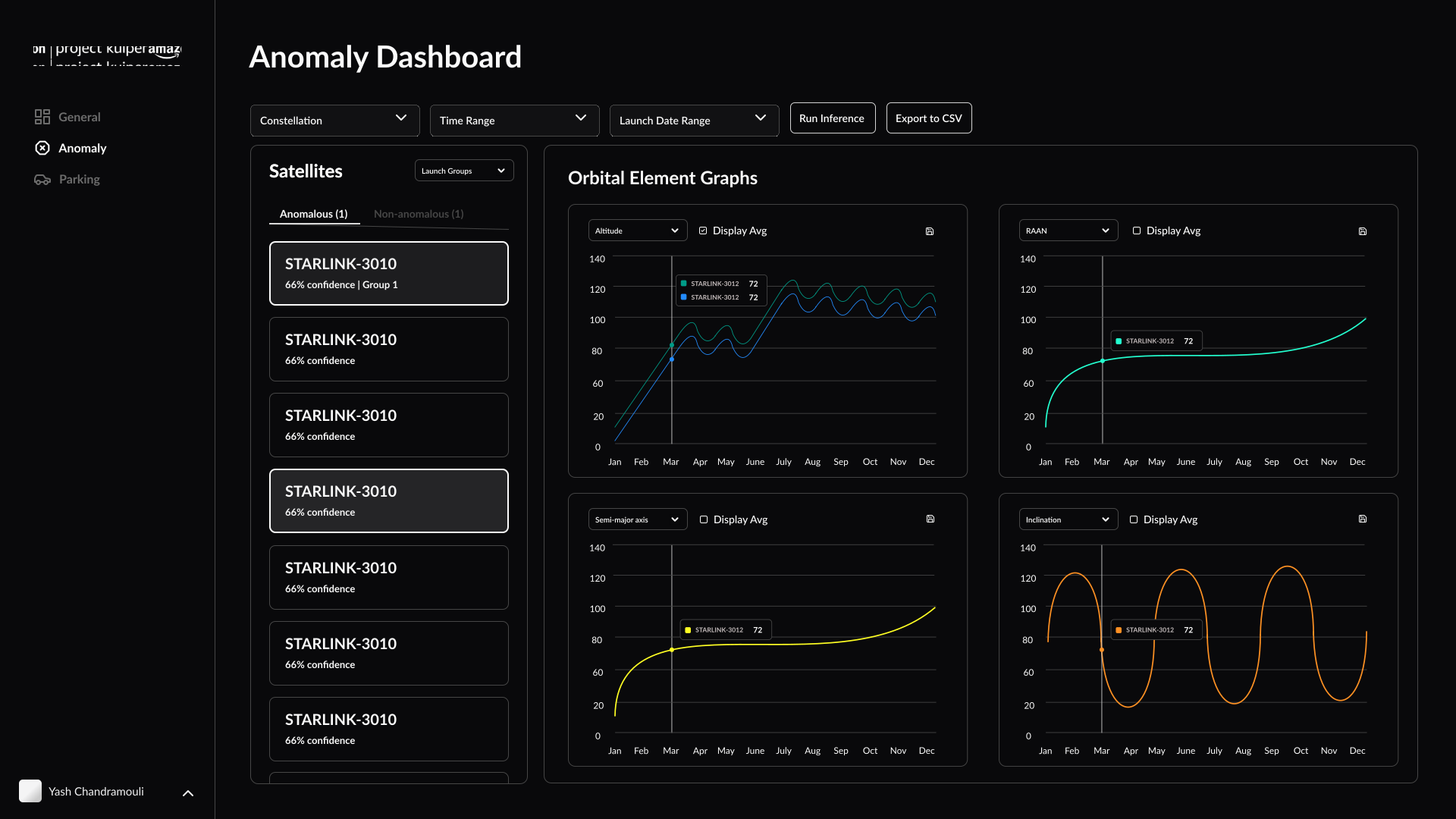
The interface runs in three layers, a constellation overview for the big picture, a satellite table for mid-level telemetry, and a detailed anomaly panel for digging in, so an analyst can go from "something's wrong" to "here's what's wrong and why" without switching tools.
Anomaly Dashboard — Orbital Elements
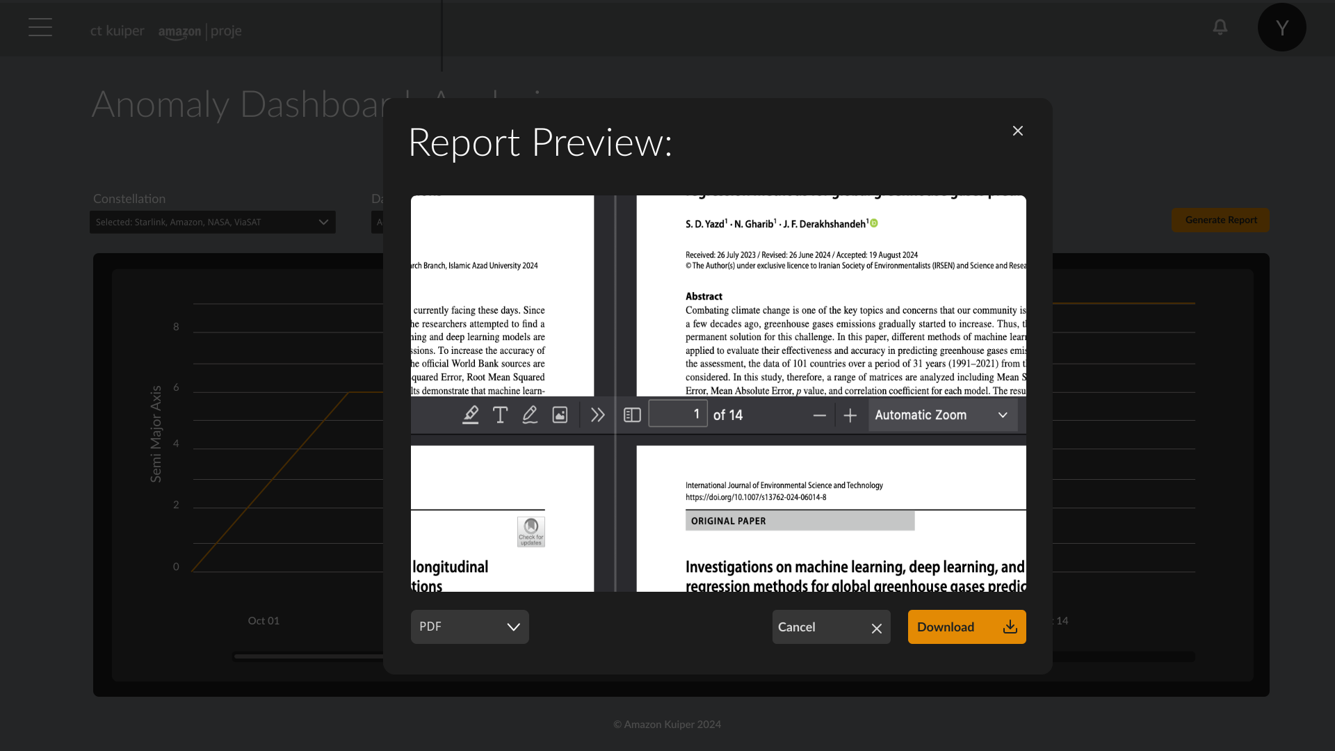
Report generation
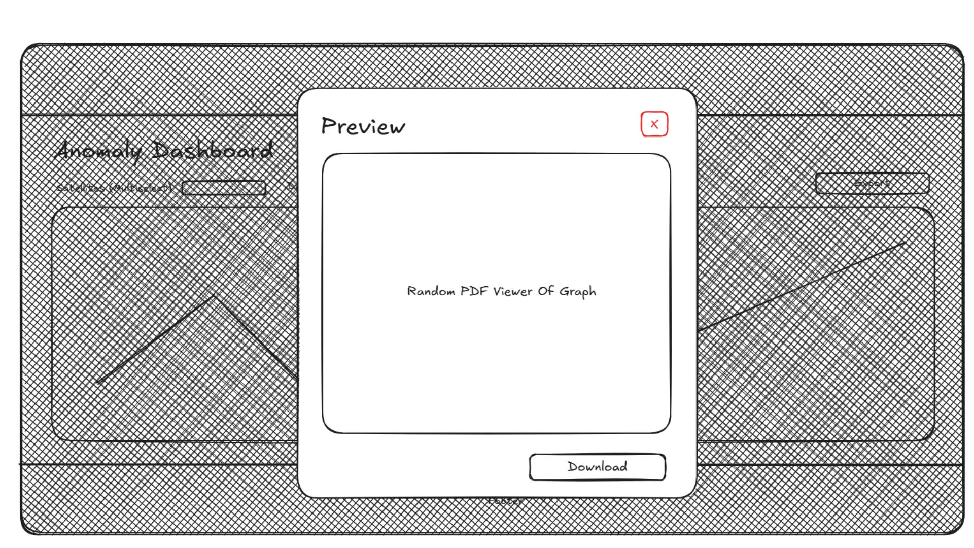
Detecting an anomaly is one step, documenting it is another, so a report generation modal lets analysts export telemetry summaries directly from the dashboard, and the whole workflow, detection to documentation, stays in one place.
I delivered a working prototype and handoff deck to Amazon's D.C. team, who named the interface clarity specifically.
Impact
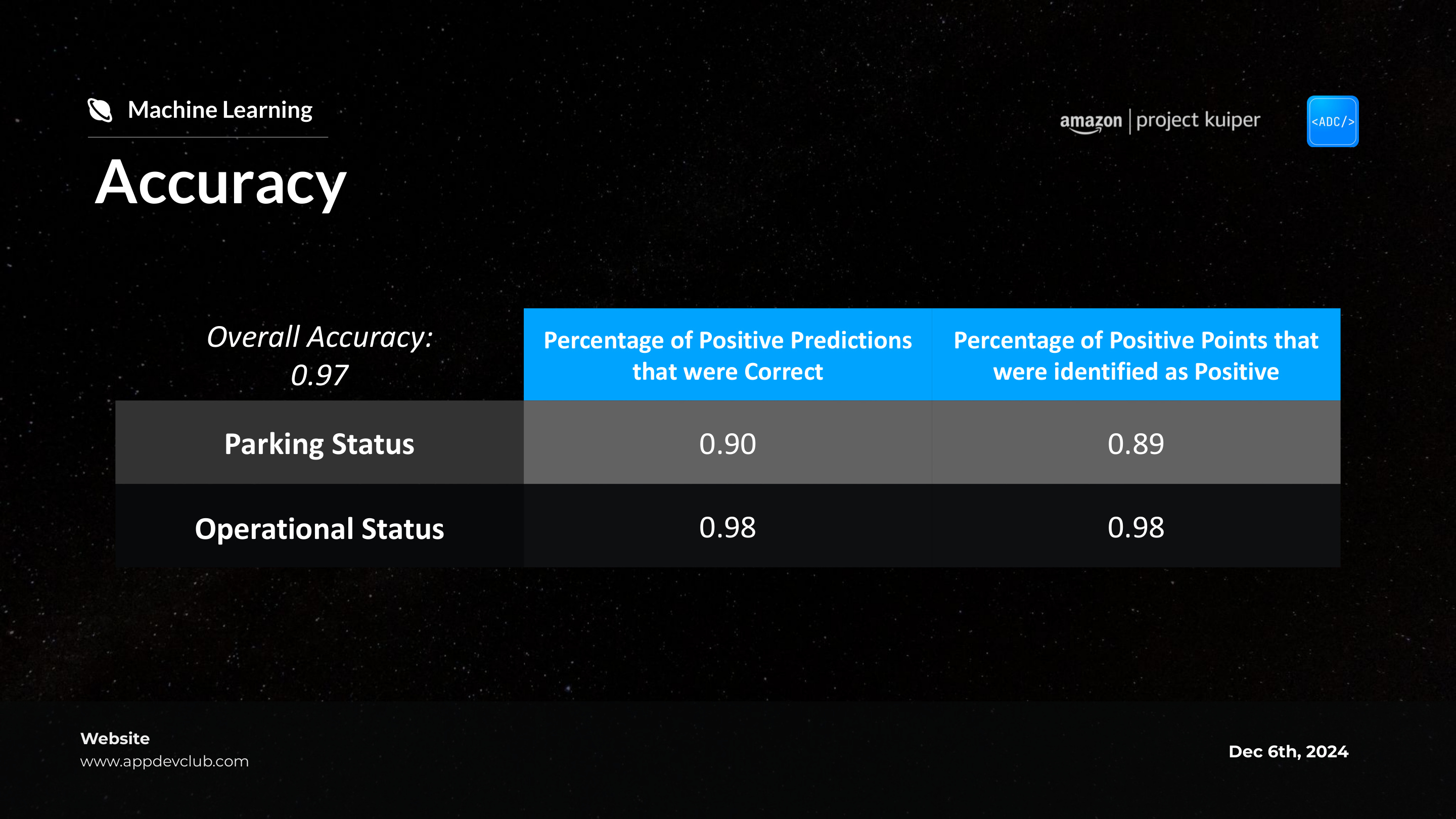
The final deliverable was a working baseline prototype, presented to Amazon Kuiper's D.C. team, where a senior engineer specifically named the interface clarity and the pitch materials.
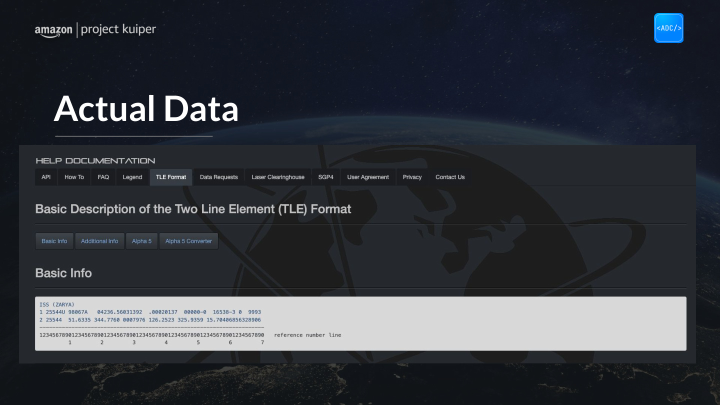
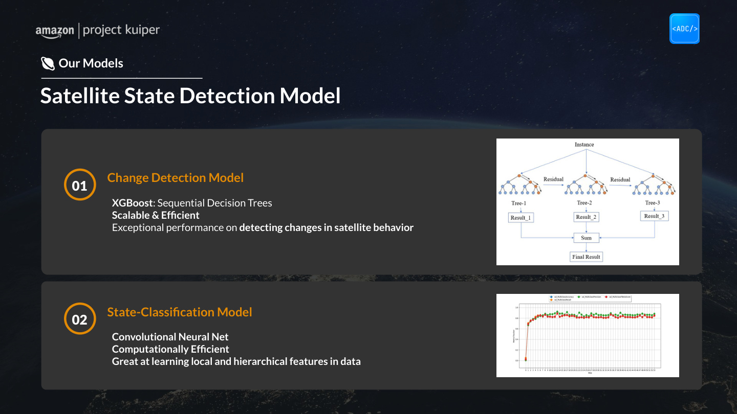
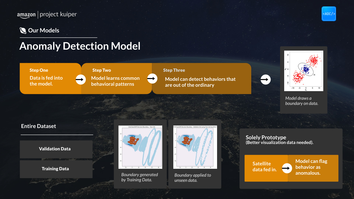
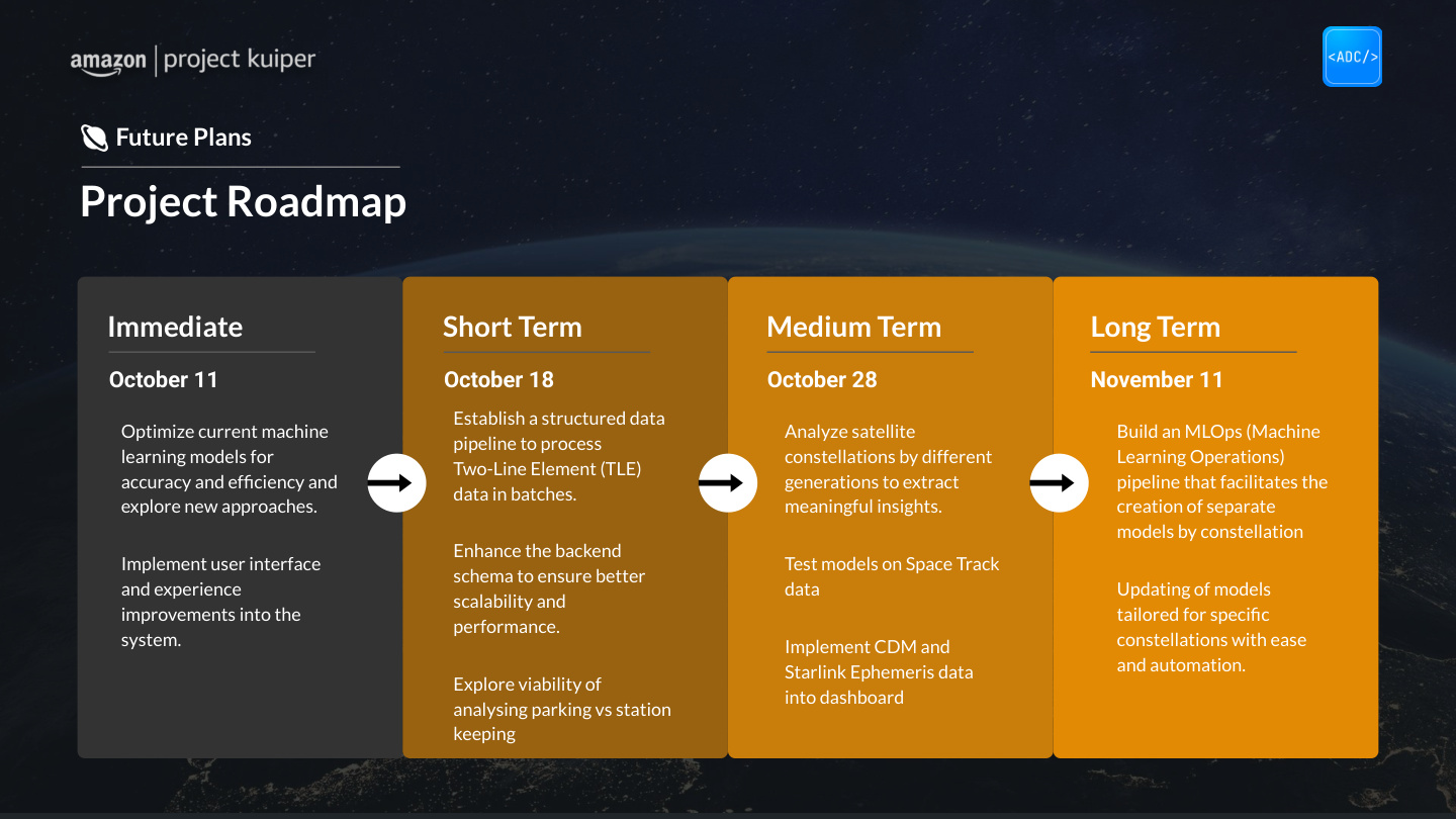
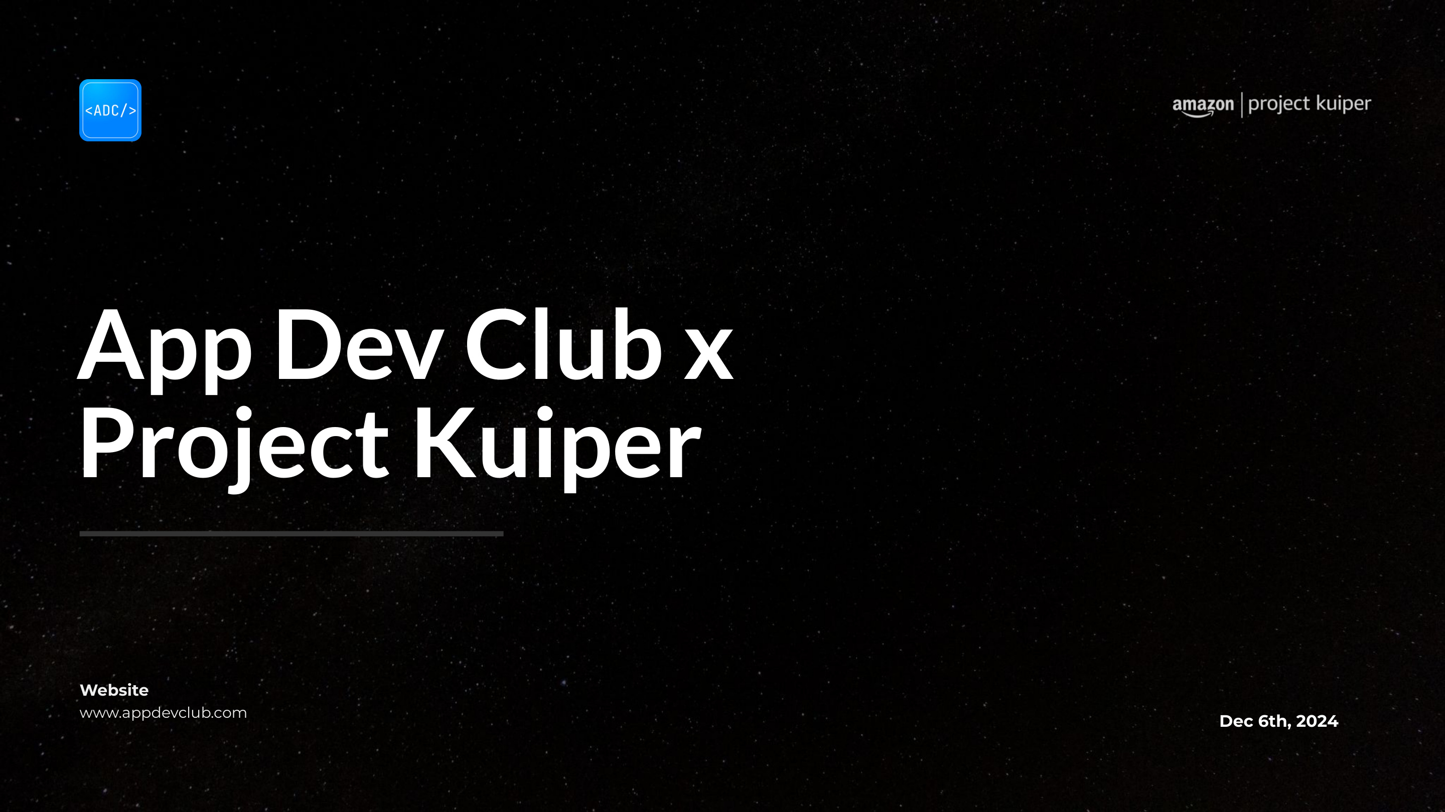
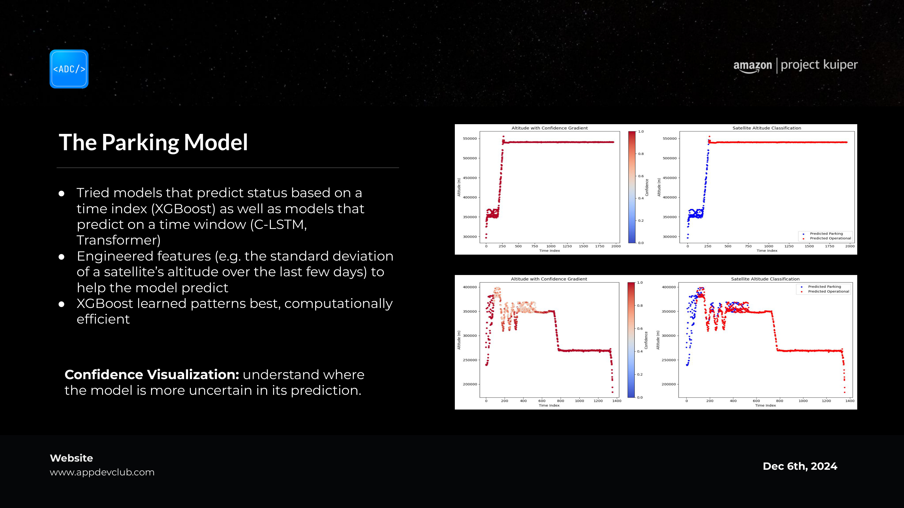
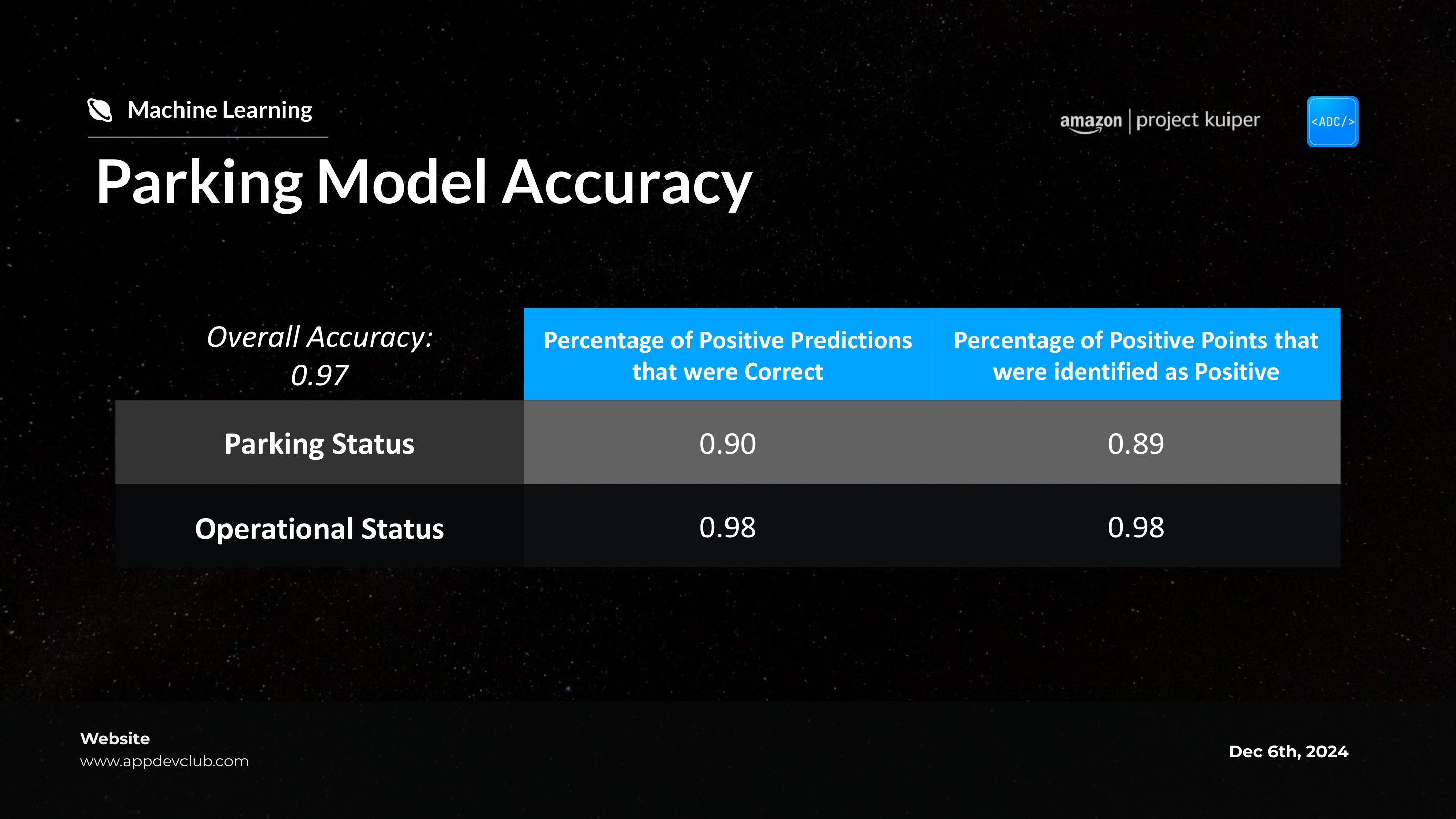
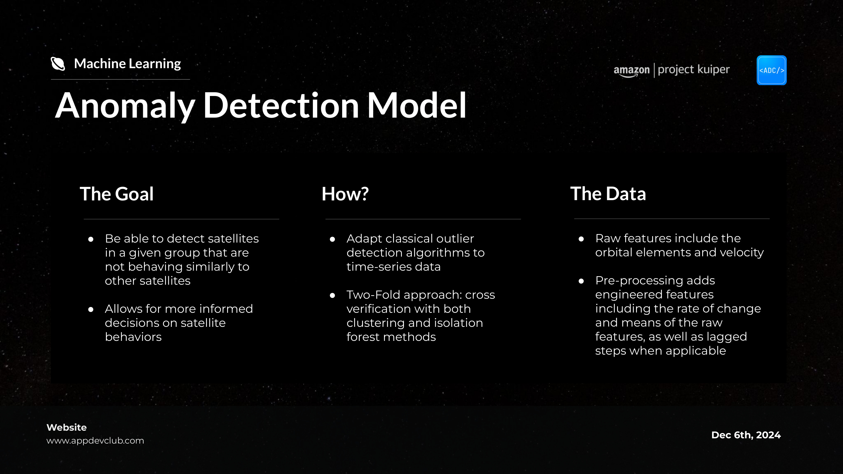
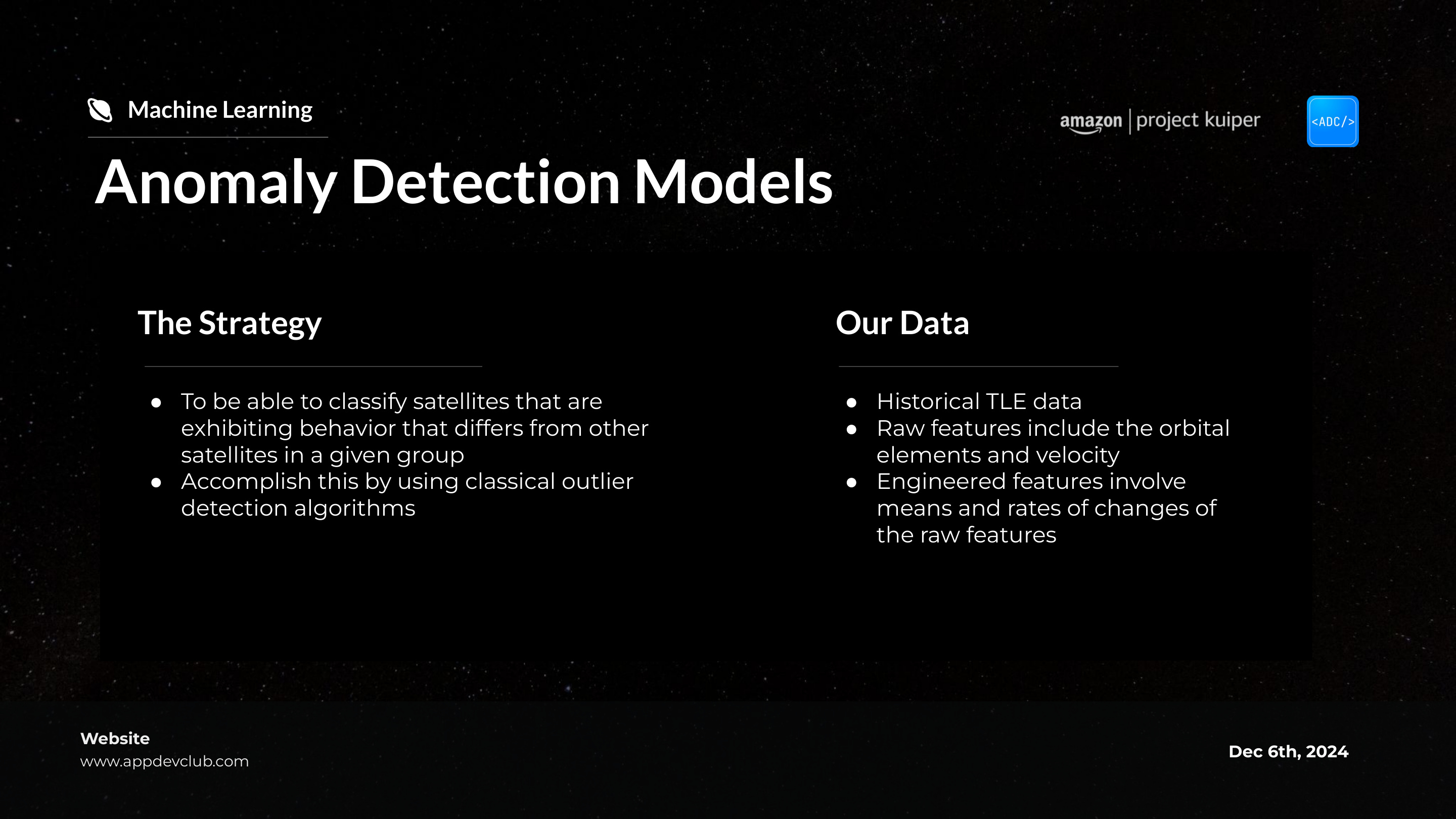
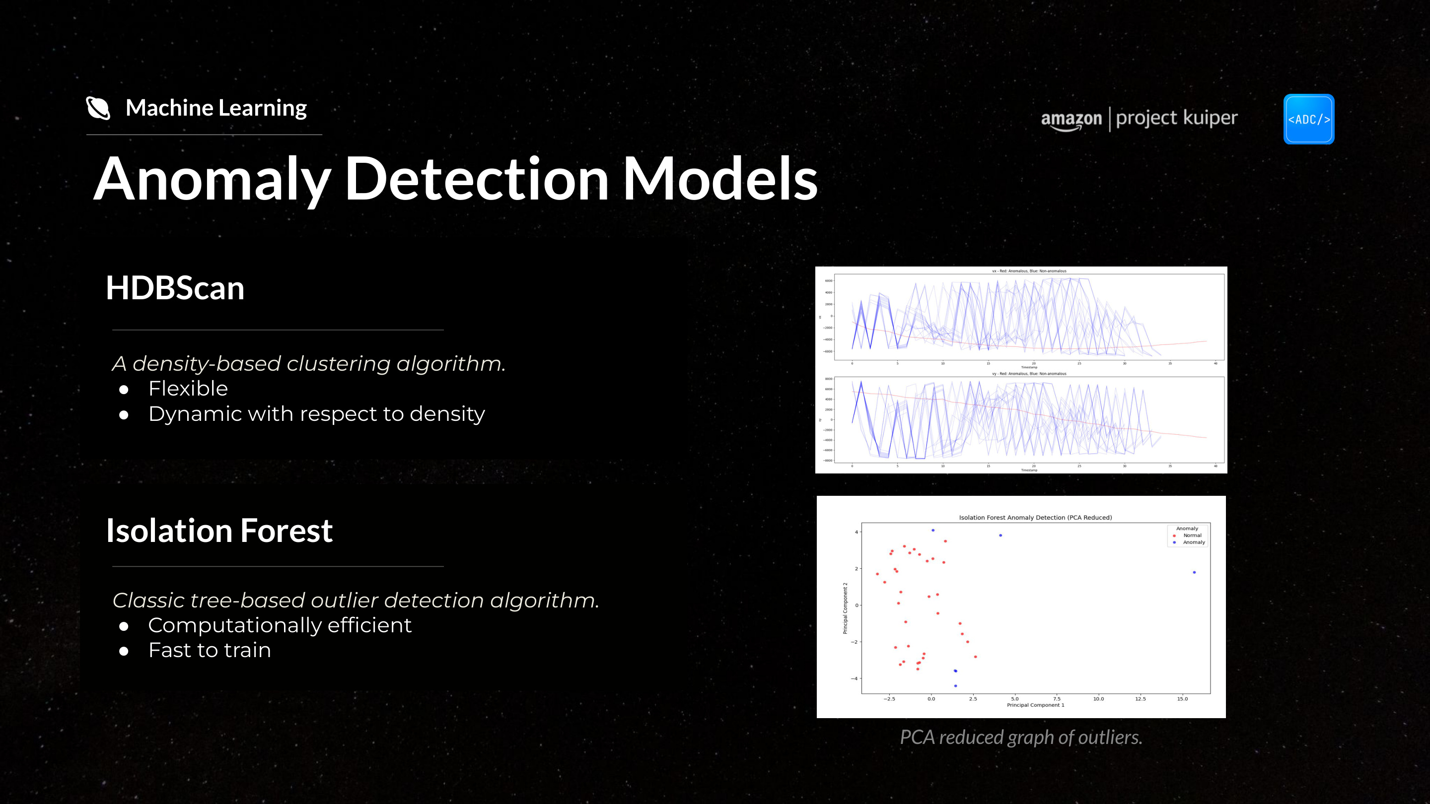
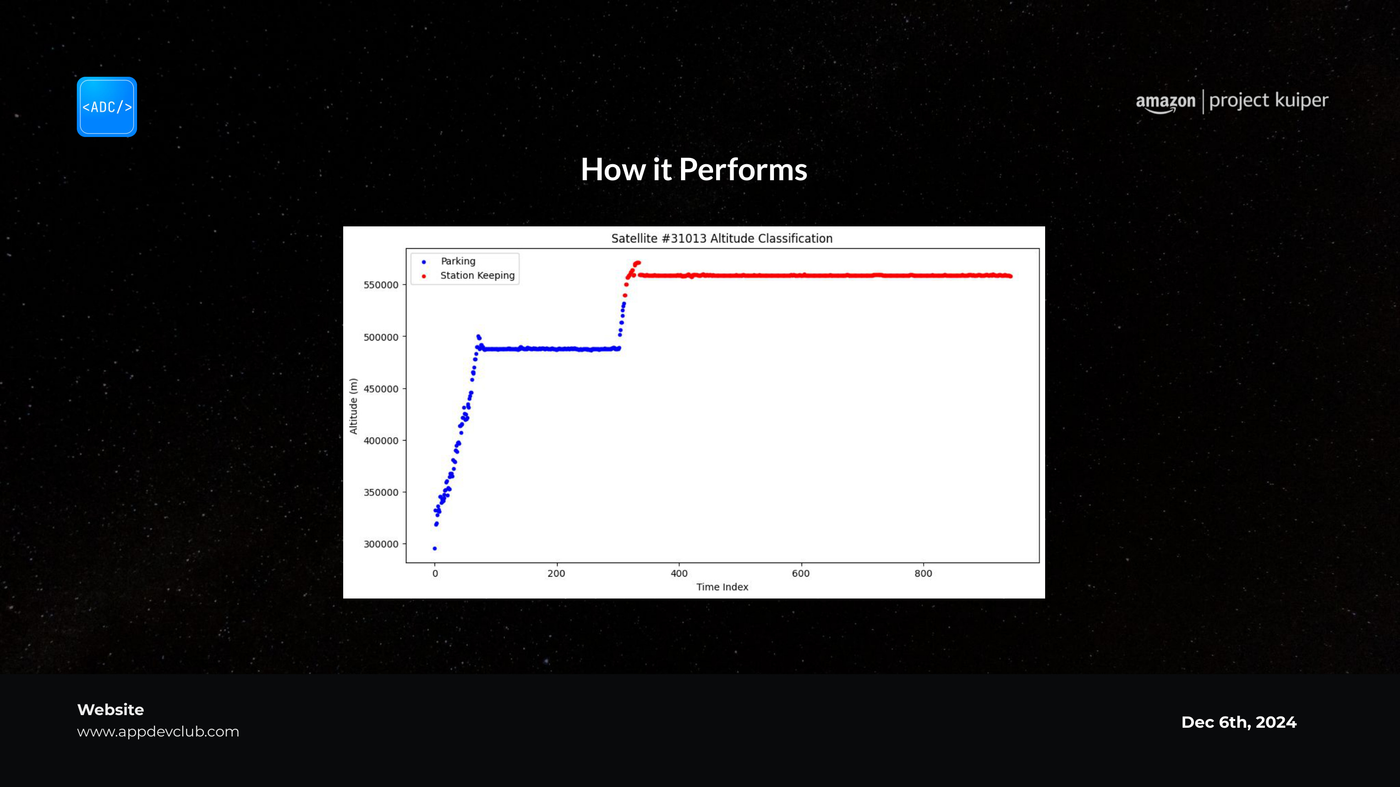
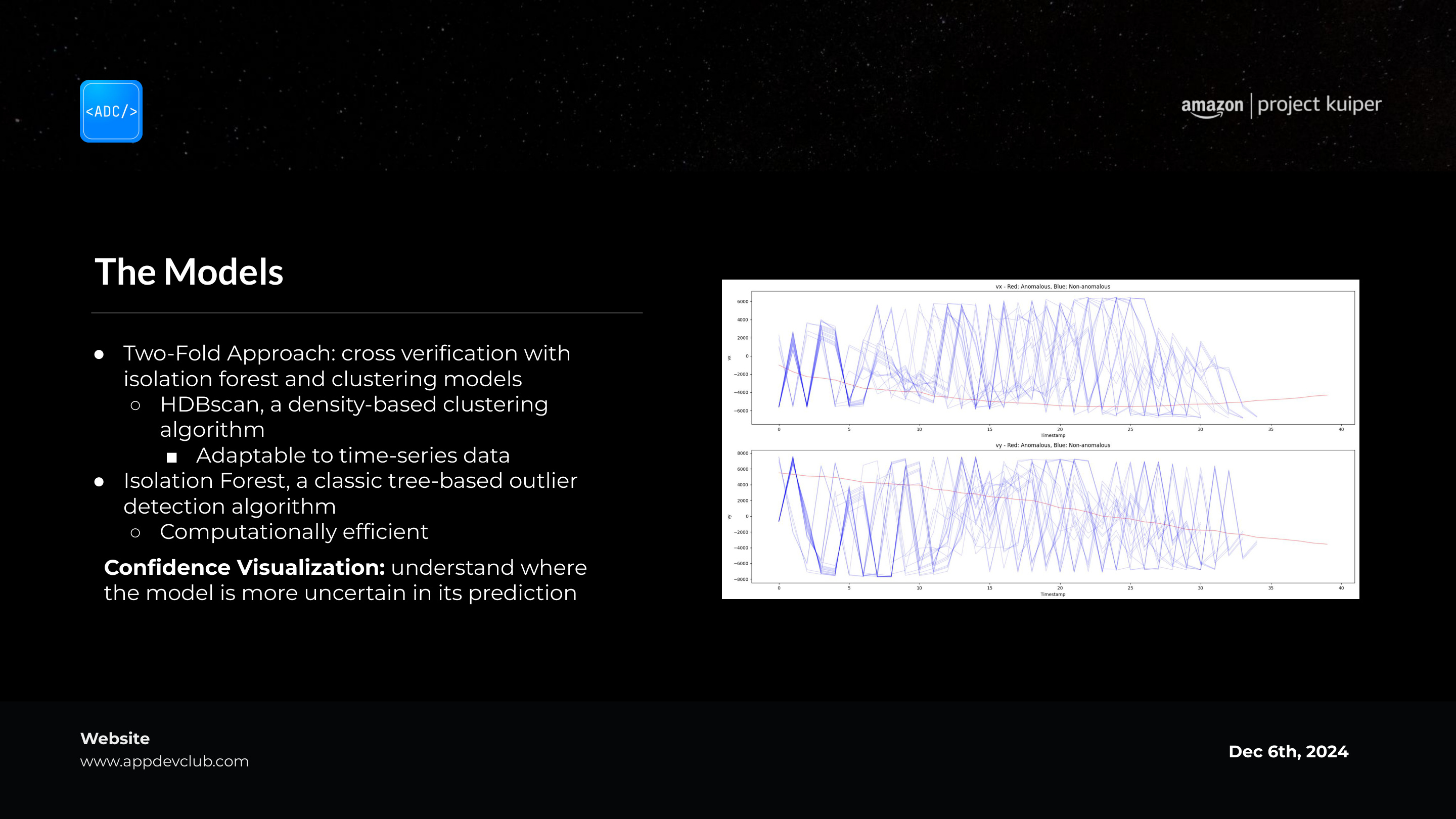
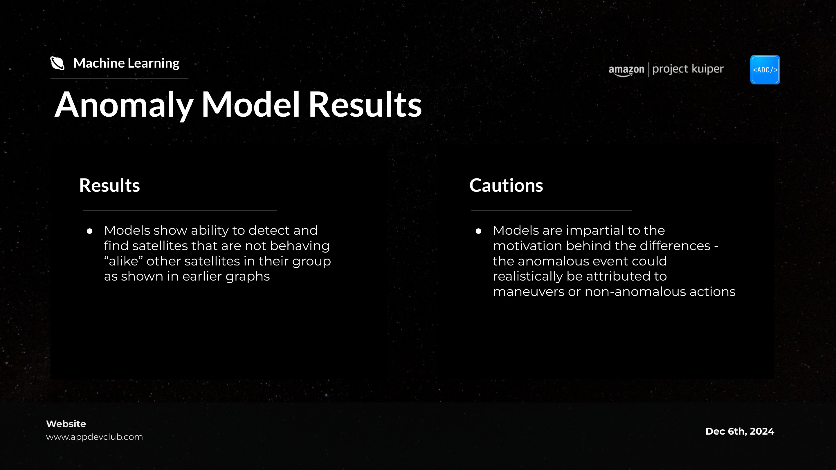
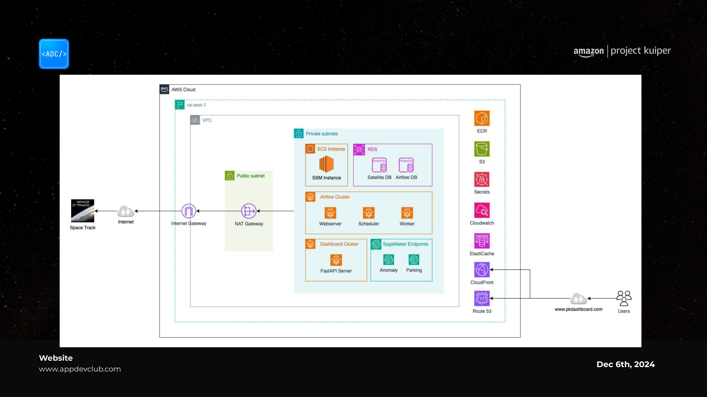
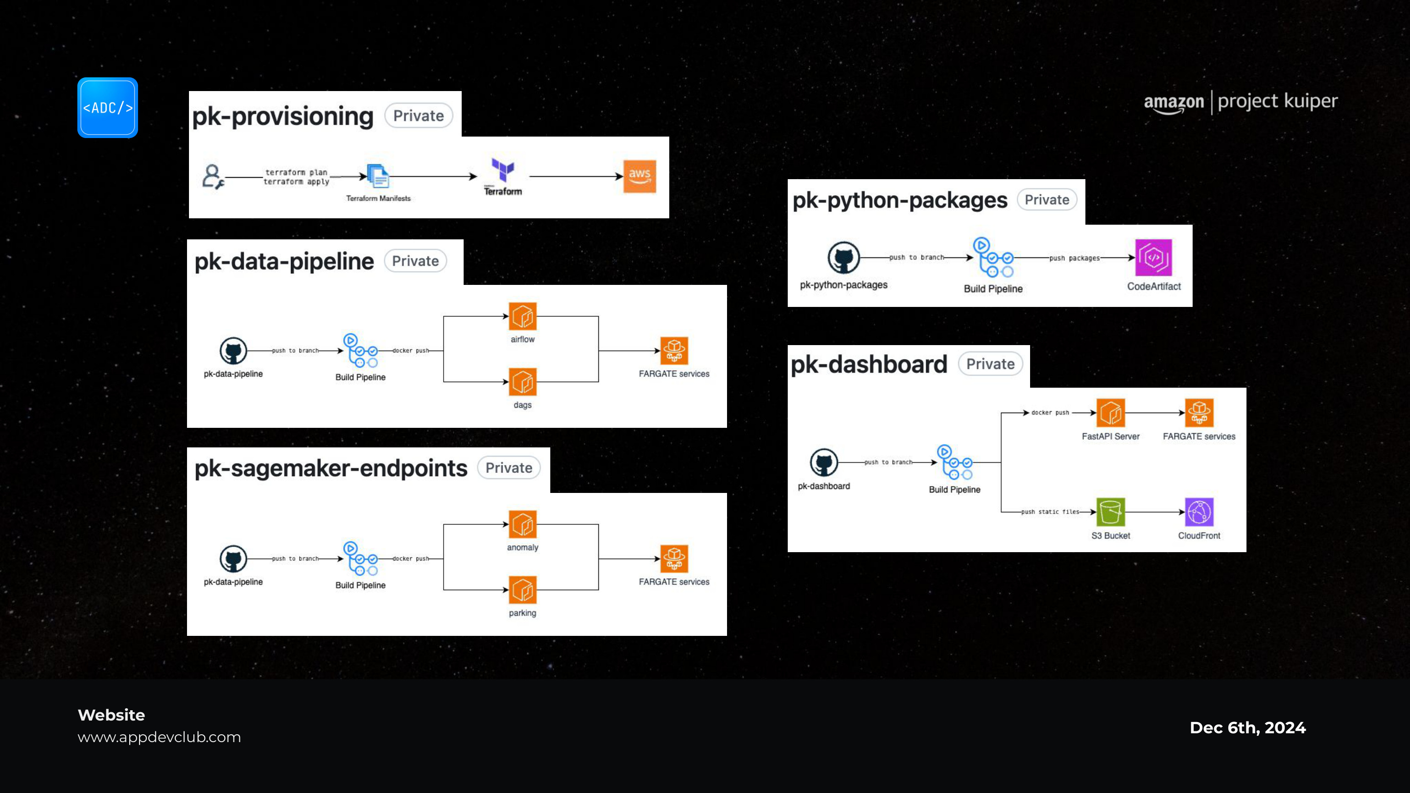
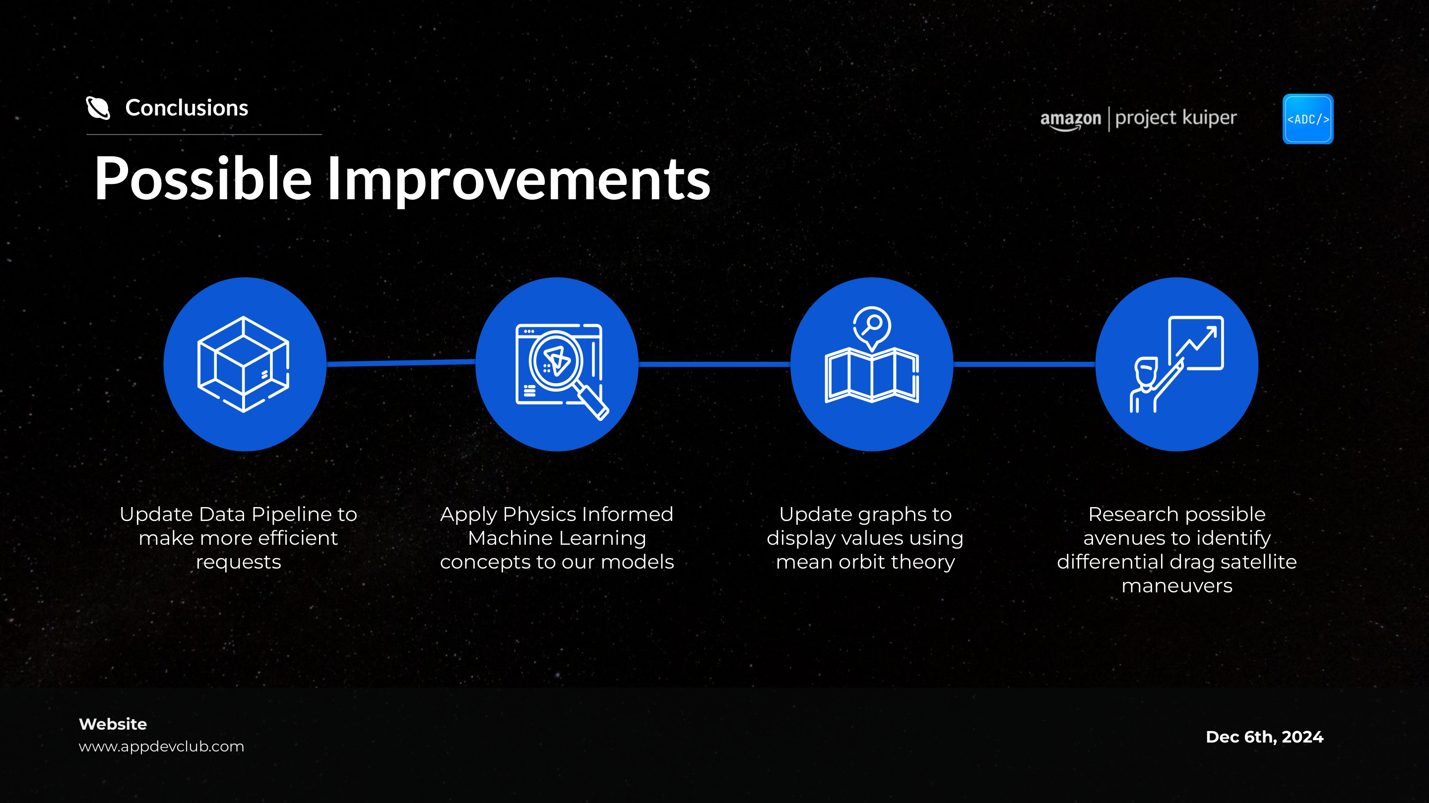
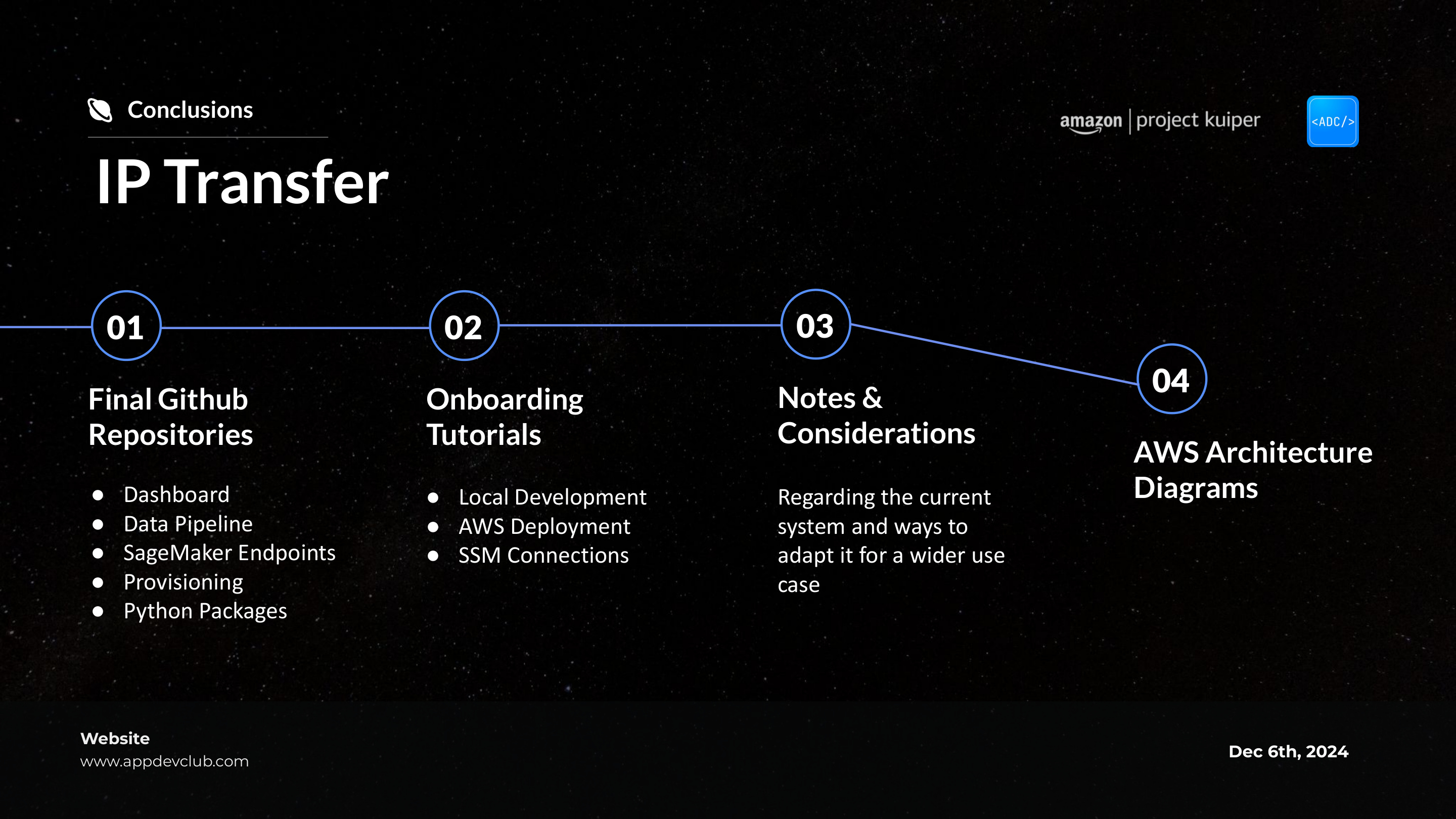
I also designed the handoff deck that went with it, covering onboarding, IP transfer, notes and considerations, and the AWS architecture diagrams the engineering team would need to pick the project up.
Handoff deck designed from scratch, walking Amazon's engineering team through onboarding, IP transfer, and architecture.
Pushing through a technical domain outside my focused work taught me I can deliver in unfamiliar territory.
Reflection
Designing for complex, unfamiliar users.
This project was tough energy wise, as I've always been drawn to spatial experiences and community focused UX like tracking assignments or books, whereas this was deeply technical. I've never had a huge interest in the hard sciences, but pushing through forced me to test my skills on digital experiences for people completely different from myself; I had to absorb complex domain knowledge quickly to make a technical topic digestible and functional for the end user.
Advocating for design under pressure.
Working alongside engineers on such a technical project taught me how to advocate for my value as a designer; they would dump dense content on me late at night, and I'd quickly turn it around into clean, structured slides that made sense. Hearing them ask how I made it look so good so fast was deeply validating, because it proved that visual organization and strategic layout matter just as much on heavy engineering projects as they do on creative ones.
Realizing my impact after stepping away.
We were all stressing and running around during the project, so it was hard to gauge my impact in the moment; it wasn't until after I left that one of the team leads reached out to say how much they missed my work and how the design direction hadn't been the same since. Knowing my contributions left a noticeable void proved that my skills made a real difference, giving me the confidence that I can step into completely unfamiliar technical territories and still deliver meaningful work.