Brand · Fashion · Marketing Design

A&F Denim Darlin'

Role
Multidisciplinary Designer
Marketing Lead
Client
Abercrombie & Fitch
Hollister Co.
Scale
7 designers
 
Audience
Exec Directors
Nationwide
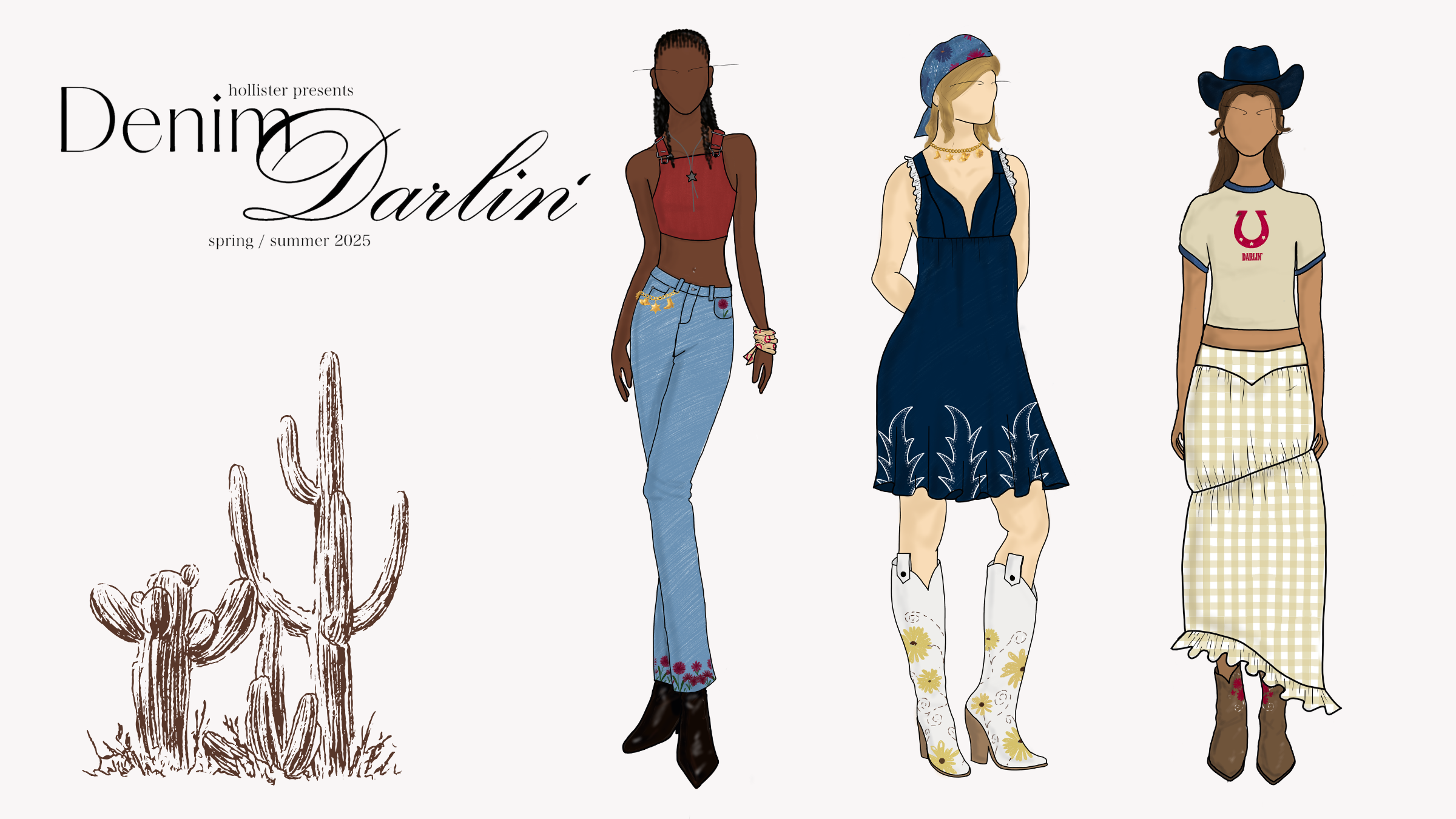
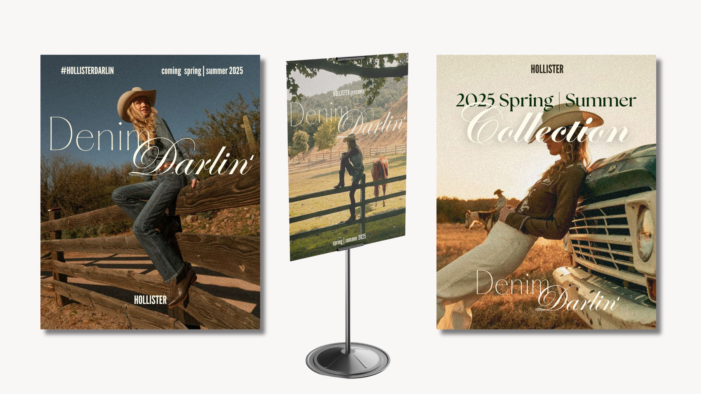
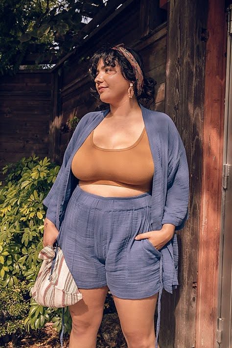
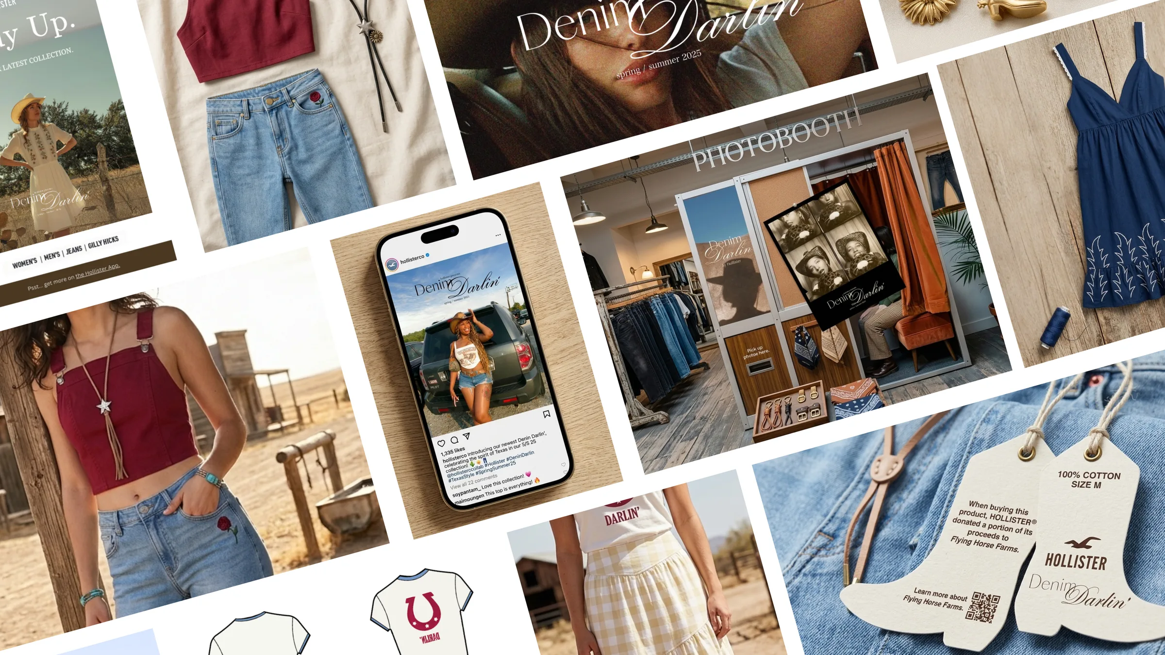
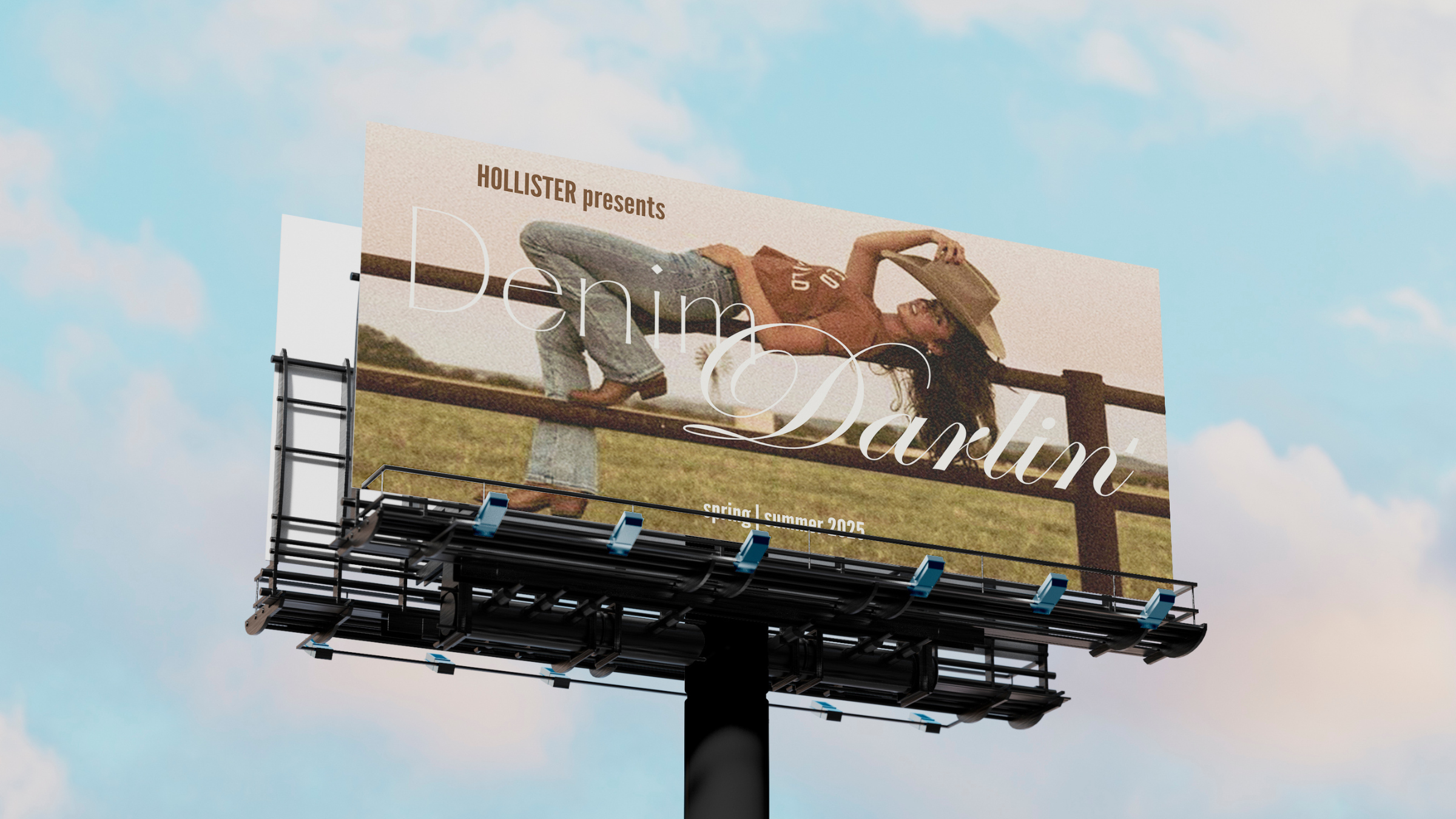
Denim Darlin' campaign hero spread
Overview

A nationwide design challenge. No templates, no guardrails, just a brief and the expectation we'd figure it out.

Challenge
A&F handed us a brief and told us to figure it out. No templates, no guardrails, one month. The brief wasn't what made it hard. Building something that actually felt like Hollister, not a student project guessing at what Hollister feels like, was.
Strategy
Three forecasting sources pointed at the same moment. The move was to trust that convergence and build something western-coded without being western-costumed — something that could stand on its own.
Solution
A full S/S campaign around a country granddaughter aesthetic: denim-forward, warm, nostalgic. The exec directors said it tracked where the brand was heading, not just where the culture was.
~80
Selected nationwide
portfolio + 3.0 GPA req.
3
Trend forecasting sources
converged on one moment
2
Customer archetypes every
decision ran through
100%
Natural fiber sourcing
across the full collection
So wait, what even was this?
Overview

No formal ranking was announced after presentations. But that response meant something.

Abercrombie & Fitch ran a nationwide design challenge, Sophomore Summit, and selected roughly 80 students with a 3.0 GPA minimum, portfolio required. We were handed a brief: build an original clothing campaign for A&F and Hollister.

My team built a full Spring/Summer campaign: trend research, visual identity, marketing collateral, a community mechanic, and a product strategy. When we presented Denim Darlin' to the A&F executive directors, one of them said it truly felt like something Hollister would implement and move towards.

Campaign hero — the final deliverable, designed to drive Hollister app acquisition.

Where exactly did I fit in?
My role

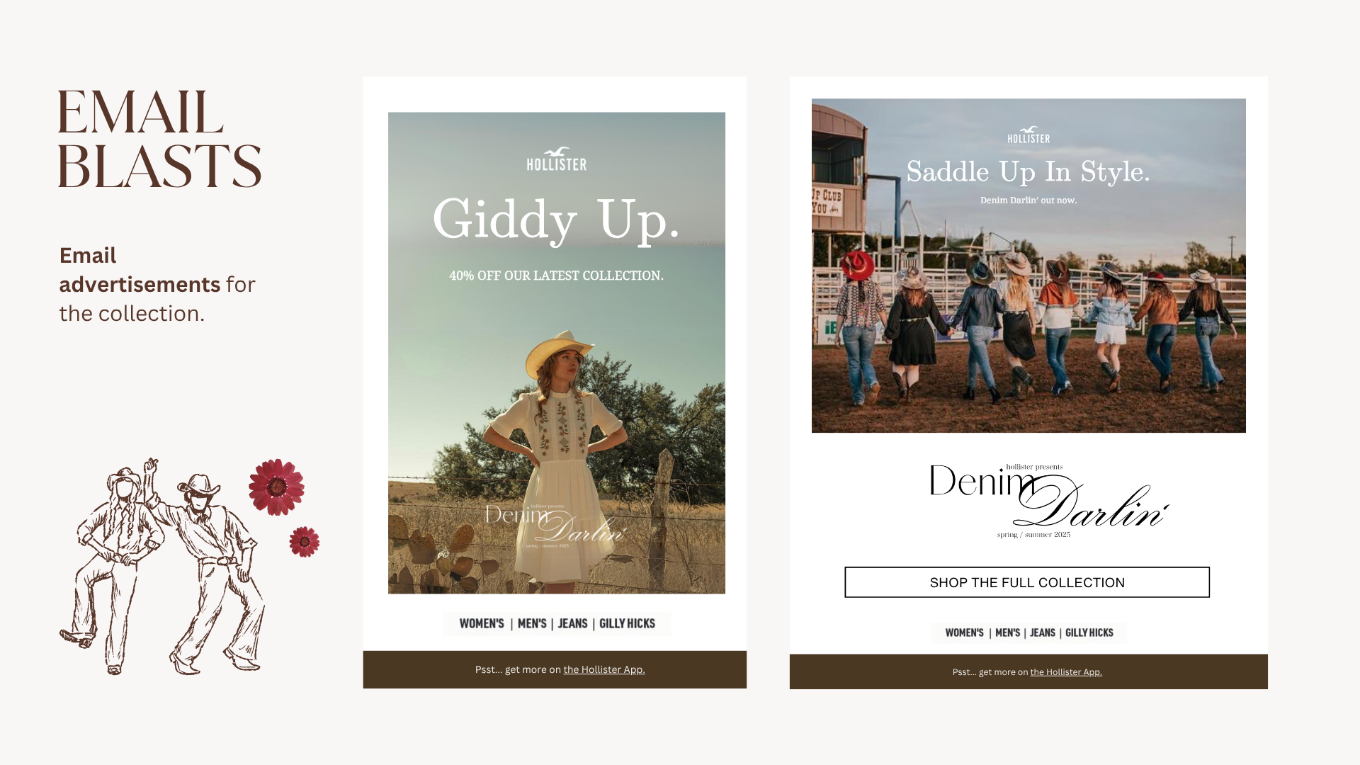
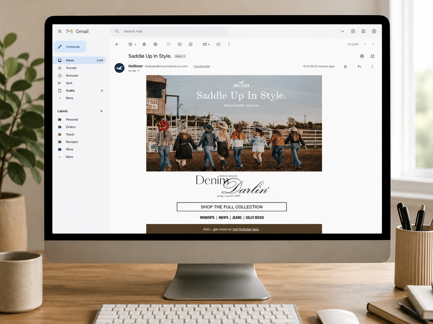
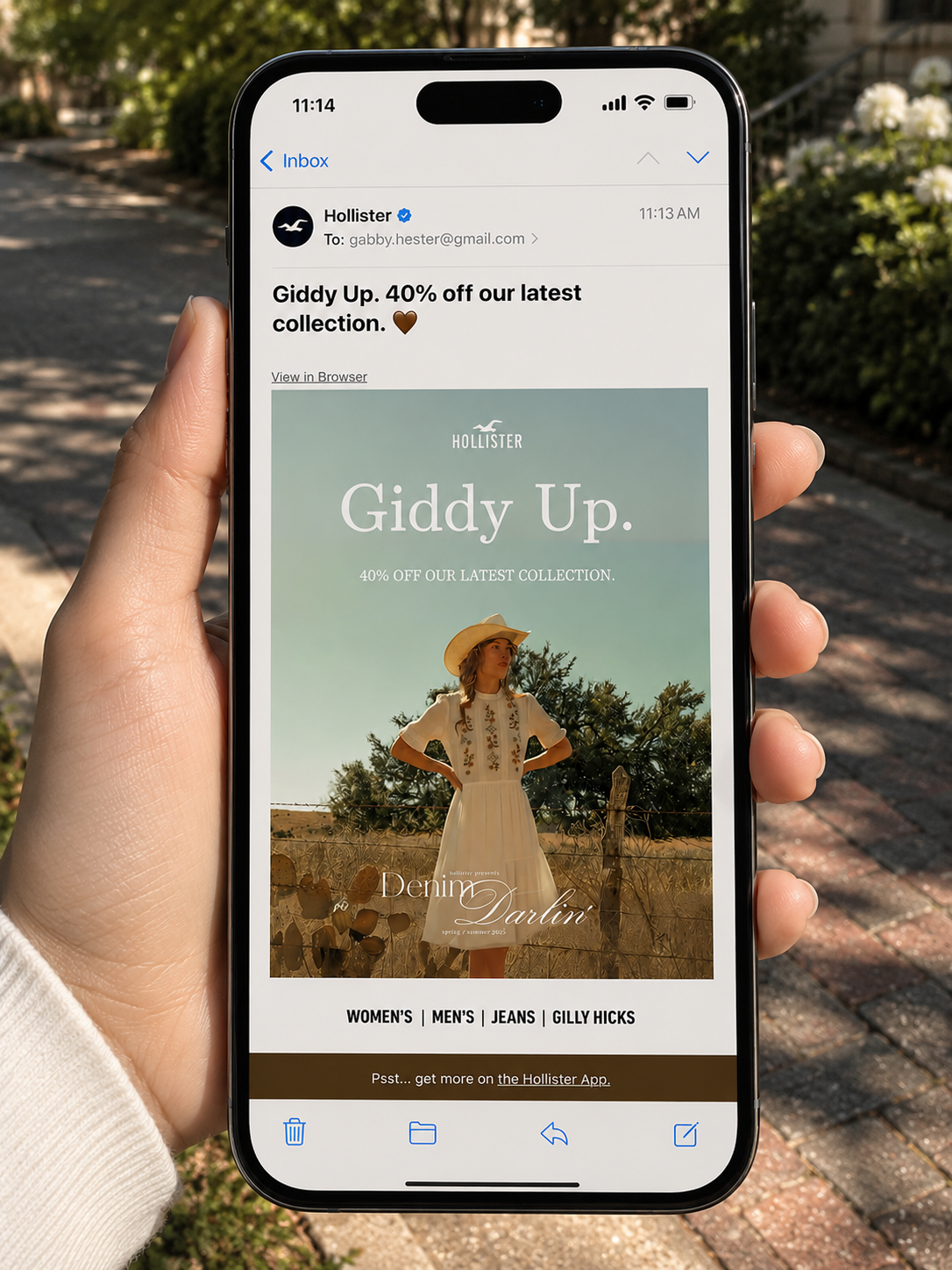
I was the marketing lead for the team, concretely meaning I personally built: digital mockups placed in everyday settings, in-app promotional layouts, email blasts, social assets, and the Instagram challenge framework, including the #HollisterDarlin community mechanic. I also consulted on overall design choices throughout the process of fashion design and brand collateral.

Working with fashion designers and UX designers gave me a clear picture of the energy they wanted the collection to carry. My job was amplifying that energy, not creating it.

Can anyone be a cowgirl?
The concept

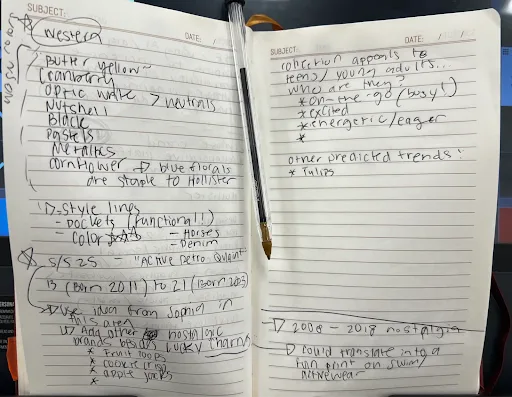
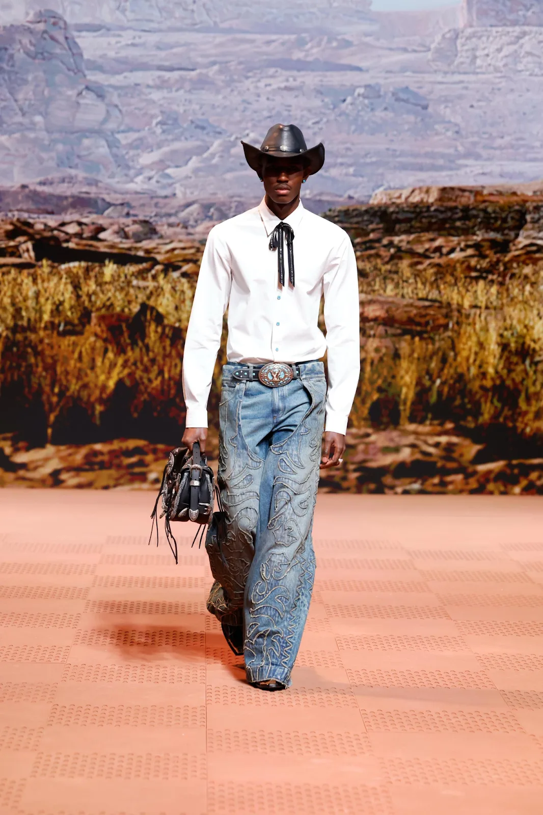
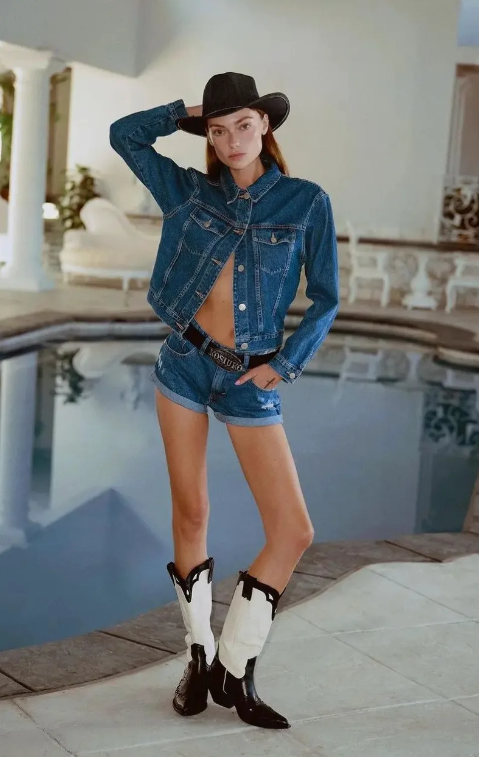
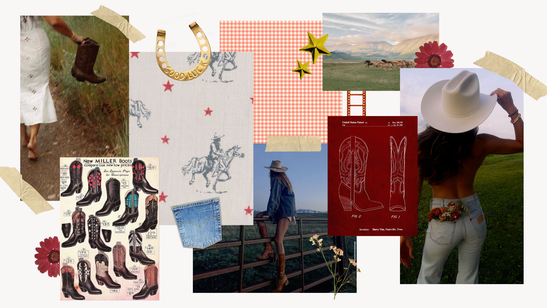
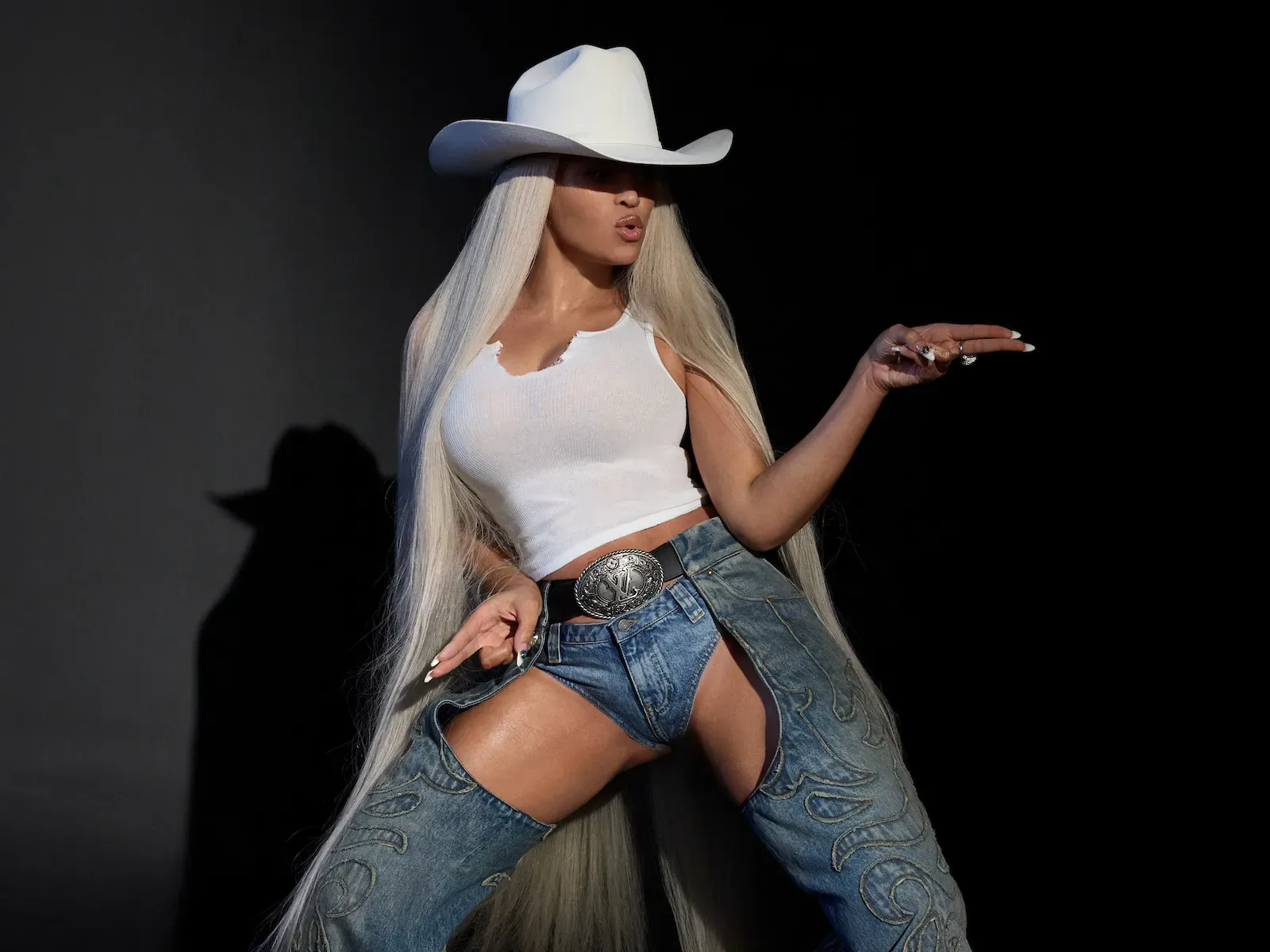
We started with social media research, specifically Instagram and TikTok. Denim was everywhere, and there was a western energy tied to the Beyoncé Cowboy Carter moment that was popular at the time.

Color Direction
  • Western palette — Butter Yellow, Cranberry, Optic White, Nutshell, Black
  • Neutrals, Pastels, Metallics
  • Cornflower blue & florals — a Hollister signature
Style Lines
  • Functional pockets, equestrian references, denim-forward silhouettes
Nostalgia & Target
  • Active Retro Quaint — targeting ages 13–21
  • Cereal brand nostalgia — Froot Loops, Cookie Crisp, Apple Jacks
  • 2008–2018 print revival for Swim & Activewear
Micro-Trend
  • Tulips
Sketchbook trend research notes for S/S 25

Early sketchbook research — the raw trend pool we were pulling from before anything got refined.

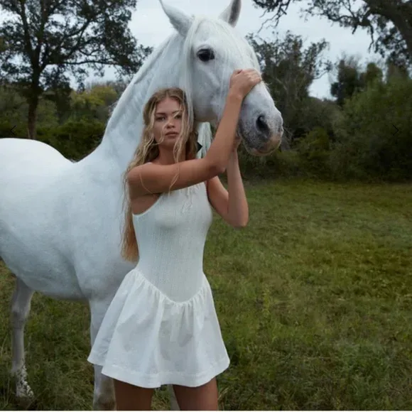
We landed on a country granddaughter aesthetic: youthful, nostalgic, denim-forward. A Blue Ivy angle came up early, but we ended up pivoting away quickly; if we had to work that hard to make a reference land (especially with an audience that may not be familiar), the campaign wouldn't be as appealing.

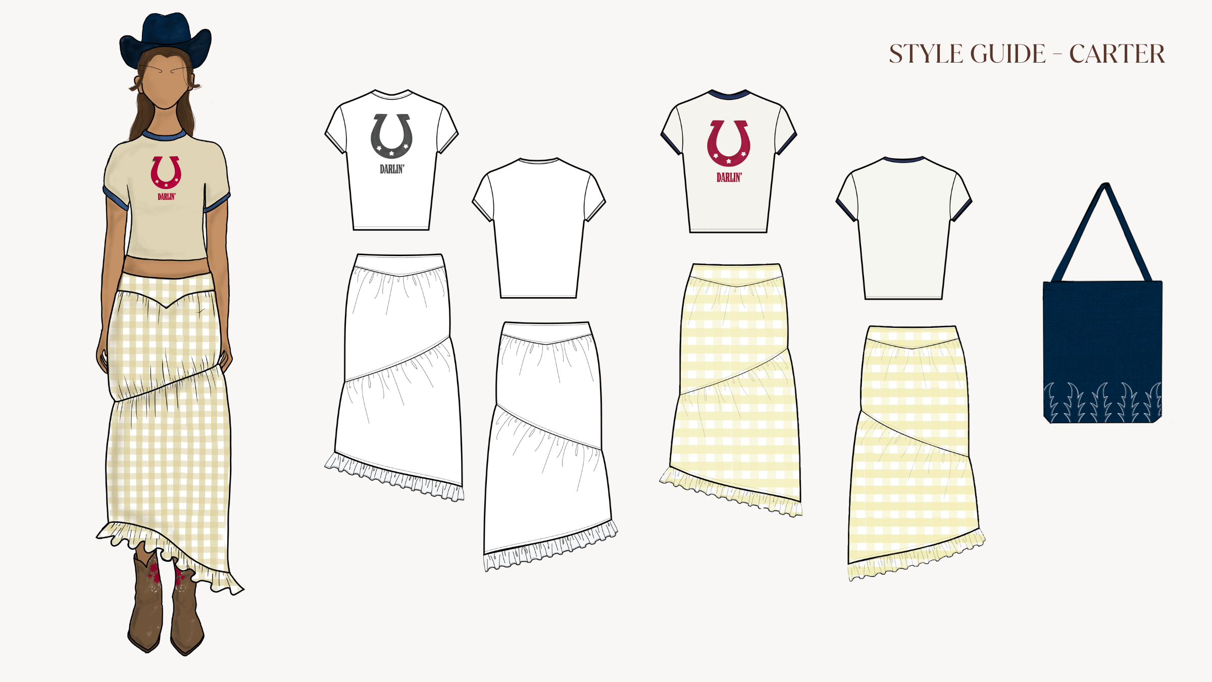
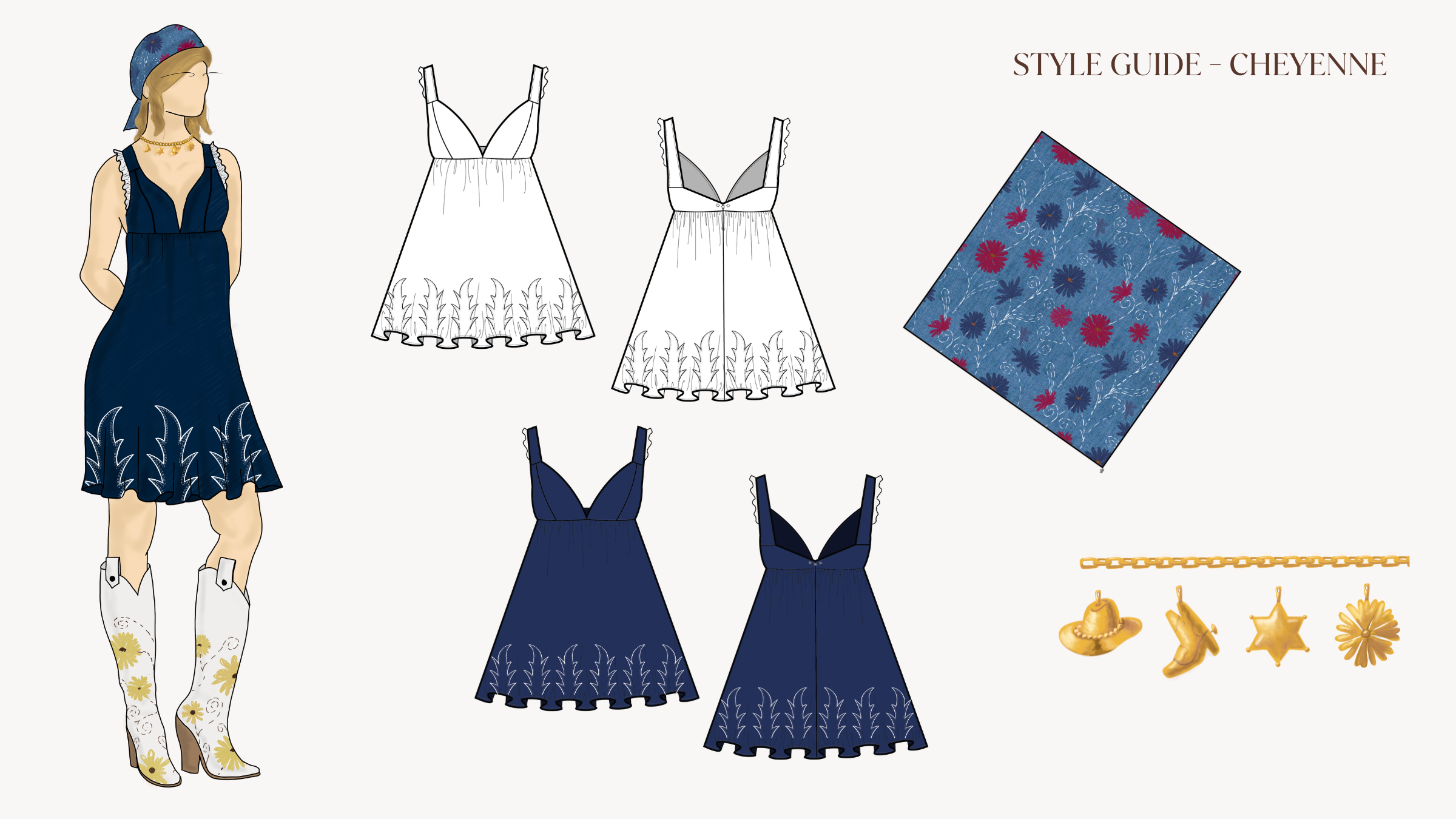
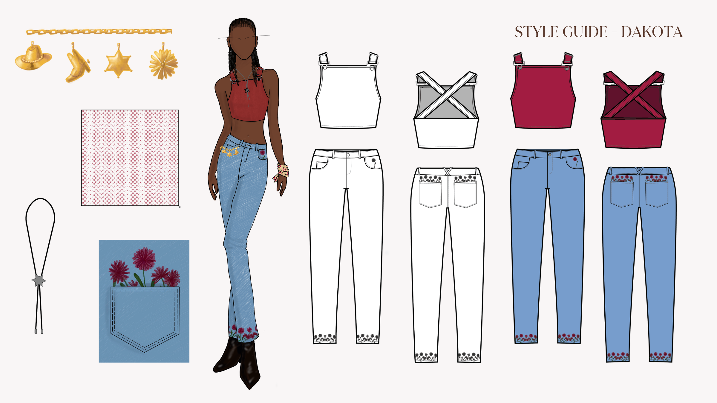
We wanted something that felt like it could be Hollister without screaming cowboy. Western-inspired, not western-costumed.

WGSN https://www.wgsn.com/en flagged Rodeo Renaissance and Cartoonification as trends for Spring/Summer '25, and Runway coined "Denim for Days". These forecasting sources reinforced the same vision we were seeing online, and we felt more comfortable committing. 
WGSNRodeo Renaissance
RunwayDenim for Days
WGSNCartoonification
WGSN — Prints & Graphics S/S 25
Rodeo Renaissance
Rodeo Renaissance mood image Rodeo Renaissance mood image Rodeo Renaissance mood image Rodeo Renaissance mood image
Trend Investment
Projection
Invest
Strong growth trend: prioritise investment for larger volumes
  • Fueled by Beyoncé's Cowboy Carter
  • Design western with #PrettyFeminine details
  • Provide a fresh perspective on the trend
  • Elevate everyday items with crafted, embroidered details
Design Direction

Focus on a pastoral or rodeo direction and be mindful of your storytelling when referencing cultural patterns. Apply to graphic tops for the young market, and invest in crafted elements and embroidery for the mature market.

WGSN flagged Rodeo Renaissance as a strong growth trend for S/S 25 — exactly what we'd already felt on TikTok.

Who actually buys this?
Target audience

Before we developed anything visual, we built two customer profiles to keep us on track, based on A&F Co.'s central customer demographic.

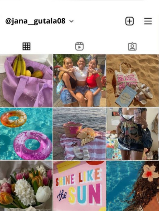
JaNa Cole
The Social Connector · 14 · Newport Beach, CA
Violin TikTok creator YA reader
JaNa JaNa

Pre-freshman year. Spending the summer figuring out who she is before the world starts watching.

Fashion is a signal for her — what she wears says something before she does. She wants to stand out without standing apart.

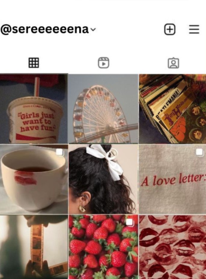
Serena Hayes
The Self-Expressive Idealist · 20 · Milwaukee, WI
Sustainability student Vegan Secondhand shopper
Serena Serena

Studying sustainability at UW Madison. She thinks about where her clothes come from — and whether a brand actually means what it says.

She's not just following trends. She's deciding which ones she trusts. She's the customer who reads the label.

JaNa and Serena: the two archetypes every creative decision ran through.

Influencer landscape

We also mapped the influencer ecosystem around our customers. The goal wasn't just reach/follower count, it was demographic fit. We wanted one creator for each end of the Hollister spectrum.

Spencer Barbosa
10.3M TikTok  ·  2.5M IG

Body positivity and youth empowerment. Her try-on content works because she makes every body feel like the point, not the exception.

The creator who makes Hollister feel like a brand that actually means it.

Demetra Dias
2.9M TikTok  ·  680k IG

Fashion content built for Gen-Z teens — hauls, unboxing, GRWMs. She's already featured Hollister organically.
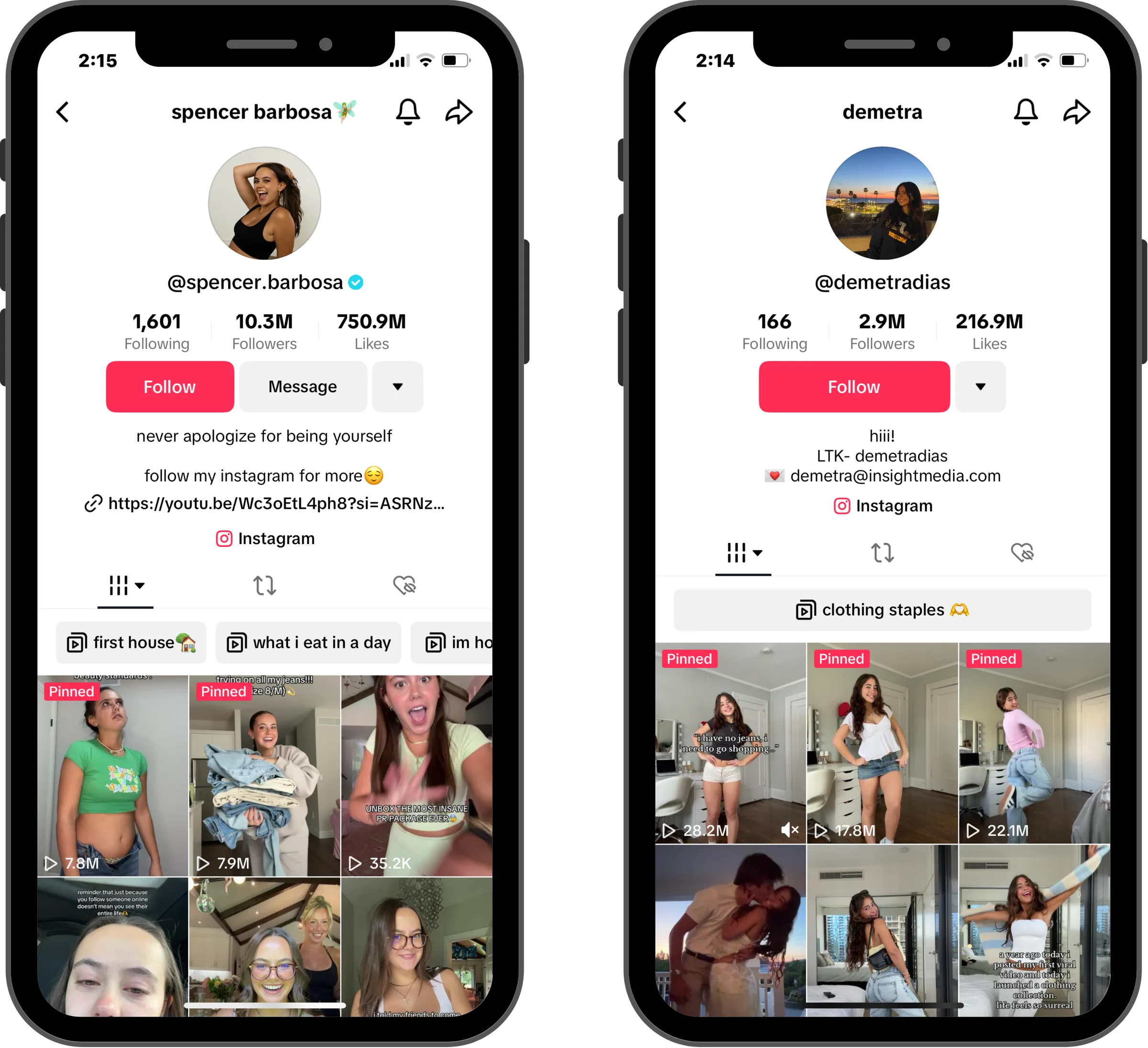
She represents the customer who discovers brands through creators, not ads.

Scrolling Soundtrack
How do you design a vibe?
Process

We started with an open brainstorm, which is where the original pivot from the Blue Ivy collab happened: we kept the feeling of western-wear, but removed the dependency on her specific reference.

From there the team split into two parallel tracks: fashion designers focused on fabric, silhouette, and what would work across the clothing pirces; marketing and UX worked on brand identity at the same time. We checked in between the two groups regularly, which is where we could identify when the clothing and the brand were starting to tell different stories, and course-correct.

Direction 1 — editorial flat lay
Direction 01
Editorial flat lay
Direction 2 — brand tags and collateral
Direction 02
Brand tags & collateral

Two early directions before landing on the final.

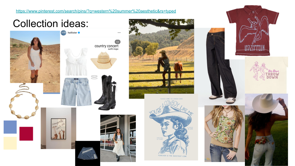
Denim Darlin' finalized moodboard

The finalized moodboard — where all the directions collapsed into one.

What does "worn-in" actually look like?
Visual direction & design

The identity had to be recognizably western, but wearable enough that someone who wasn't making a statement could still reach for it on a regular day. We decided on a muted palette with pops of red and navy, which emphazied an "Americanized" quality. We wanted it to feel warm and familiar without crossing into costume territory.

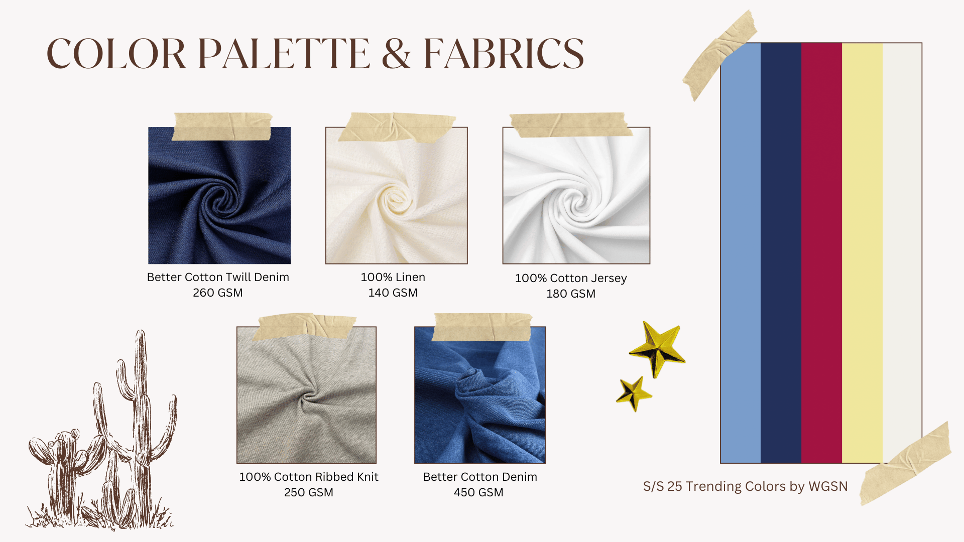
Color palette & fabrics

Better Cotton Twill Denim and Better Cotton Denim gave the collection its backbone: weights that feel like something quality, that hold an intended crease, and that don't read as fast fashion. Linen and Cotton Jersey were brought in for lighter seasonal pieces.

The palette pulled from WGSN's S/S 25 colors: dusty blue, navy, crimson, cream.

Better Cotton Twill Denim
260 GSM
100% Linen
140 GSM
100% Cotton Jersey
180 GSM
Cotton Ribbed Knit
250 GSM
Better Cotton Denim
450 GSM
Denim Darlin' finalized color palette and fabric samples

The finalized color palette and material selections for the Denim Darlin' collection.

Print direction

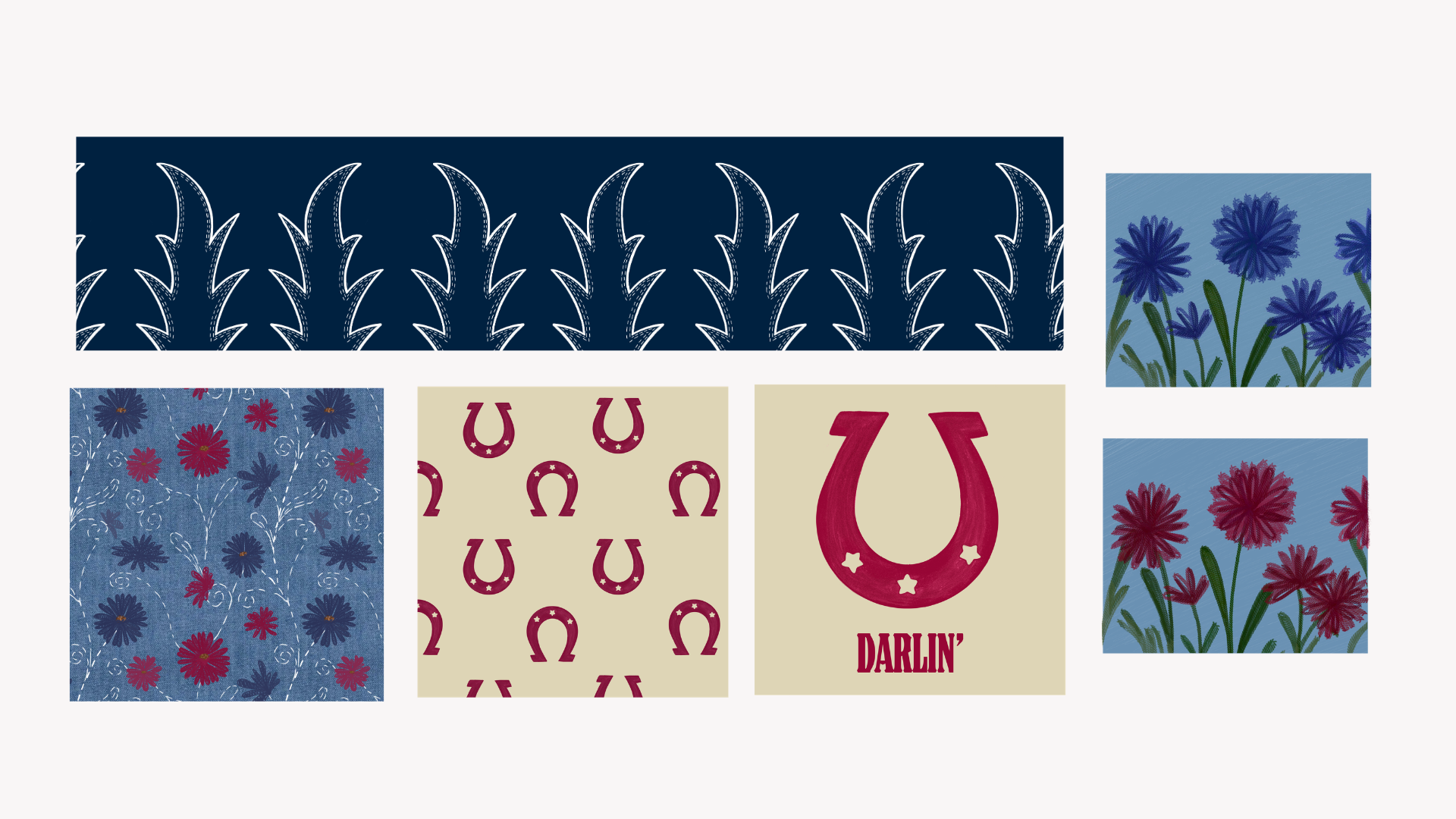
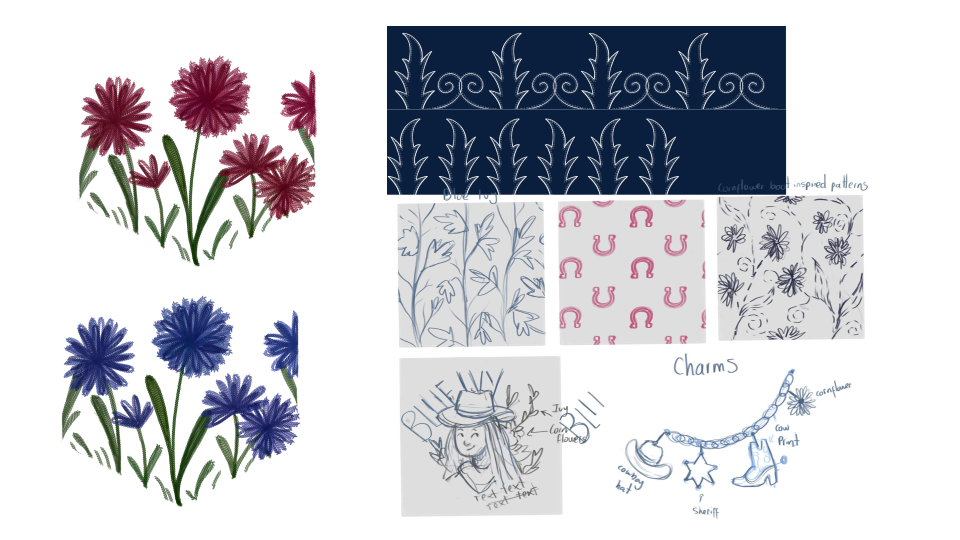
The prints were always part of the brief, specifically the 2008–2018 print revival we'd flagged in trend research. Before anything got refined into a final pattern, we sketched out early ideas to figure out the visual language: how bold, how abstract, how much it should lean western versus something more graphic and nostalgic.

Early sketch of Denim Darlin' print patterns
Early draft
Print pattern exploration — before the direction locked in
Finalized Denim Darlin' print pattern 1

Where the print patterns started — rough, iterative, figuring out what the collection wanted to say.

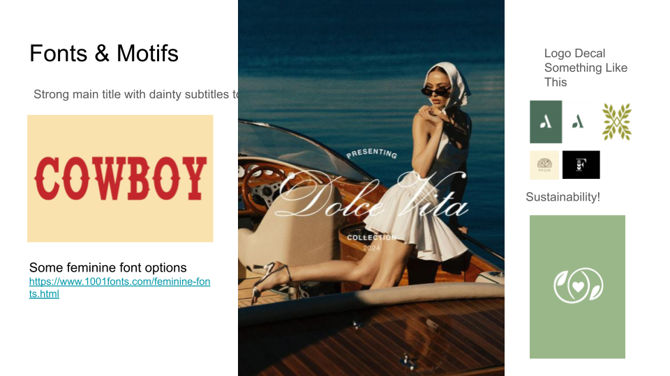
Typography & online branding

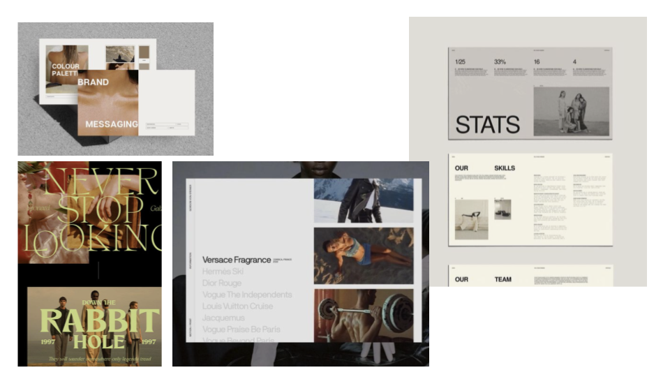
The font ideation was about finding something that could hold the western warmth of the collection without tipping into novelty; both legible in a social feed and expressive in a physical sign.

Early typography exploration for Denim Darlin'

Early type exploration — finding the typographic voice before the digital system locked in.

Finalized typography for Denim Darlin' online branding

The finalized type direction for the website and digital campaign.

Does the planet get a vote?
Sustainability

Sustainability was built around Better Cotton. Not only was it an ethical constraint, it was a signifigant brand story worth telling.
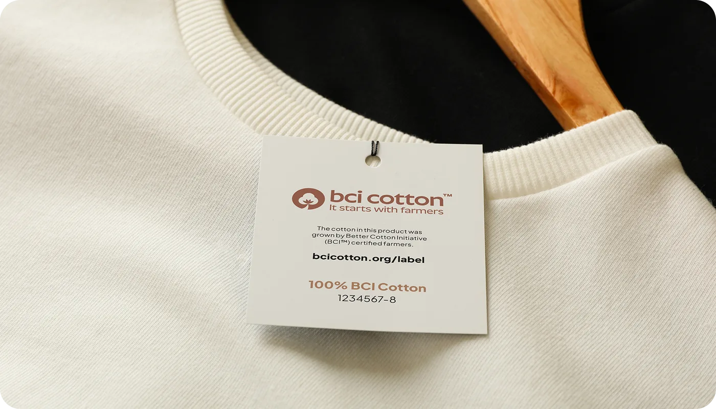
Other synthetic fibers require 342 million barrels of oil and release 8 million tons of plastic annually. That context gave the campaign a layer of integrity that extended past the visual.

By sourcing exclusively from natural fibers and ethically proven suppliers, the collection could speak to Serena without losing JaNa. Sustainability was positioned as a design value, not a disclaimer.

BCI Cotton label — It starts with farmers, 100% BCI Cotton certified

Better Cotton Initiative certification: the sourcing story made visible on the product itself.

The material argument
Natural fibers over synthetic. Not just for the planet, but for the product. Better Cotton Denim at 450 GSM feels different than fast fashion. That physical quality communicated the campaign's values before anyone read a word of copy.
Getting the word out, darlin'.
Marketing & Outreach

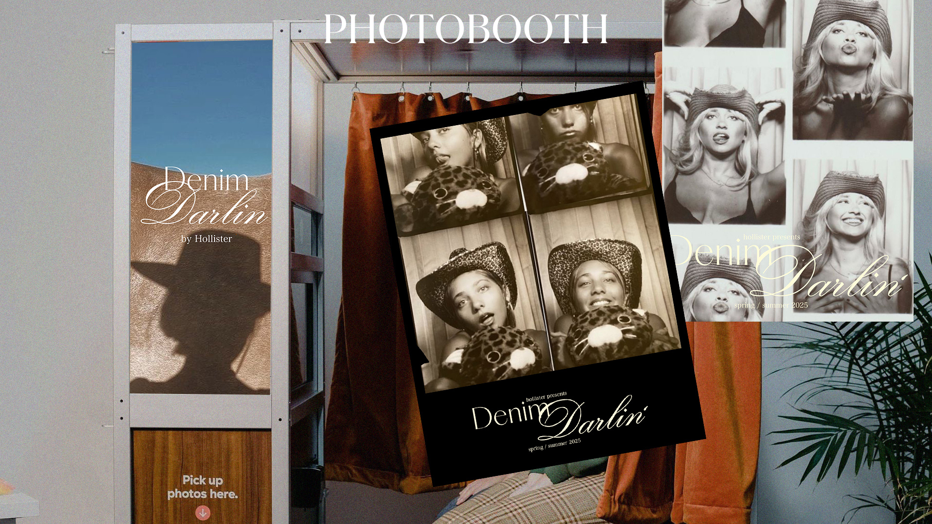
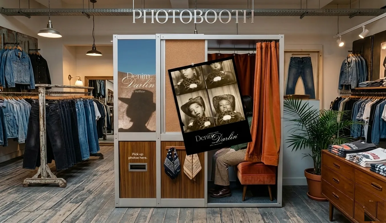
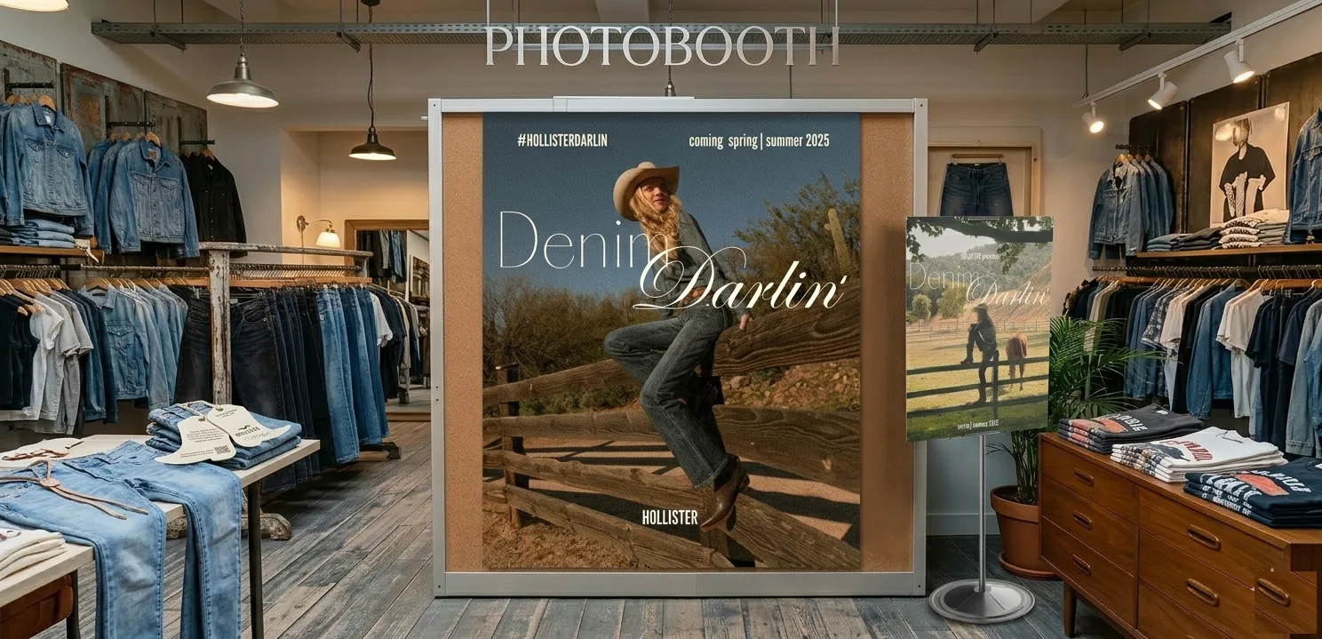
The idea I'm most proud of from this project is the charm bracelet concept (people love collecting things, and they love personalizing things). The #HollisterDarlin hashtag and the pop-up photobooth already gave customers a way to physically enter the campaign, but the charm bracelet extended that into something you could wear and carry with you. 

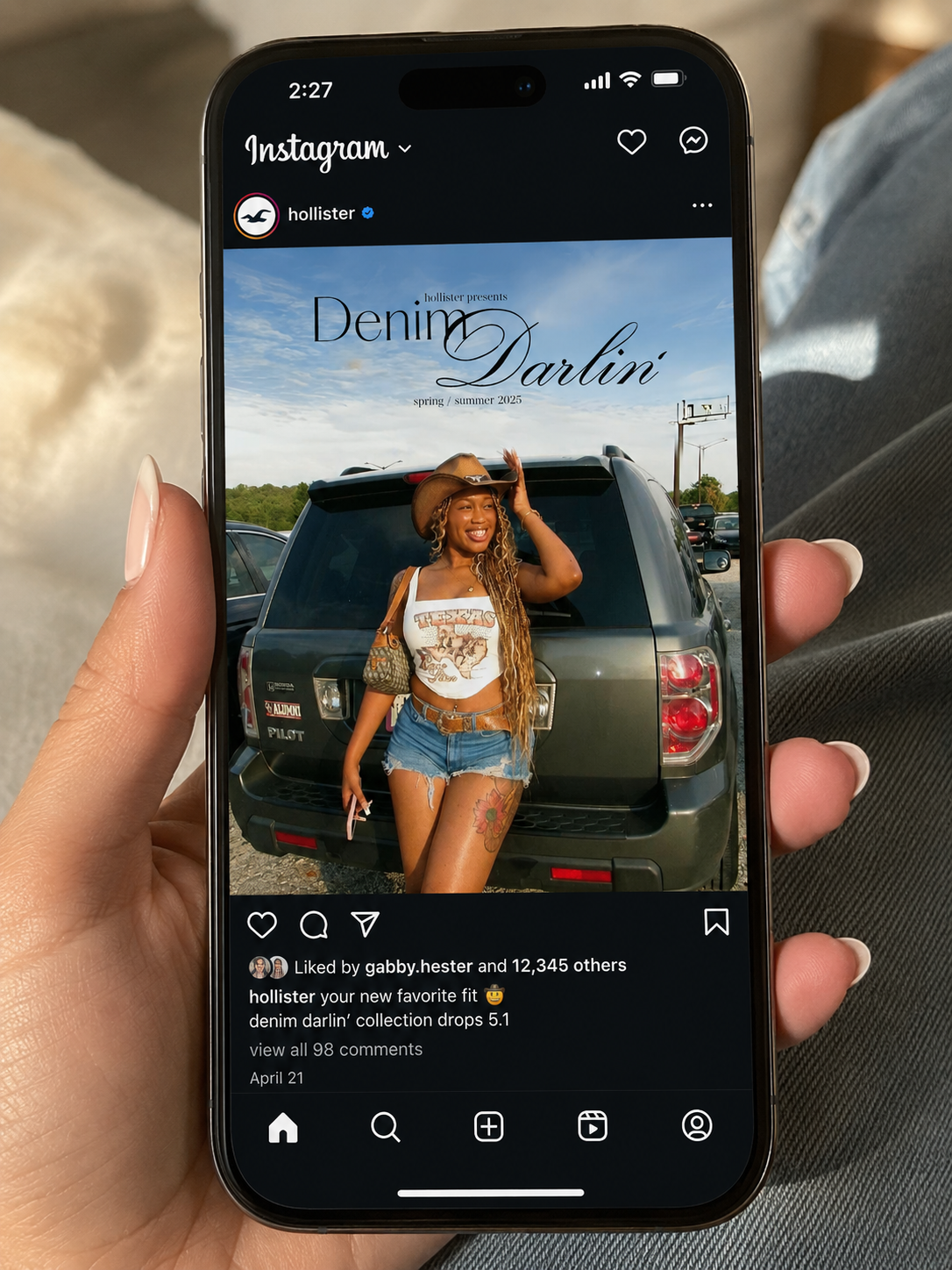
The #HollisterDarlin social campaign — anyone can be a cowgirl.

Denim Darlin' charm bracelet concept

Pop-up photobooth activation and printed photo strip: the IRL layer of the campaign.

15% of each charm purchase going back to farms and agricultural spaces gave the campaign a charitable layer; the exec directors responded to it specifically. They thought it was a strong way to integrate community and conscientiousness into a campaign that could have easily just been aesthetics.
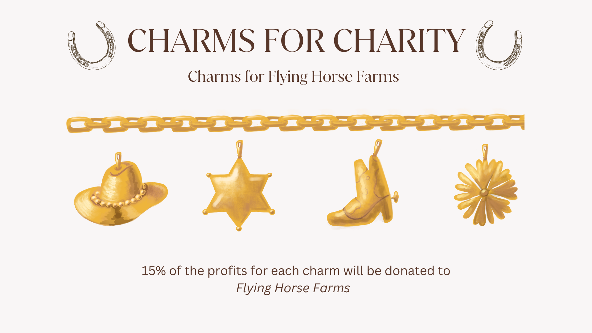
Denim Darlin' charm bracelet — cowboy hat, sheriff star, boot, daisy
Denim Darlin' charm bracelet detail
Charms for Charity
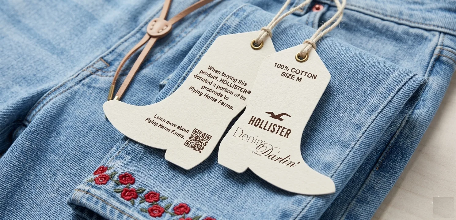
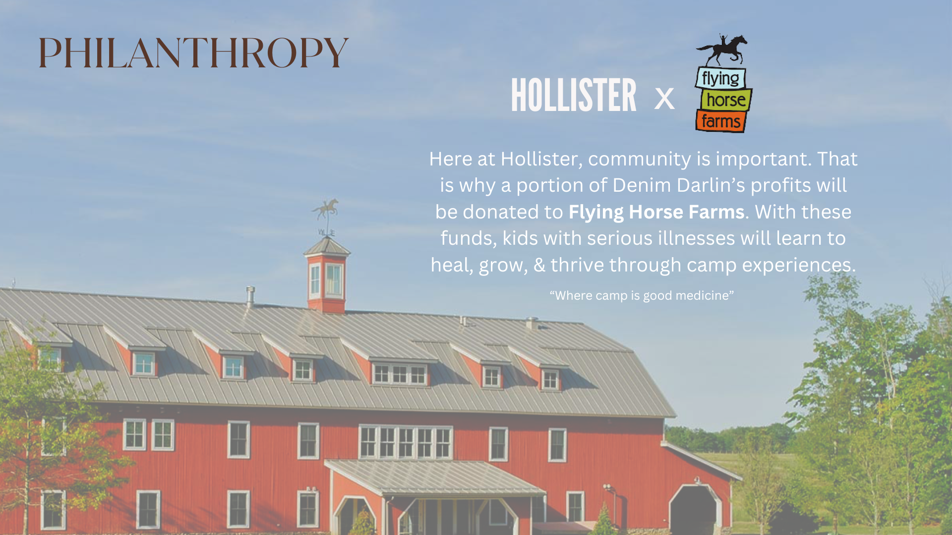
15% of the profits for each charm are donated directly to Flying Horse Farms.

JaNa and Serena's identities largely shaped specific components of our campaign — from the mockup settings to the fabric sourcing to the charm bracelet's charitable model. Here's how each of their perspectives ran through the finished work, including the following:

JaNa Cole
The Social Connector

She lives her life in front of cameras and in crowds — so the mockups ended up in front of cars and at concerts instead of haybales.

She set the visual benchmark: would you actually wear this on a regular Tuesday?

Serena Hayes
The Self-Expressive Idealist

She reads the label, shops secondhand, decides which trends she trusts — so the collection runs entirely on natural fibers.

She's why the charm bracelet mechanic included a 15% charitable donation to Flying Horse Farms rather than just being a branded collectible. She needed the campaign to mean what it said.

Would you actually wear this?
Mockups

I didn't want to show the collection only in western settings: haybales, farms, open fields. That would have made it a costume. The whole concept was western-inspired, not western-costumed.

Instead, I placed the clothes in the settings our actual customer lives in. JaNa doesn't live on a farm, she lives in front of cameras, at concerts, on streets. You don't have to want to be a cowgirl to reach for these pieces, and they should integrate well into other styles when needed.

I would buy this even if I didn't want to be a cowgirl. The benchmark we held every decision against.

Denim Darlin' lifestyle mockup
Pop-up photobooth activation Denim Darlin' photobooth in-store render

The community layer: collectible charms, charitable giving, and IRL activation.
Denim Darlin' community layer activation
Denim Darlin' hang tag — 100% cotton, Flying Horse Farms QR code Denim Darlin' hang tag detail

Lifestyle mockups: the collection placed in everyday settings, not western ones.

Email blast mockup Hollister Instagram mockup — Denim Darlin' feed post

Social and email extensions: same warmth, same voice, across every touchpoint.

When do you let go of something you care about?
Challenges

The more interesting challenge was navigating creative overlap. The lanes get blurry fast when everyone has opinions, and we had to work together as total strangers. I had real feelings about where the logo should go, but someone else on the team cared more about it and had a clearer vision. So, I stepped back.

What I found was that stepping back on that one thing gave me room to do something more useful. I took their logo and built the entire marketing layer around it. They got to own their contribution fully, and I got to be the person who made everything cohere. That felt better than holding my ground would have, and we were able to move forward as a team cohesively.

The question we kept coming back to, whether or not we named it explicitly: does this actually serve the finished product? If it does, push for it. If it doesn't, let it go. I think that's what kept us from getting in each other's way.

Good enough, or actually good?
Reflection
It tracked where Hollister was heading.
I think we made something genuinely good. The exec directors said it tracked where the brand was heading, not just where the culture was, which felt great to hear.
We played it a bit safe.
There was a pull throughout toward what a "correct" campaign looks like. We delivered polished, cohesive, on-trend, but I wish we'd asked: is this as surprising as it could be?
How far could we have gone?
The question I'm still carrying out of this: what if we'd given ourselves permission to push further, while we still had time to find out?