Re-Architecting a Concert Visual Campaign in 5 Days to Convert 1.3K Ticket Sales
Role
Design Director
Solo Designer
Client
Smino, Victoria Monét
University of Maryland
Tools
Adobe Illustrator
Figma
How do you save a concert campaign when a programming pivot leaves you with a 5-day deadline?
Overview
Challenge
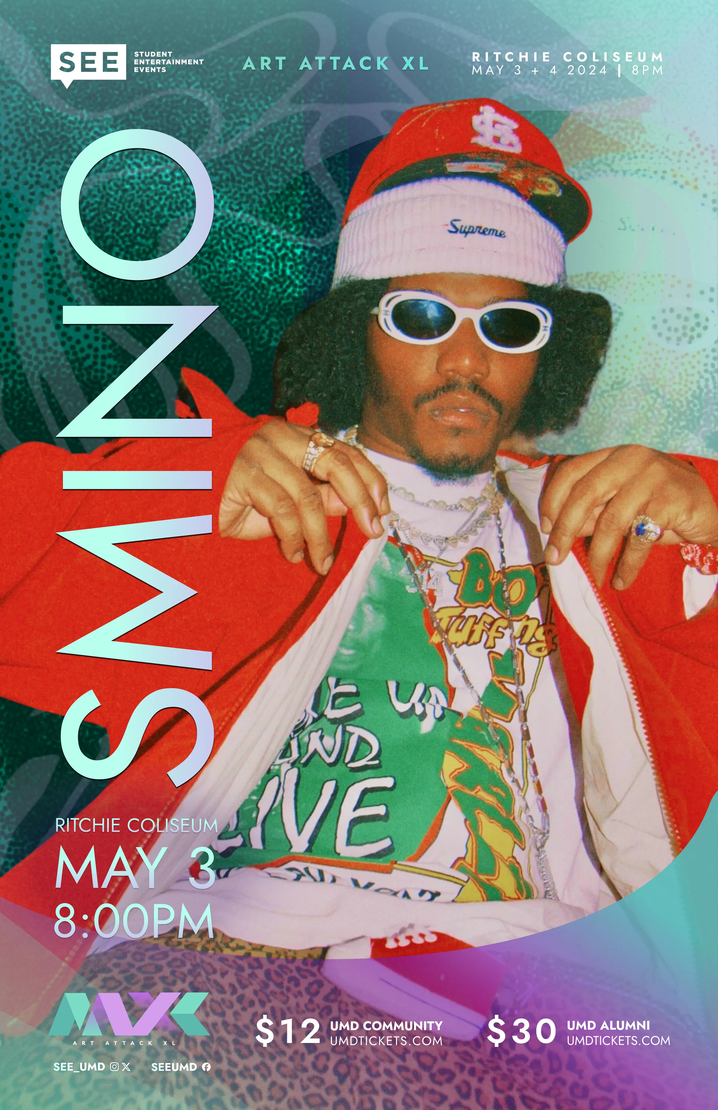
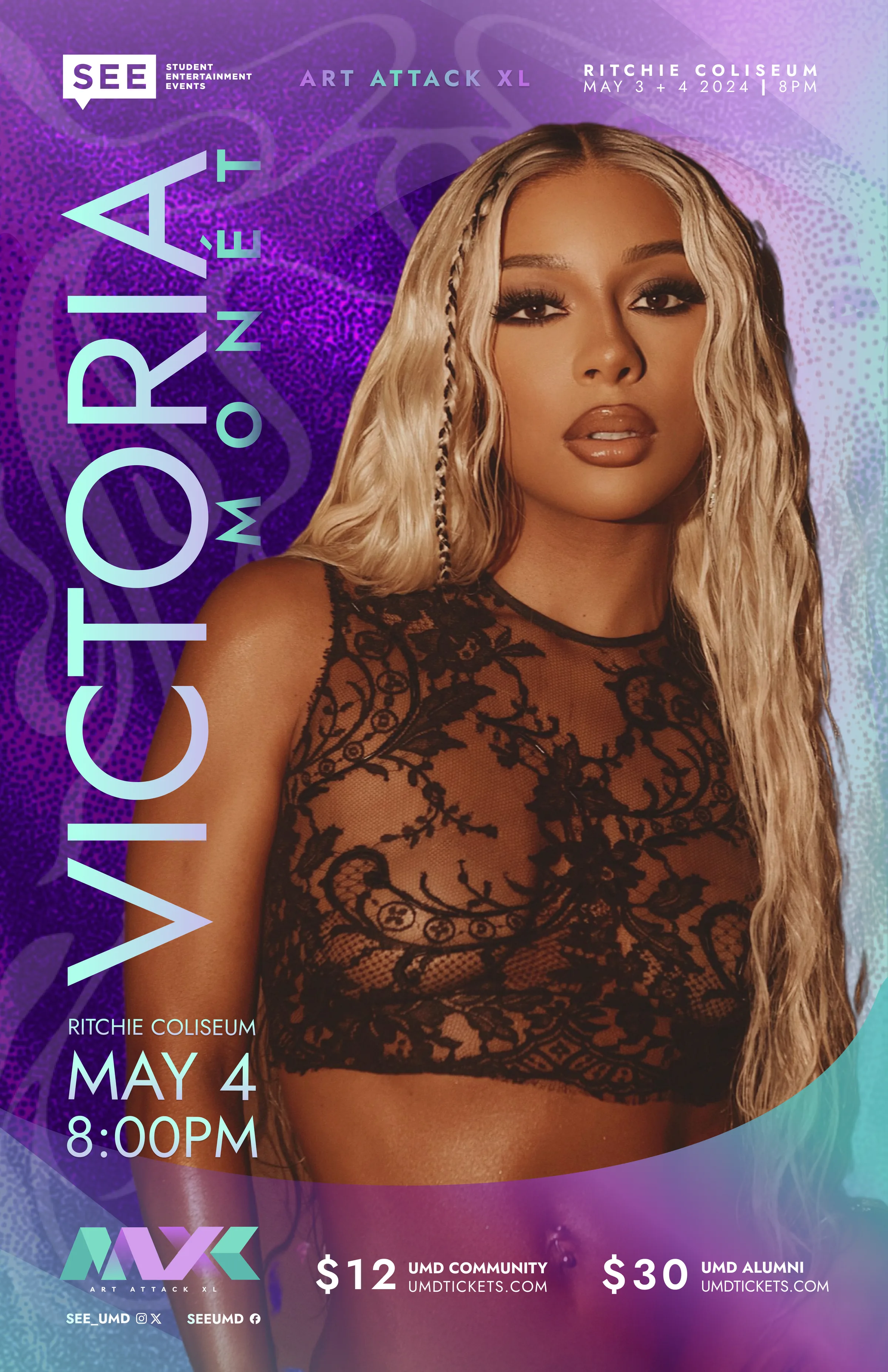
Build a full campaign identity for the 40th Art Attack without largely altering artist headshots in order of artist compliance. Create a secondary campaign for a last-minute change of events.
Strategy
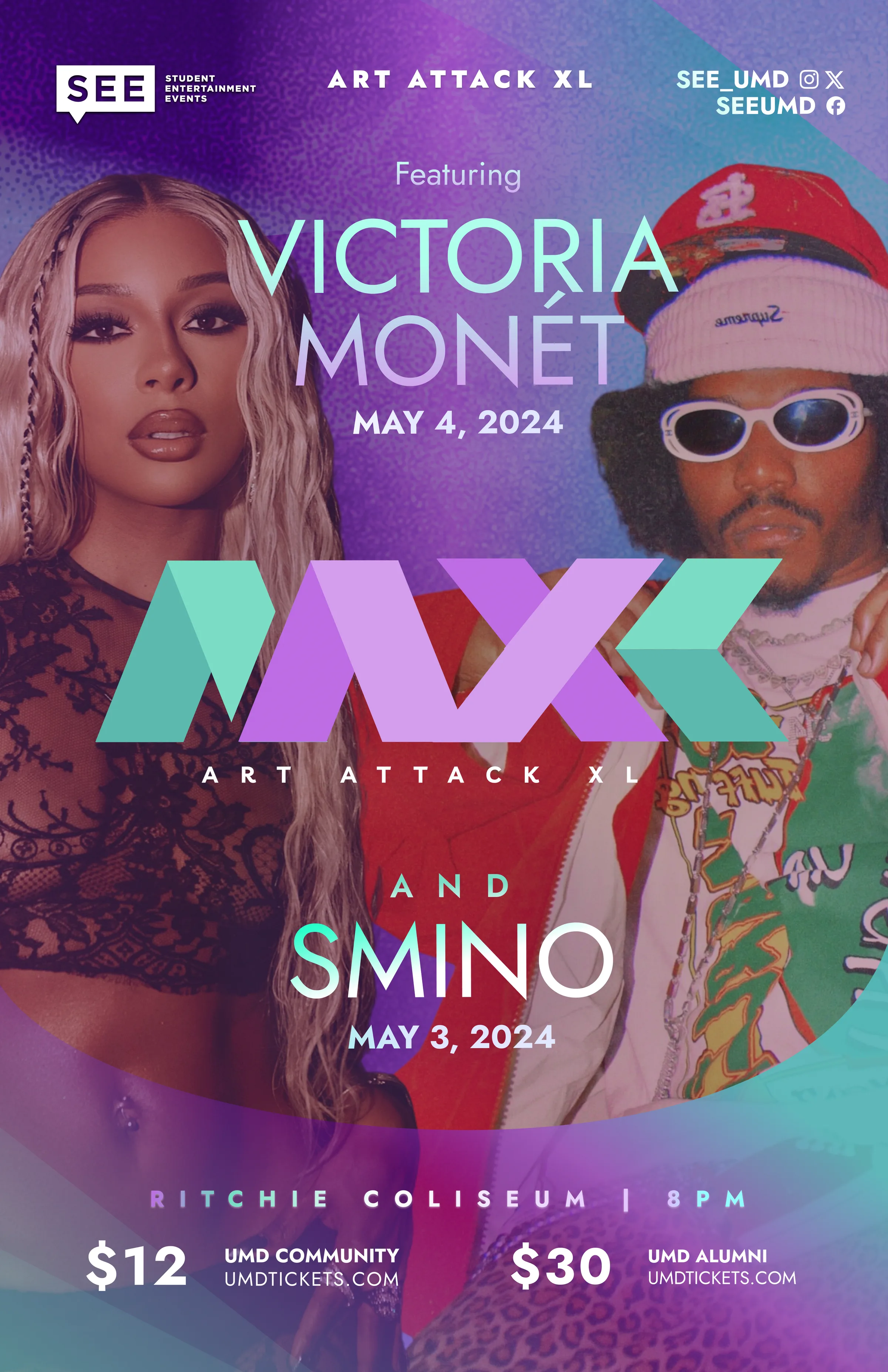
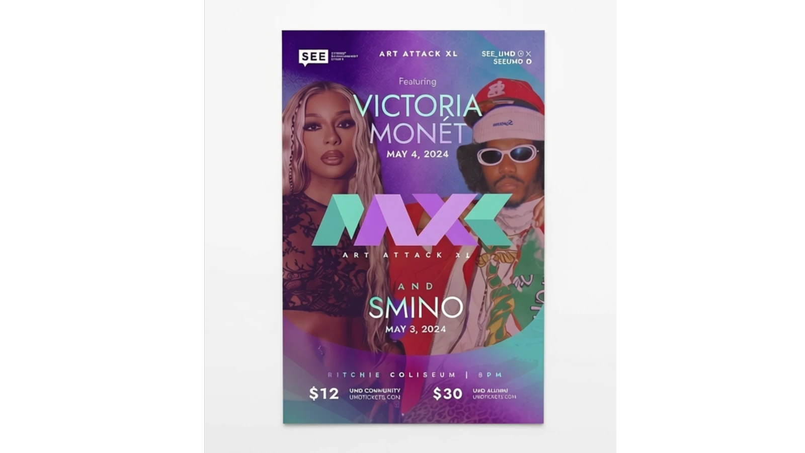
Develop a design system that blends two different artists, carry posters, merch, and social, and to survive a five-day pivot when the lineup changed.
Result
Generated 1,300 ticket sales, a 4x increase in typical social engagement, and 5,400 daily organic impressions. The campaign successfully transitioned into commercial merchandise that audiences wore post-event.
1.3k
Tickets sold
4–6.5x
Engagement increase over our average post
5.4k
Daily impressions across the campaign
Organic
Social + campus only
Ticket figures from SEE box office records; engagement figures from Instagram Insights.
SEE's 40th Art Attack show gave me two headshots and a logo, which I turned into a full campaign identity.
Overview
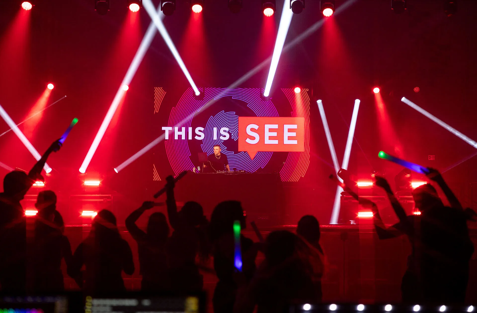
Art Attack ↗ is the University of Maryland's longest-running concert series, produced by Student Entertainment Events, the principal student programming board on campus. For the 40th edition, Art Attack XL, SEE went larger than before: two nights, two headliners.
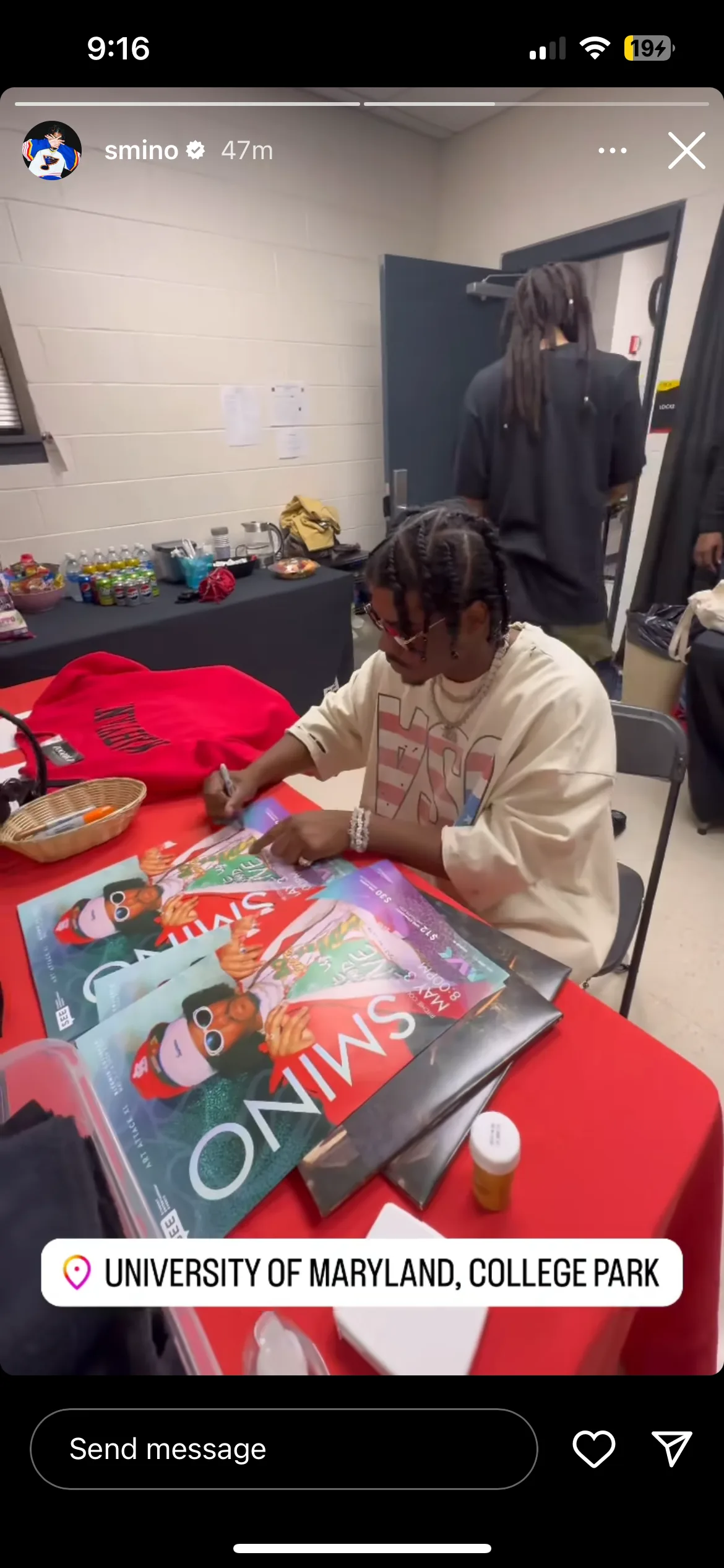
It also ended up being two campaigns, the first built around Grammy-nominated artists Victoria Monét and Smino, the second for a revised event after one of the days unexpectedly got cut.
Asset constraints & legal compliance
Chapter 02 · The Brief
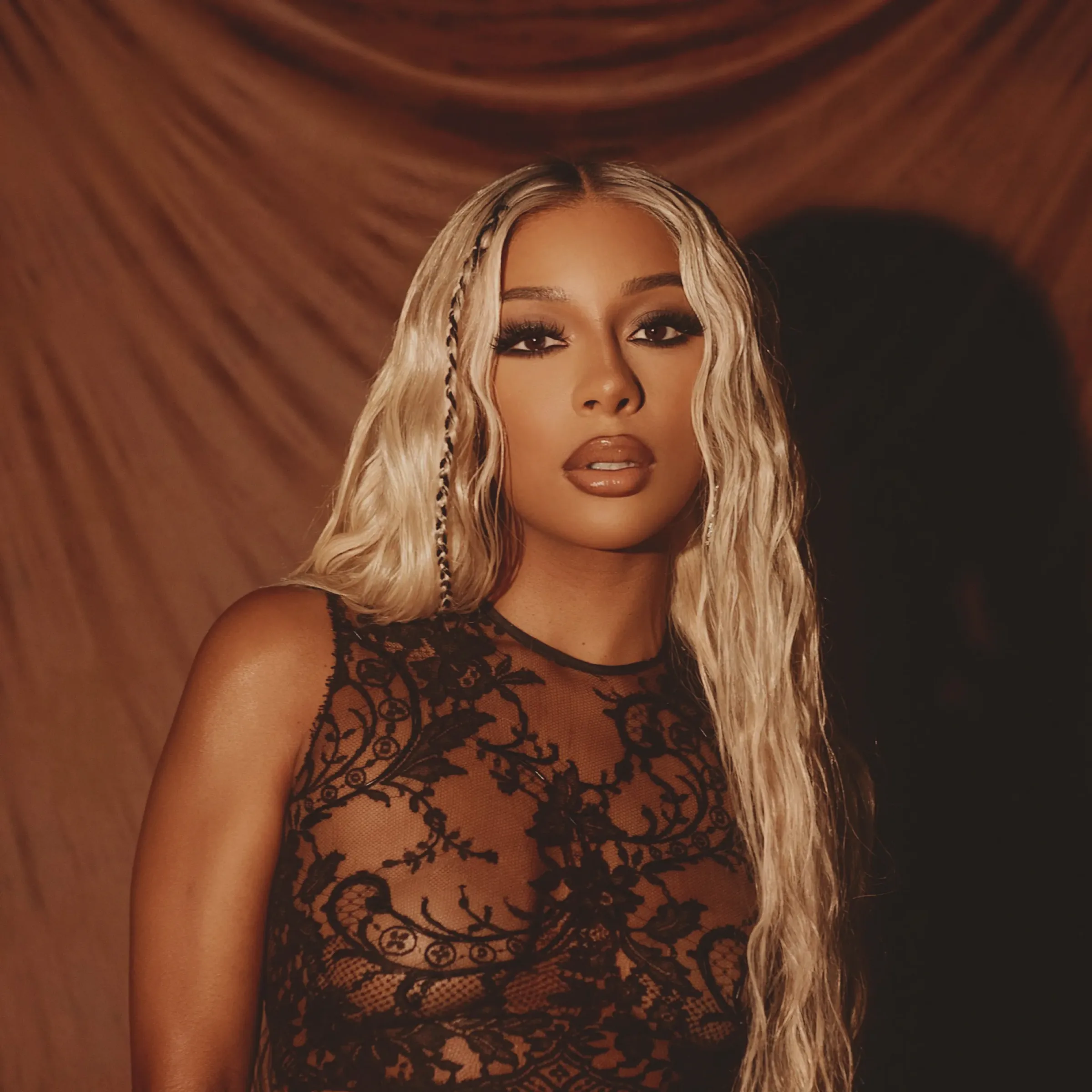
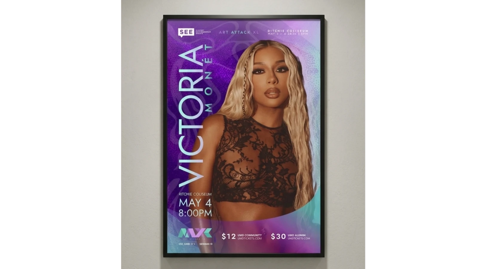
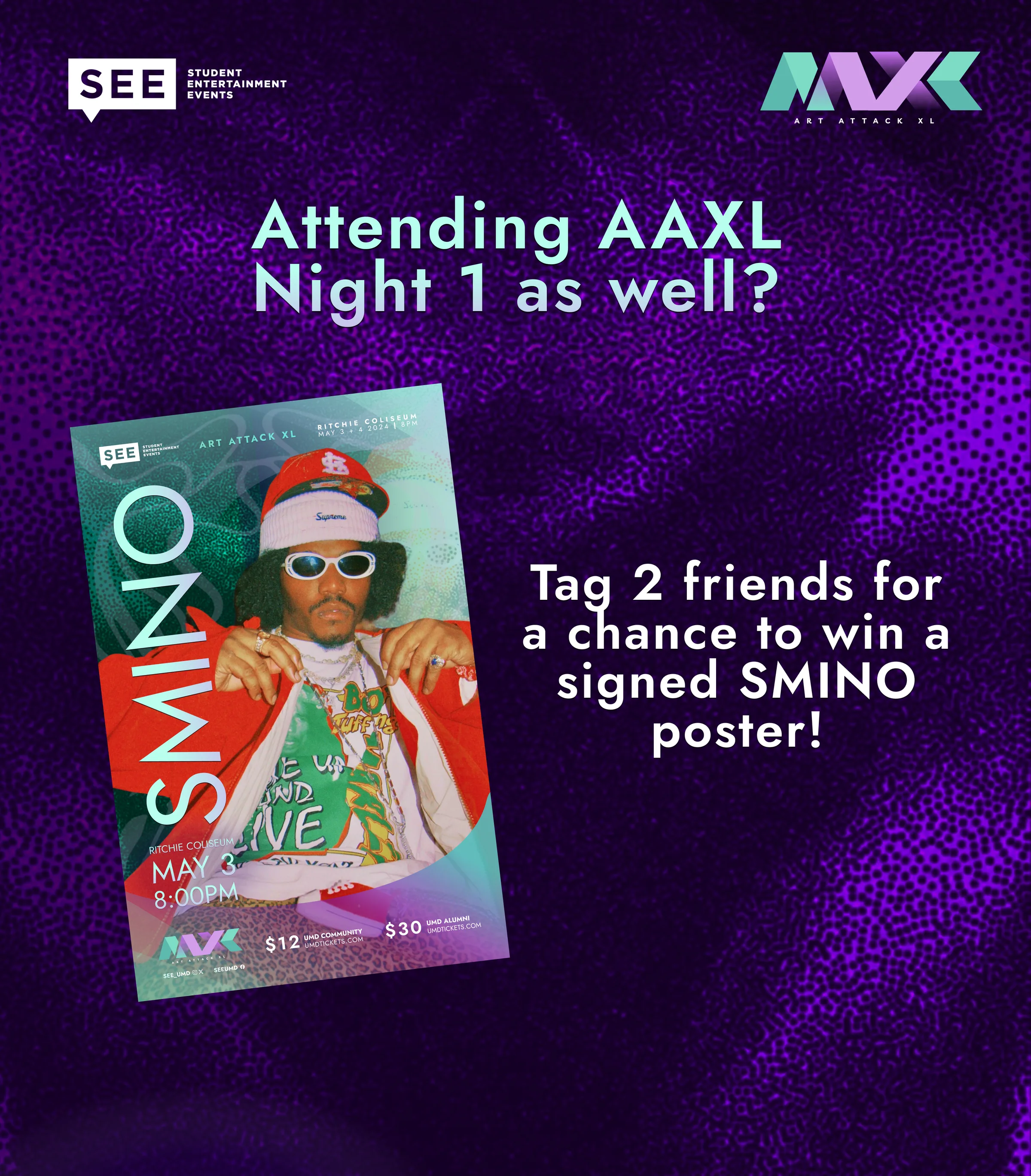
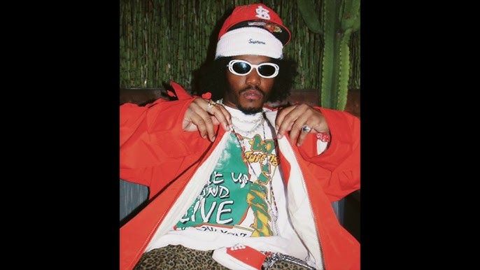
I approached the design by starting with my baseline criteria: Victoria Monét and Smino are different sonically, but I saw a shared energy between Monet's glamorous and shimmery photo, and Smino's cooler, "vintage-leaning" look.
According to contract, none of the headshots could be severely altered in my process. I was thinking about the audience too, a college crowd that's diverse, so I wanted something glamorous without being princess-y and cool without being cold; which is what shaped most of my decisions.
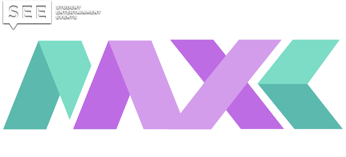
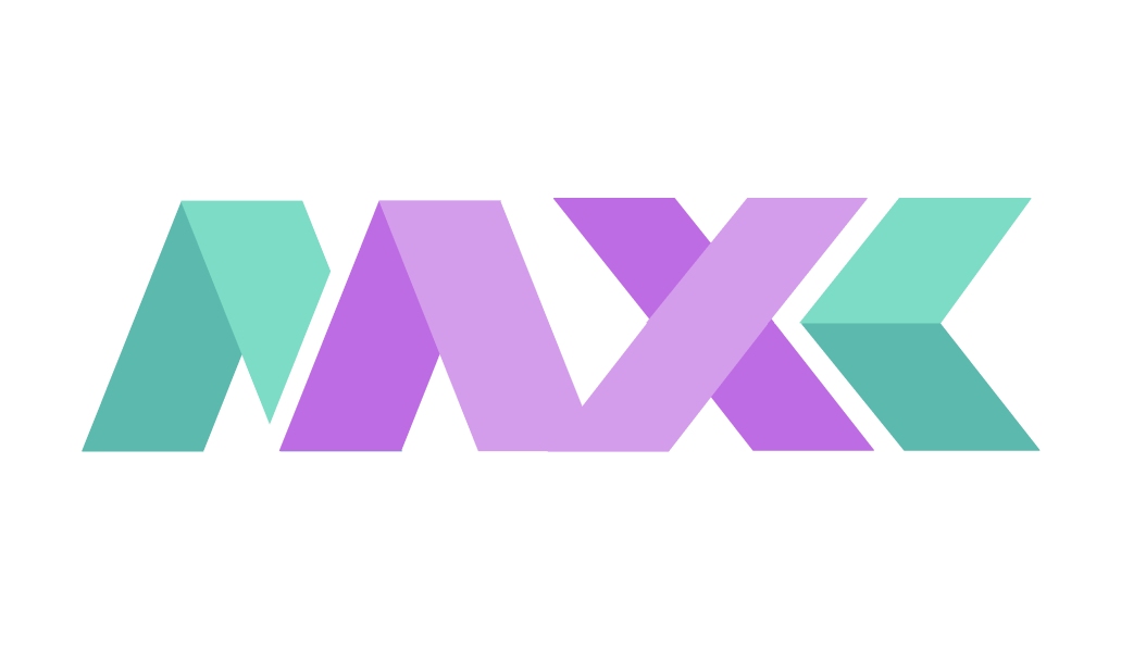
I gave each letter, and the numeral XL, its own geometric shape, to carry the weight of a milestone show.
Chapter 03 · The Identity
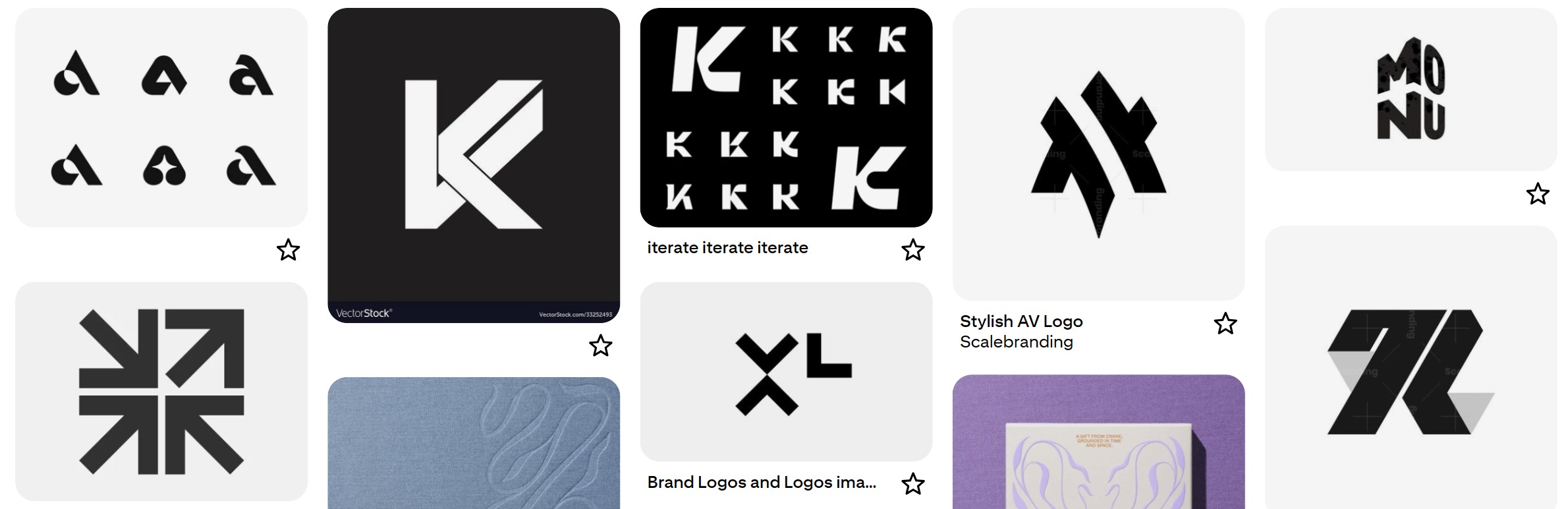
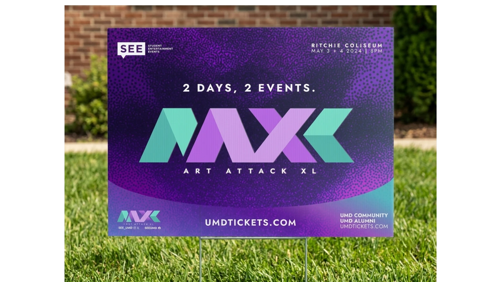
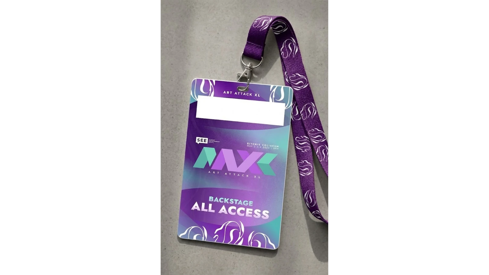
The main focal point of the campaign is the AAXL logo. I wanted to create something clean, bold, and modern, but still with a sense of fun and movement.
Inspiration moodboard
Logo inspo
For the main colors, I wanted to reflect both of the artists while still blending together a scheme that would read well across an audience for 40,000 different students with different backgrounds.
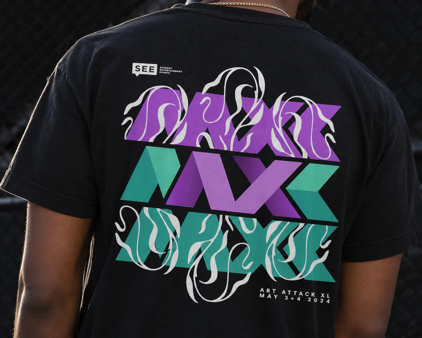
I thought teal reads as cool and more masculine, while purple sits adjacent to glamour without being overtly feminine. The gradient version ended up on the shirt and in a special variety of the logo used mostly in physical print (outside of apparel).
Style guide
Color system
VIOLET#BE6CE3
LILAC#D39DEC
TEAL#5BB9AE
MINT#7CDCC5
Gradient
Typography hierarchy
SMINO
Artist name · Jost Regular
ART ATTACK XL
Campaign wordmark · Livvic Bold
2 Days, 2 Events.
Event headline · Jost Bold
Ritchie Coliseum · May 3+4 2024 · 8PM
Event details · Mono tracked caps
Color and type.
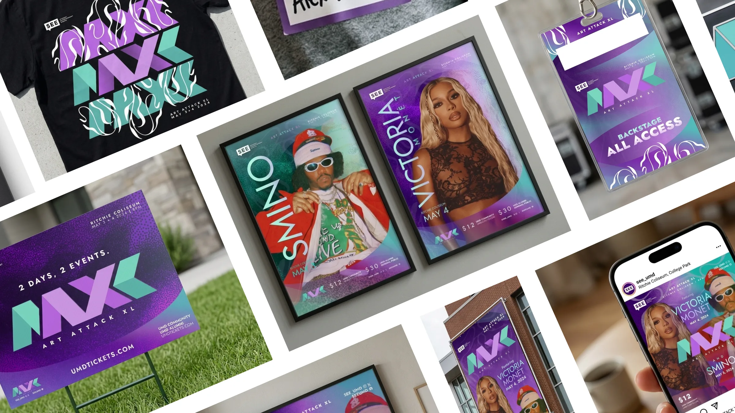
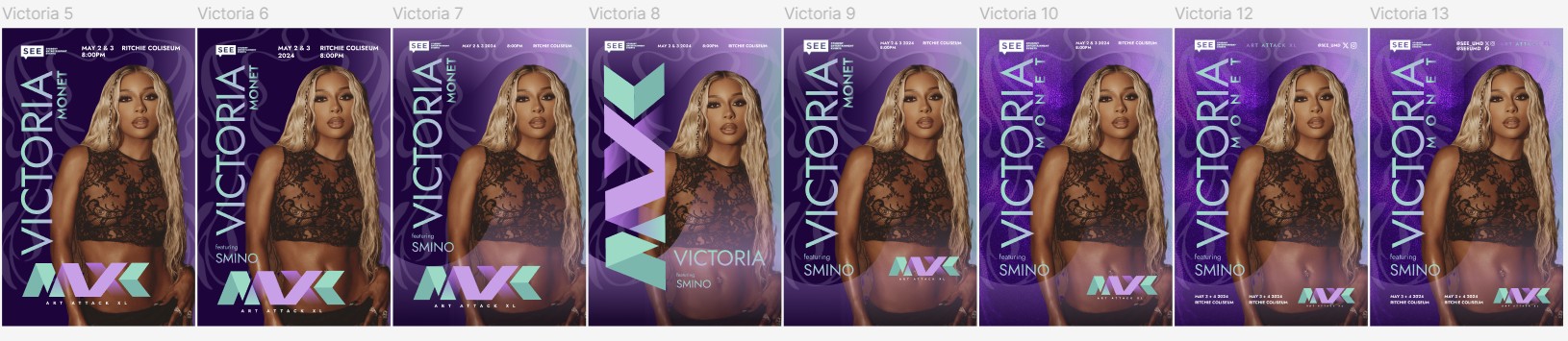
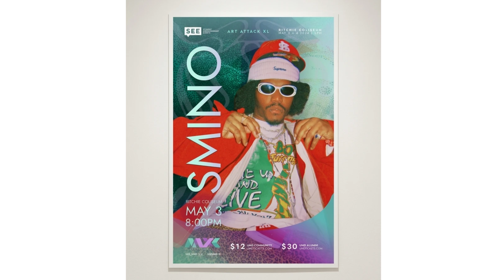
For the posters, I layered the artist photography directly into the identity. I give the criteria for any poster to be something I'd be comfortable displaying on my wall, which I hoped would be the case for the students who also picked one up.
Process
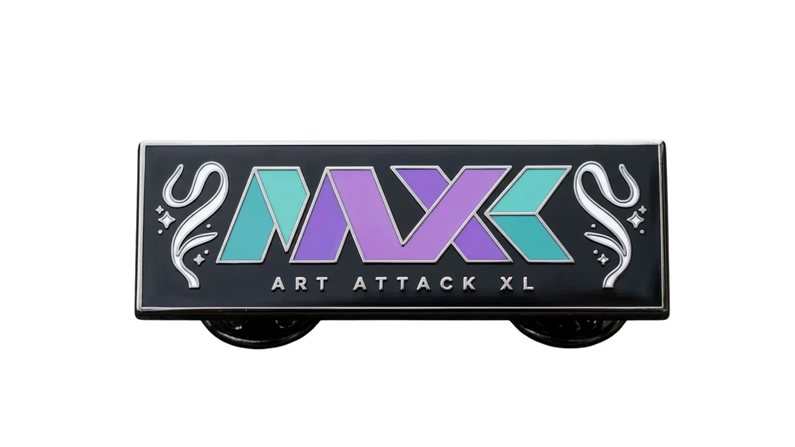
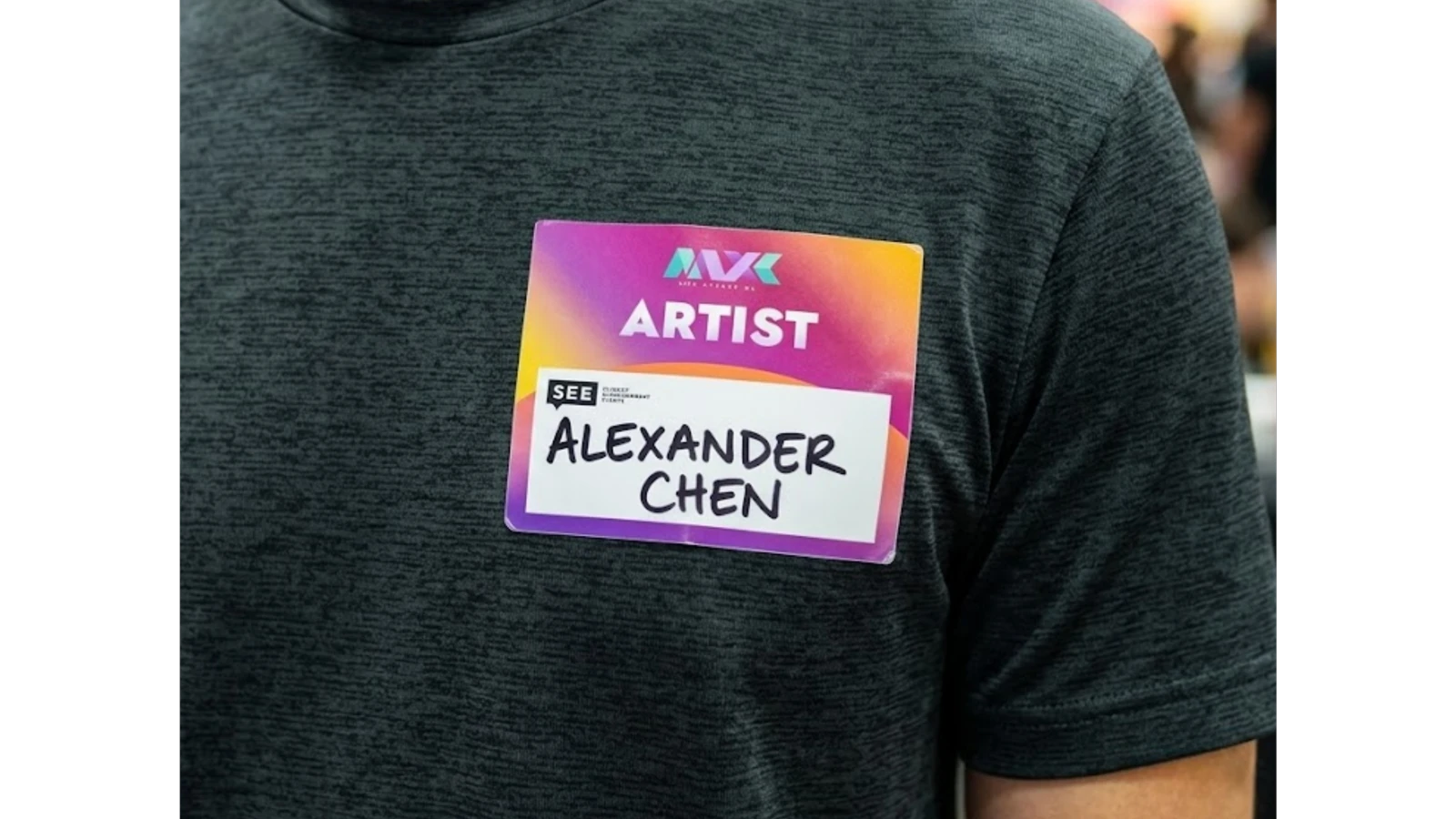
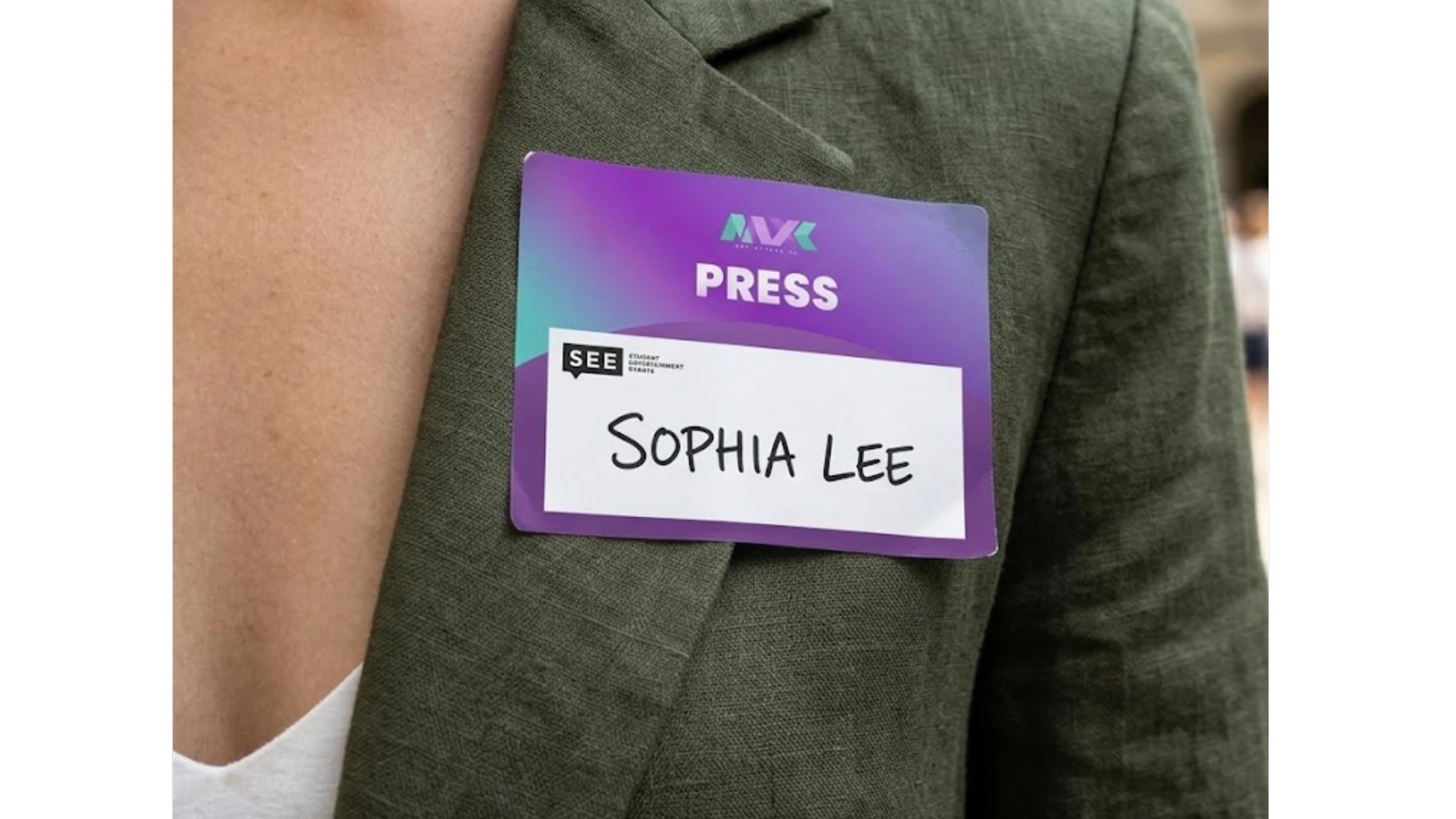
The shirt, pin, and other merchandise extended those same motifs (the interlocking mark, the gradient, a flowy quality in the secondary elements).
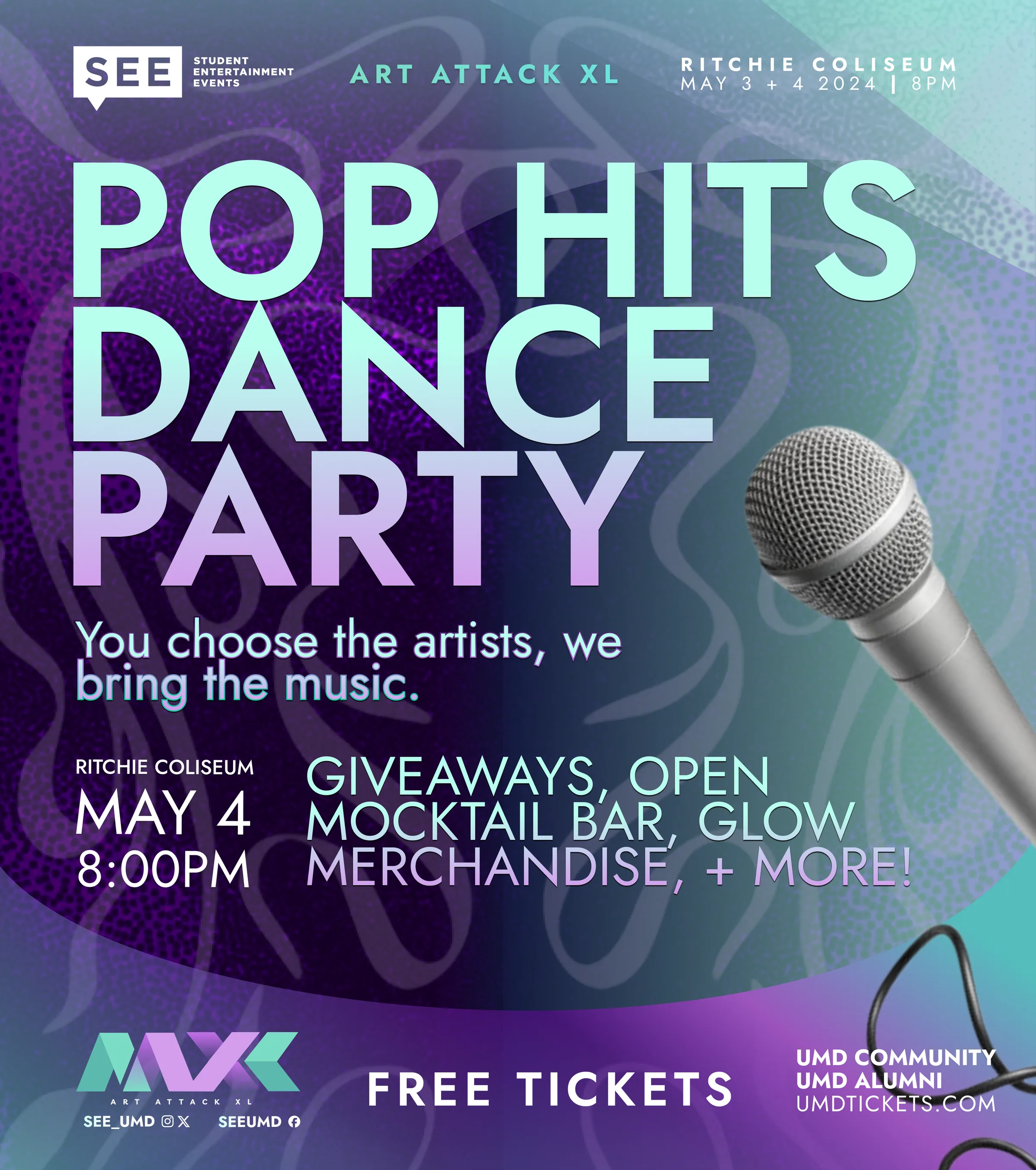
Losing Day One a week out meant rebuilding the campaign so it felt like a surprise event, not a cancellation notice.
Chapter 04 · Adaptive Campaign Management
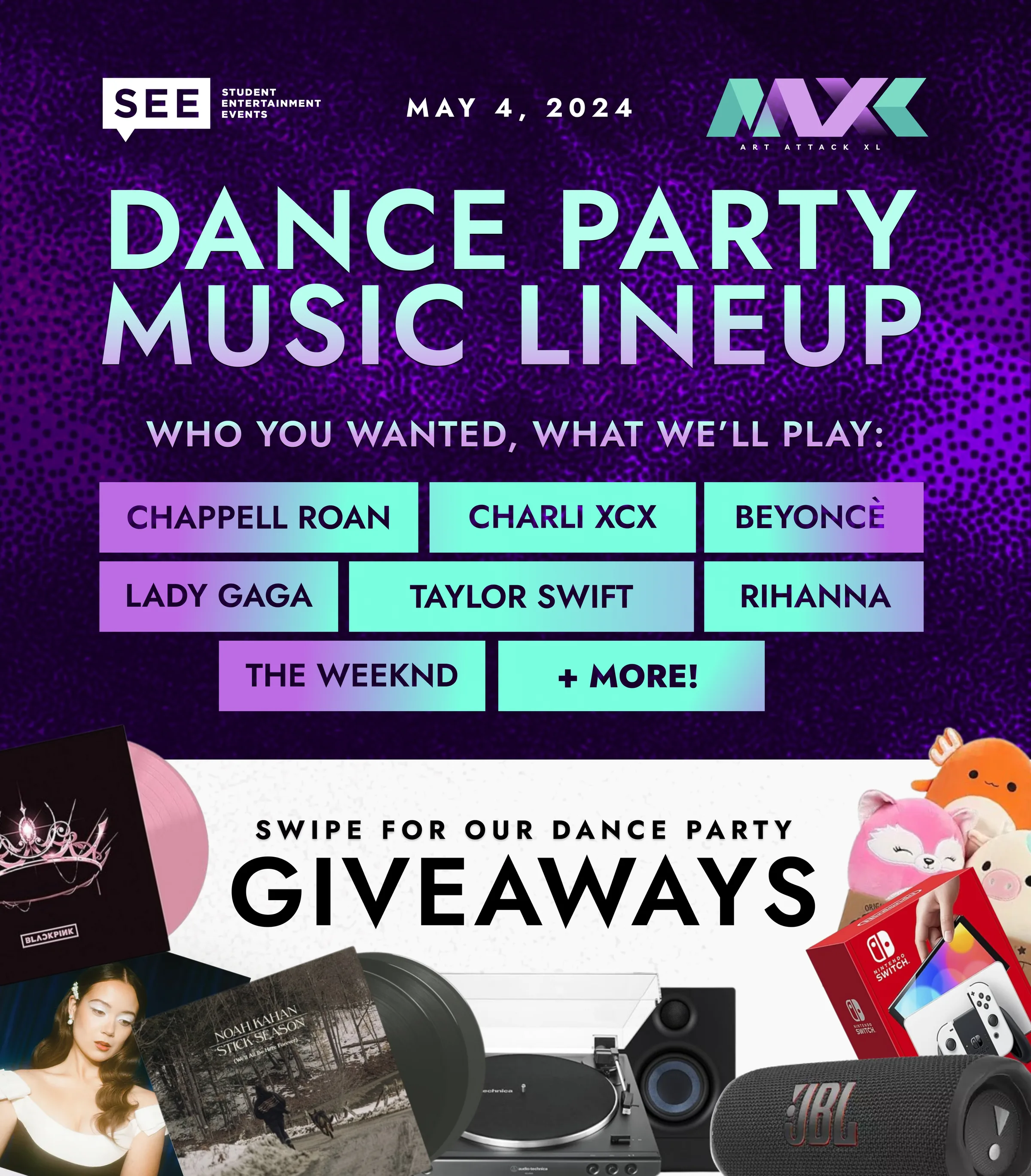
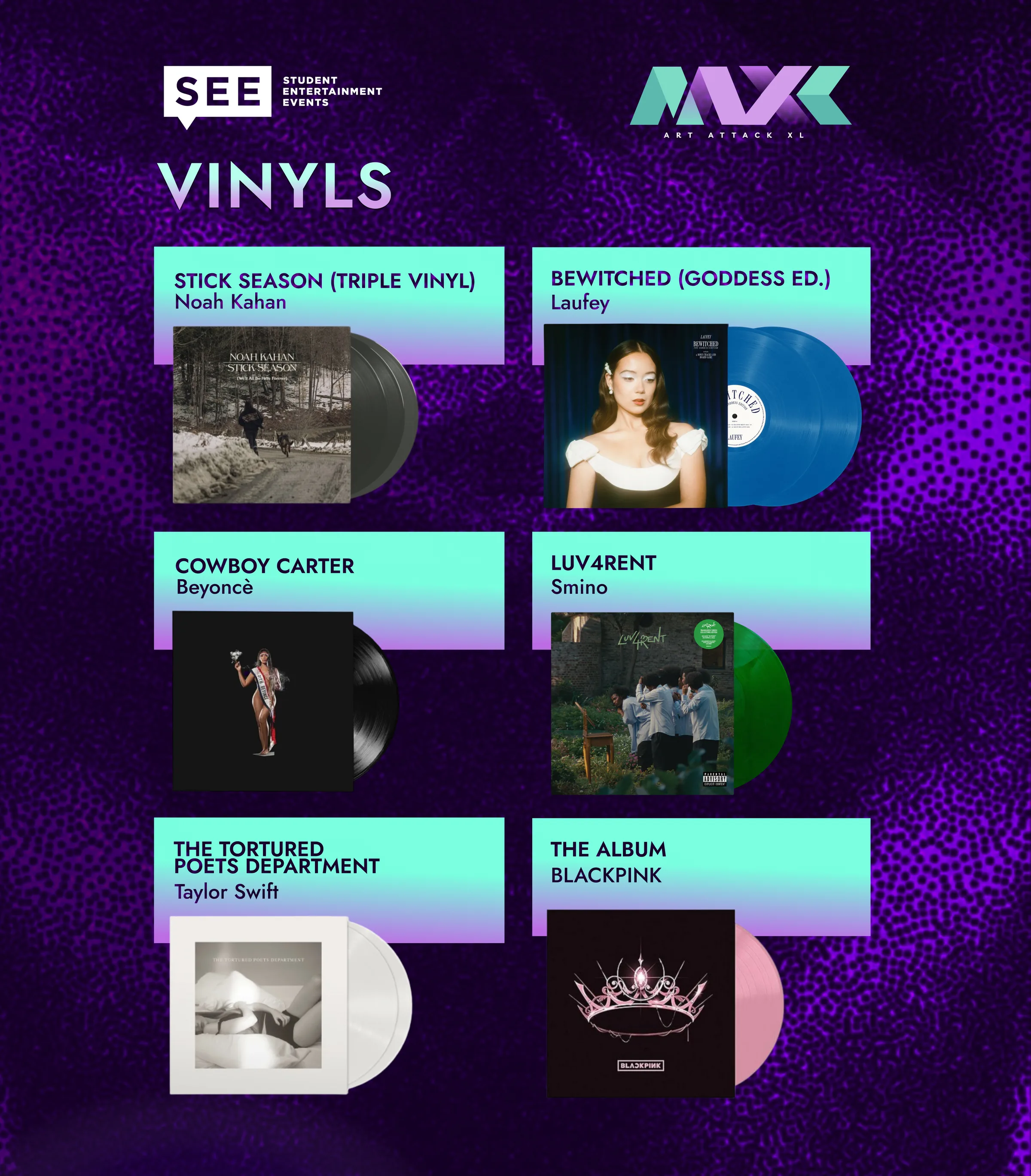
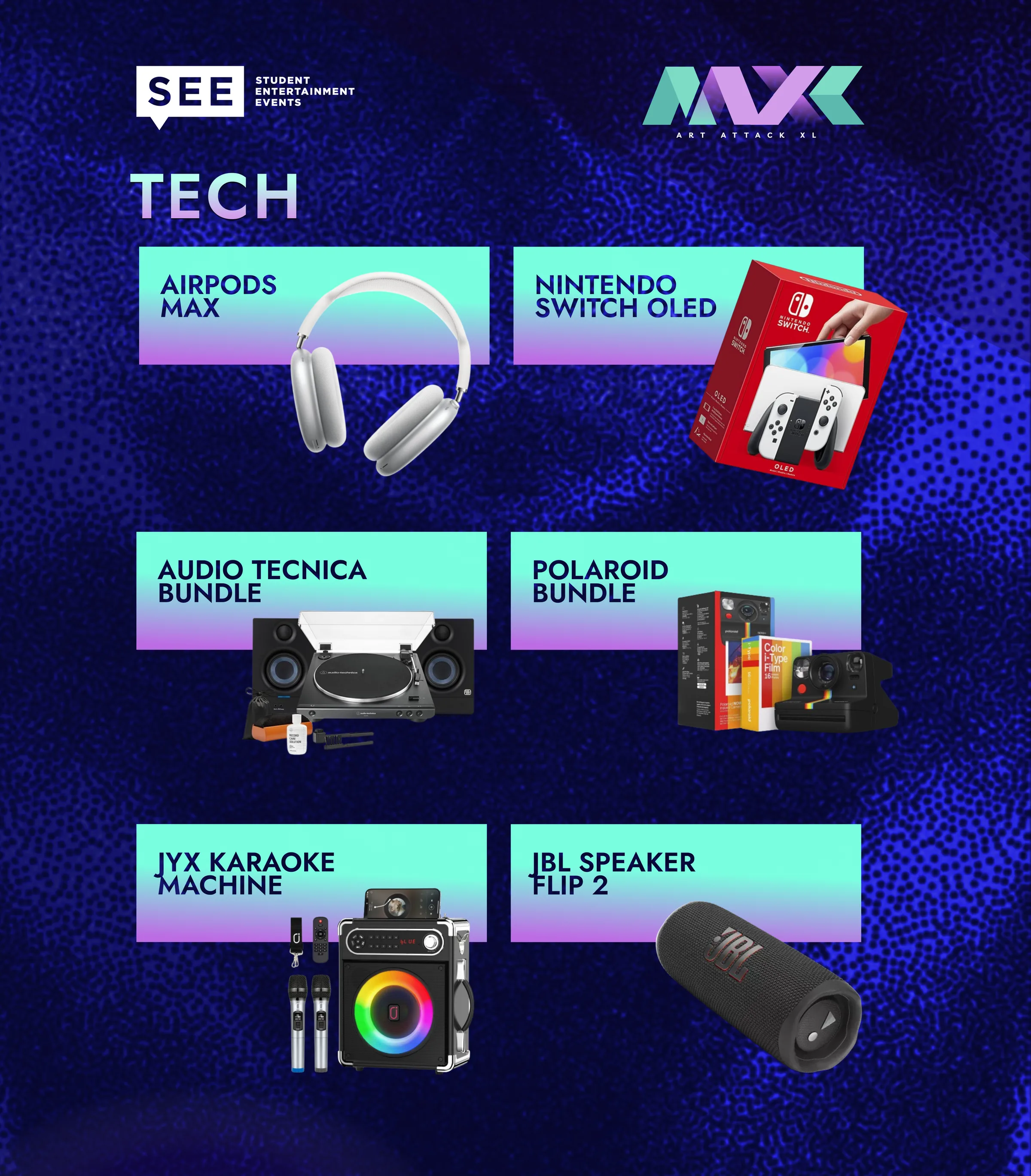
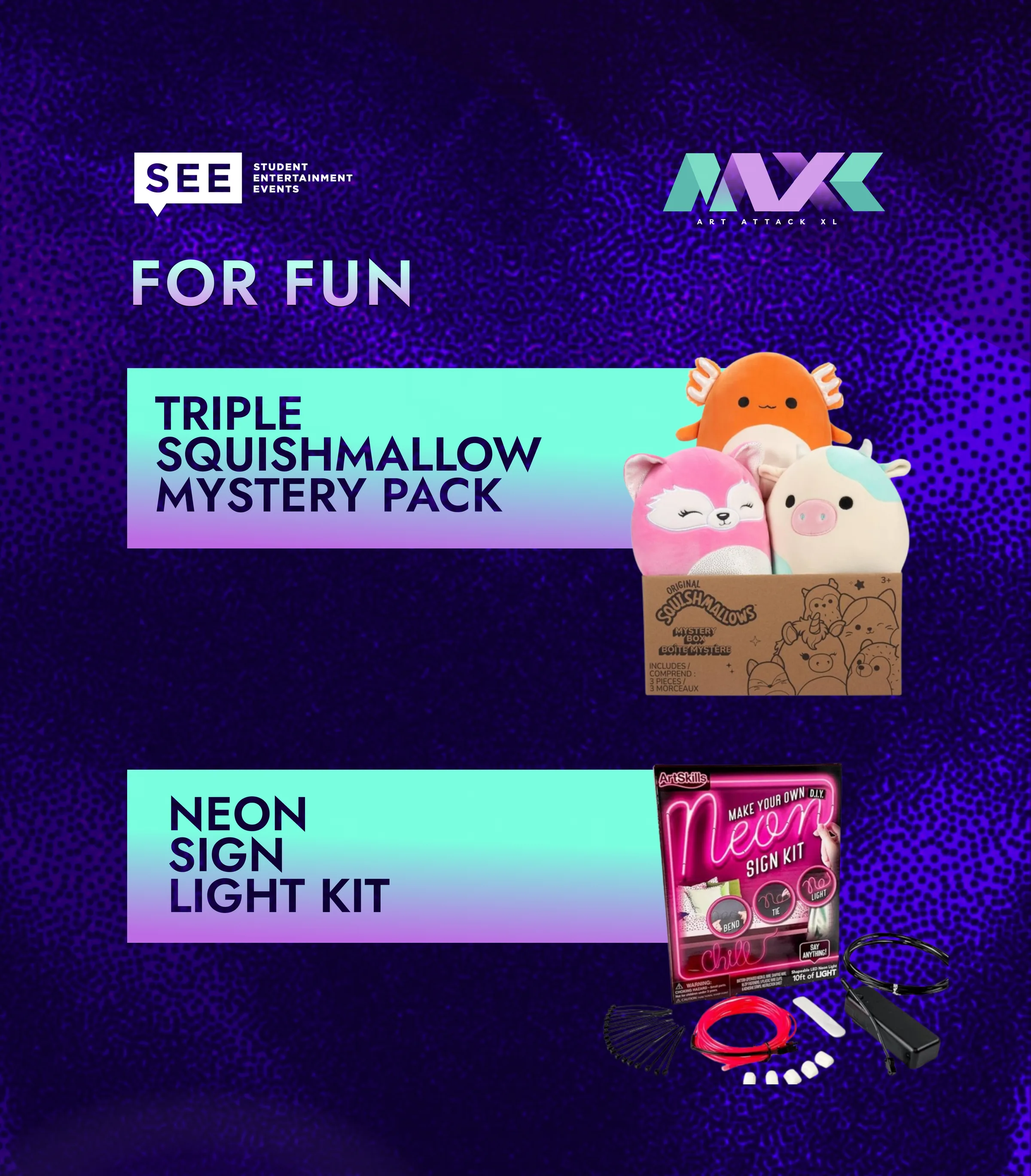
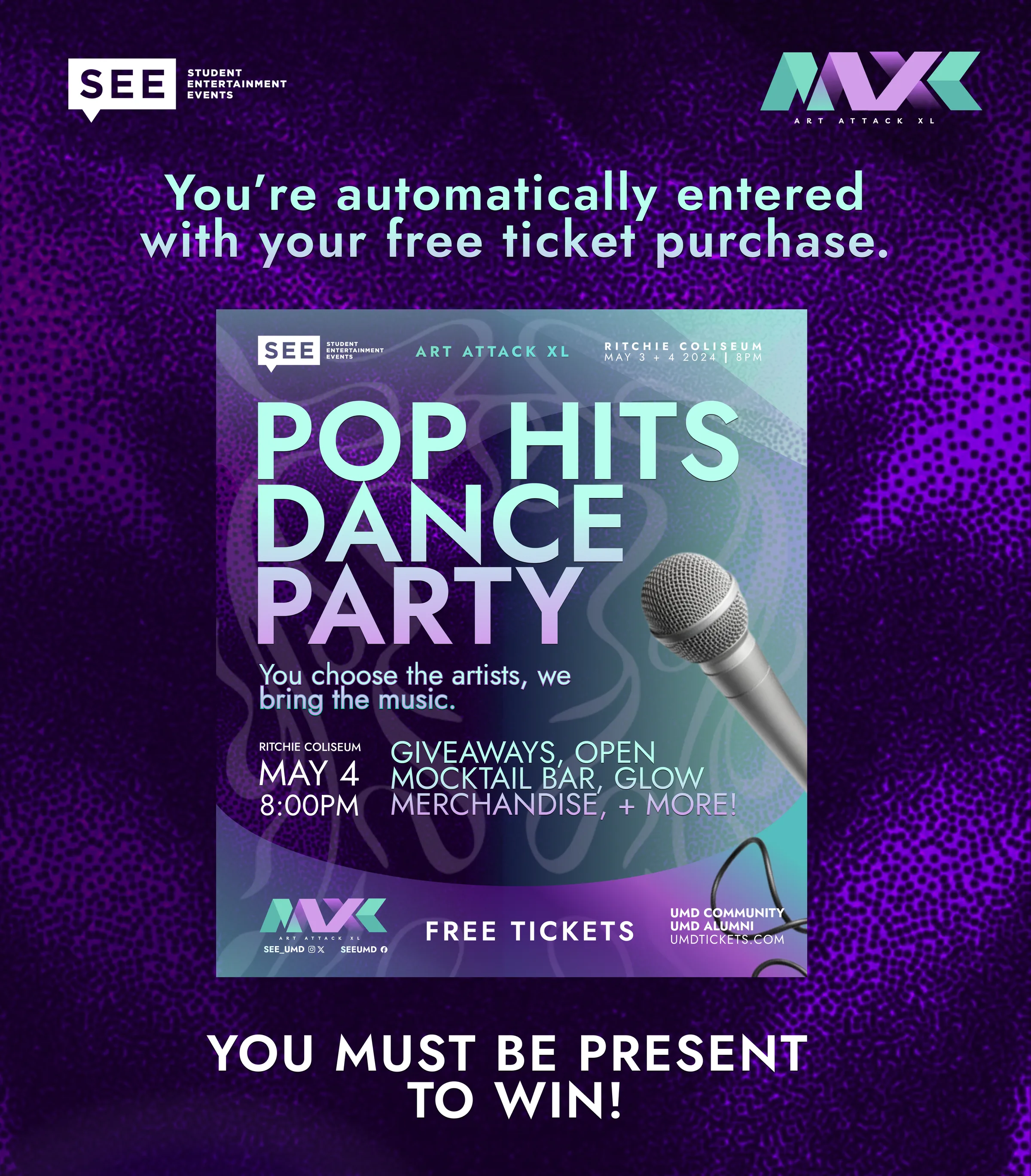
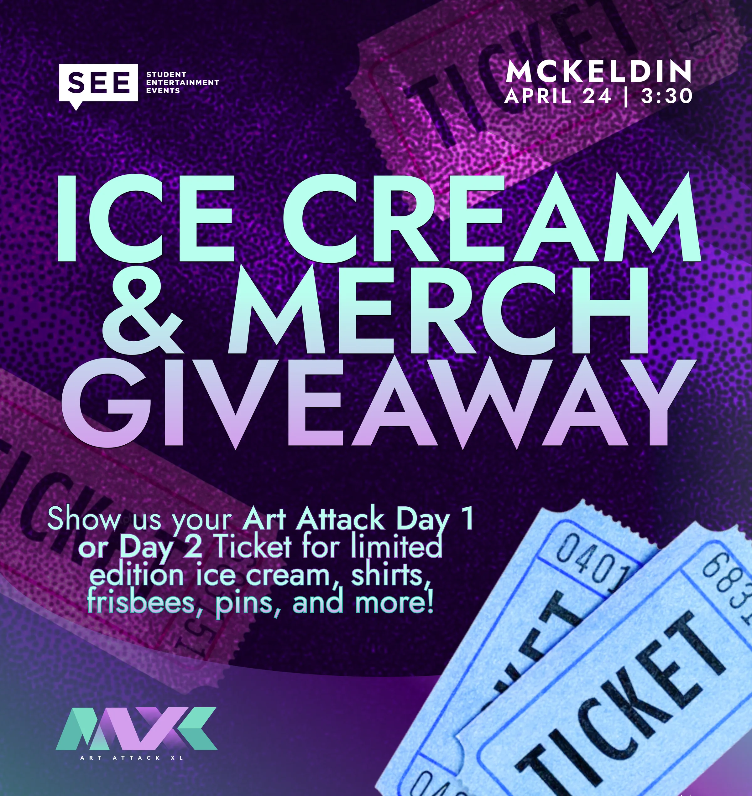
A week before the event, we had to unexpectedly scrap our Victoria Monét performance, and I had roughly five days instead of the usual two months to pivot to a Pop Hits Dance Party (crowd-voted playlist, giveaways, mocktails, glow merch).
S
see_umd
Ritchie Coliseum
see_umd Swipe for our Dance Party Giveaways ✨
I kept the same wordmark, color system, and sense of motion, but shifted the tone toward a design language where I could easily insert any headshot, graphic, or last-minute incorporation thrown at me while the programmers reworked the event.
Once the shirt stopped being free and people still wore it, I knew the brand had actually landed.
Chapter 05 · Establishing Brand Value
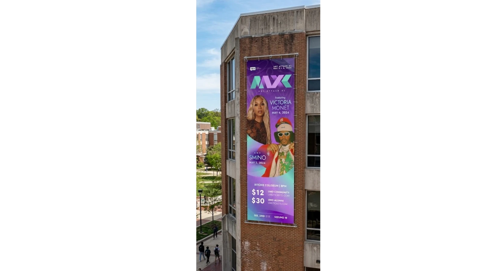
One of my biggest indicators of success is seeing my design work worn in public. I'll be at the gym and spot the shirt on someone, or it'll show up in an Instagram post, and that only happens if it's connects with an audience enough to wear after the night is over.
1.3k
Tickets sold
4–6.5x
Engagement increase over our average post
5.4k
Daily impressions across the campaign
Organic
Social + campus only
Seeing my work resonate across campus and rebuilding a whole campaign proved I could hold it together under pressure.
Reflection
Seeing my work across campus.
Taking on Art Attack felt like a massive responsibility, especially since I was so early in college and still getting to know the campus community. Seeing my posters hanging everywhere and students wearing the shirts was rewarding, but the most meaningful moment was seeing someone post a photo in my design as the lead image on their Instagram. I still keep that screenshot today, because it showed that the care and thoughtfulness I put into the design actually resonated with an audience I hadn't designed for before.
Learning Figma under real constraints.
I am proud of how much I grew through this project at such an early stage in my education; it was the exact project that forced me to master Figma as my primary tool. Beyond the software, it taught me how to manage high-visibility projects, stay grounded when plans fall apart, and adapt quickly when unexpected changes happen on a live timeline.
Rebuilding the campaign.
It was frustrating when the original event plans fell through and most of my initial design work had to be scrapped; I had to learn quickly how not to get too attached to a single outcome. Rebuilding a whole new campaign in just five days was stressful, but working closely with our concerts director helped me realize I could be a stabilizing presence under pressure; getting those new graphics out fast gave him peace of mind and ensured the event still felt intentional, even in its new format.