Brand · Fashion · Marketing Design

Pitching an Executive-Endorsed Sustainable Apparel Collection for Abercrombie & Fitch

Role
Multidisciplinary Designer
Marketing Lead
Client
Abercrombie & Fitch
Hollister Co.
Scale
7 designers
 
Audience
Exec Directors
Nationwide
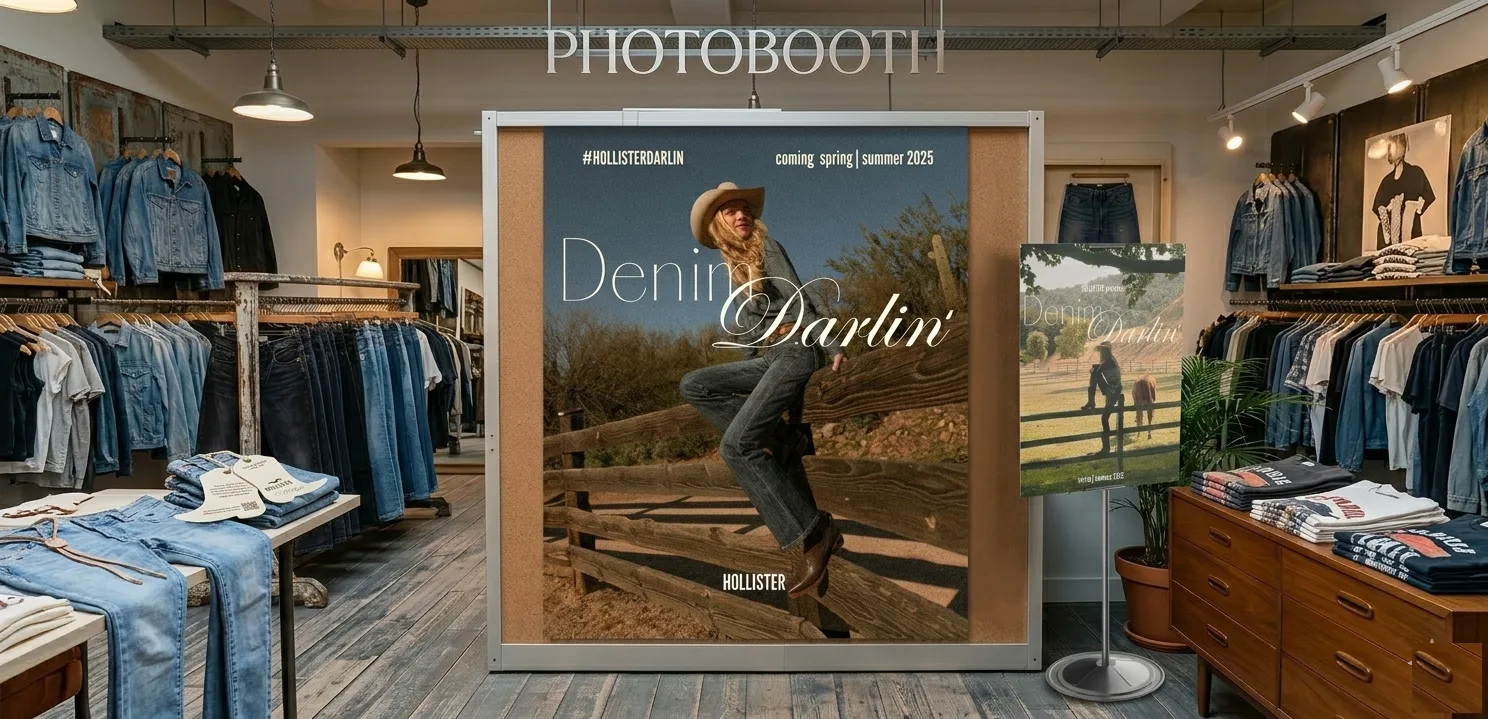
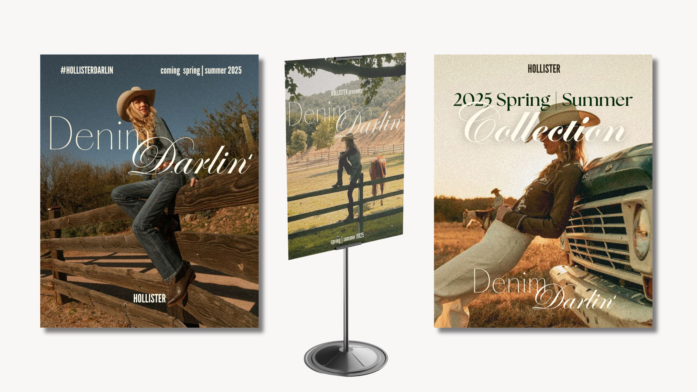
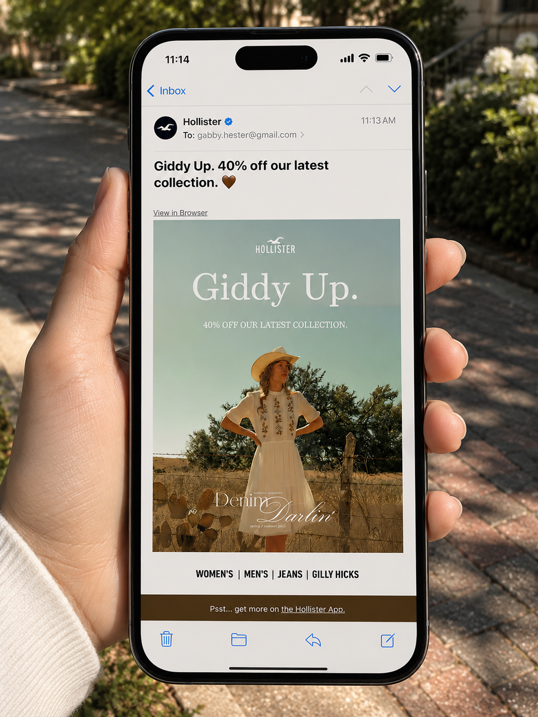
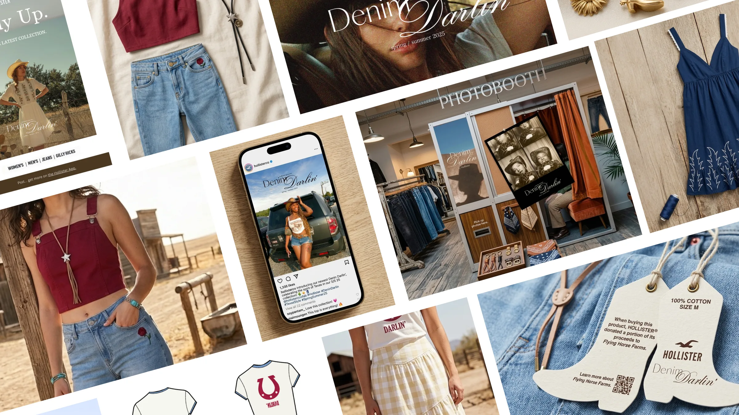
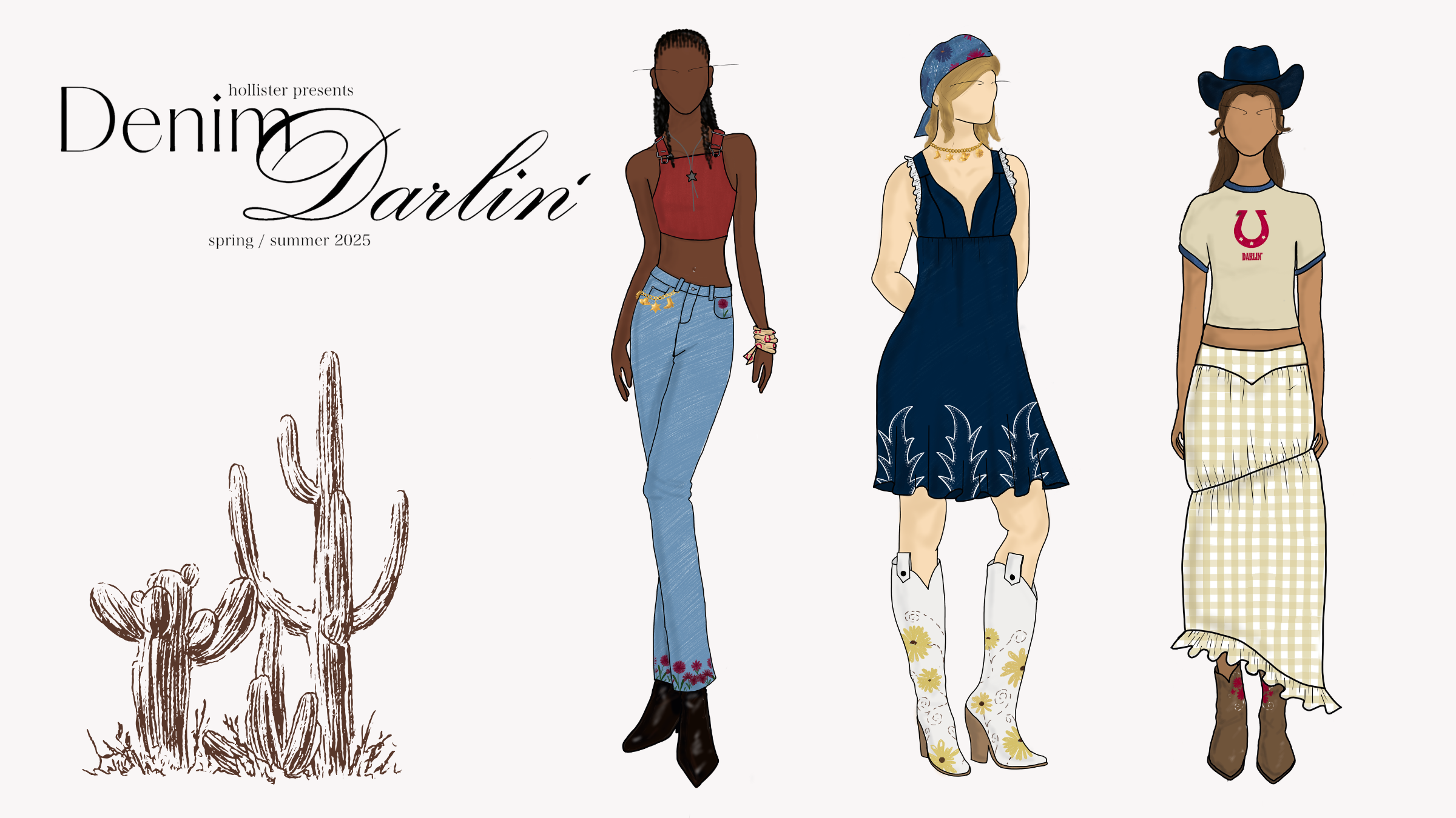
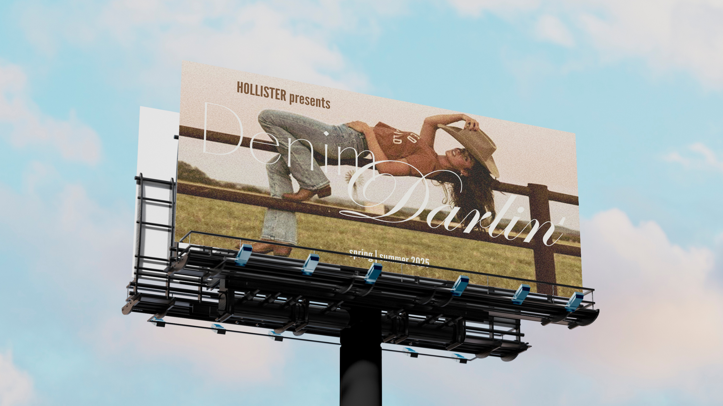
Denim Darlin' campaign hero spread
How do you connect corporate goals with what Gen-Z consumers actually want to buy?
Overview
Challenge
Develop a scalable apparel campaign for Abercrombie & Fitch Co. under tight timelines with a cross-disciplinary team, avoiding clichés while creating a viable product strategy for Gen-Z consumers.
Strategy
Aligned design choices with WGSN and retail forecasting trends. I mapped distinct consumer personas to build a natural-fiber product lifecycle and a digital-to-physical marketing framework.
Solution
Secured formal endorsement from corporate executive directors, who cited alignment with future company goals. The final assets included end-to-end digital branding and high-engagement social mechanics.
~80
Designers selected nationwide
portfolio + 3.0 GPA req.
3
Trend forecasting sources
converged and ideated on
100%
Natural fiber sourcing
across the full collection
Endorsed
A&F execs said it tracked
with where the brand was heading
Selection figures from Sophomore Summit program records; endorsement from the final presentation to A&F leadership.
I joined 80 selected students in A&F's nationwide design challenge and presented directly to their executive directors.
Overview

Abercrombie & Fitch ran a nationwide design challenge, Sophomore Summit, and selected roughly 80 students (3.0 GPA minimum, portfolio required); we were handed a brief to build an original clothing campaign for A&F and Hollister.

My team's work spanned trend research, visual identity, marketing collateral, a community mechanic, and a product strategy.

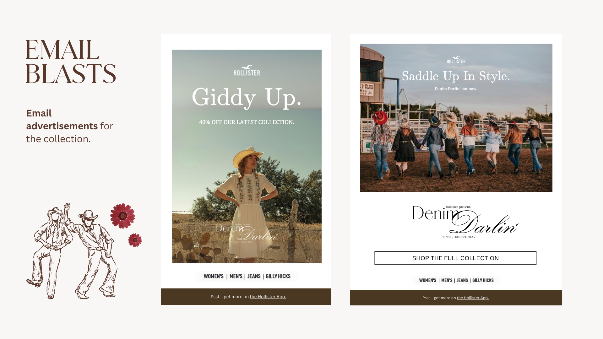
I was marketing lead, building the promo layouts, email blasts, and the Instagram challenge framework.
My role

Concretely, that meant I personally built: in-app promotional layouts, email blasts, social assets, and the Instagram challenge framework, including the #HollisterDarlin community mechanic. I also consulted on overall design choices throughout the process of fashion design and brand collateral.

Working with fashion designers and UX designers gave me a clear picture of the energy they wanted the collection to carry, and my job was amplifying that energy.

Research into what was already trending on Instagram and TikTok pointed us toward a "country granddaughter" aesthetic.
The concept

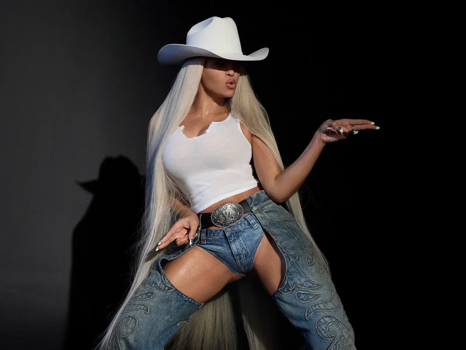
We started with social media research, specifically Instagram and TikTok. Denim was everywhere, and there was a western energy tied to the Beyoncé Cowboy Carter trend that was popular at the time.
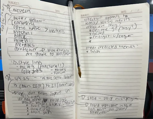
Color Direction
  • Western palette (Butter Yellow, Cranberry, Optic White, Nutshell, Black)
  • Neutrals, Pastels, Metallics
  • Cornflower blue & florals (Hollister signatures)
Nostalgia & Target
  • Active Retro Quaint (targeting ages 13–21)
  • Cereal brand nostalgia (Froot Loops, Cookie Crisp, Apple Jacks)
  • 2008–2018 print revival for Swim & Activewear
Style Lines
  • Functional pockets, equestrian references, "denim-forward" silhouettes
Micro-Trend
  • Tulips
  • Bows
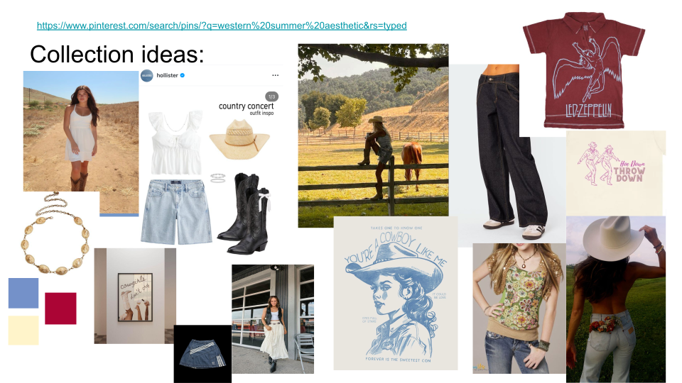
Sketchbook trend research notes for S/S 25

Early sketchbook research

Further research

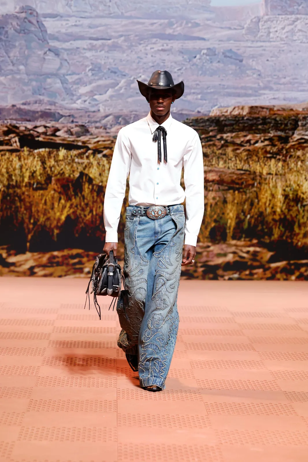
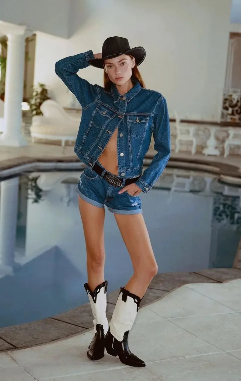
WGSN ↗ flagged Rodeo Renaissance and Cartoonification as trends for Spring/Summer '25, and Runway coined "Denim for Days". These forecasting sources reinforced the same vision we were seeing online, and we felt more comfortable committing. 
WGSNRodeo Renaissance
RunwayDenim for Days
WGSNCartoonification
Rodeo Renaissance mood image Rodeo Renaissance mood image Rodeo Renaissance mood image Rodeo Renaissance mood image
Design Direction

"Focus on a pastoral or rodeo direction and be mindful of your storytelling when referencing cultural patterns. Apply to graphic tops for the young market, and invest in crafted elements and embroidery for the mature market."

Trend Investment
Projection
Invest
Strong growth trend: prioritise investment for larger volumes
Design Directives
  • Fueled by Beyoncé's Cowboy Carter
  • Design western with #PrettyFeminine details
  • Provide a fresh perspective on the trend
  • Elevate everyday items with crafted, embroidered details
Deciding a direction

Since youthful, nostalgic, denim-forward was the direction, a Blue Ivy (Beyoncé's daughter) angle came up early, but we pivoted away from it quickly, since if we had to work that hard to make a reference land (especially with an audience that might not even know it), the campaign wouldn't land.

We wanted something that felt western-inspired without screaming cowboy or western-costumed.

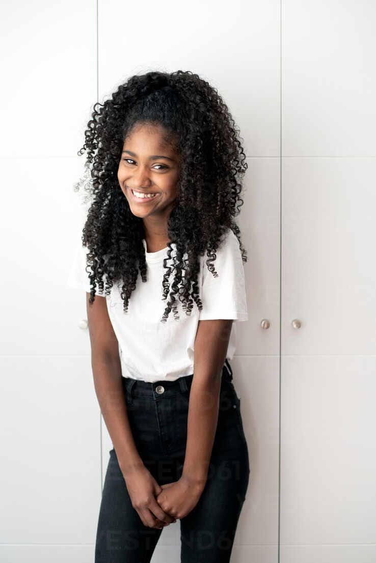
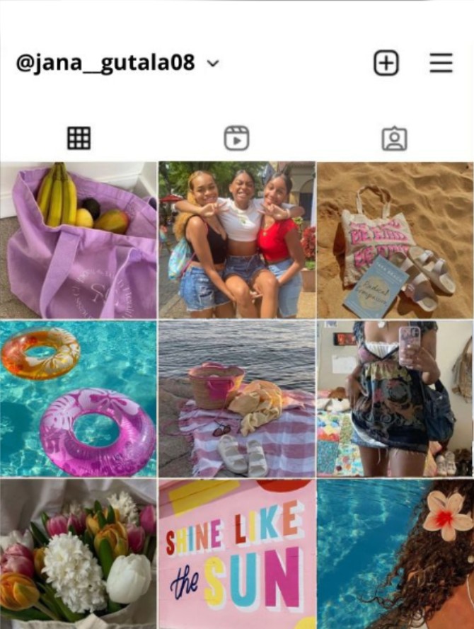
Creating two customer profiles, JaNa and Serena, kept the whole team on track.
Target audience

Before we developed anything visual, we created two personas based on A&F Co.'s central customer demographic.

JaNa Cole
14 · Newport Beach, CA
Violin Player TikTok User Y/A Reader
JaNa JaNa
Who she is

Pre-freshman year, spending the summer figuring out who she is before high school.

What drives her

Fashion is a signal for her; what she wears says something before she does. She wants to stand out without standing apart.

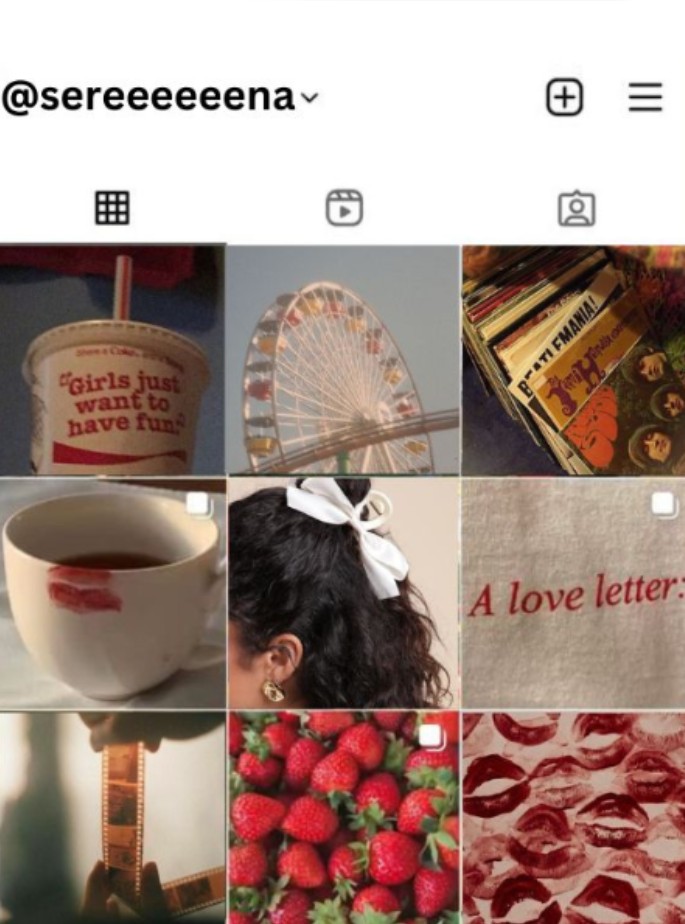
Serena Hayes
20 · Milwaukee, WI
Sustainability student Vegan Secondhand shopper
Serena Serena
Who she is

Studying sustainability at UW Madison. Serena thinks about where her clothes come from and whether a brand actually means what it says regarding their environmental impact.

What drives her

Serena's not just following trends, she's deciding which ones she trusts. She's the customer who truly reads the label.

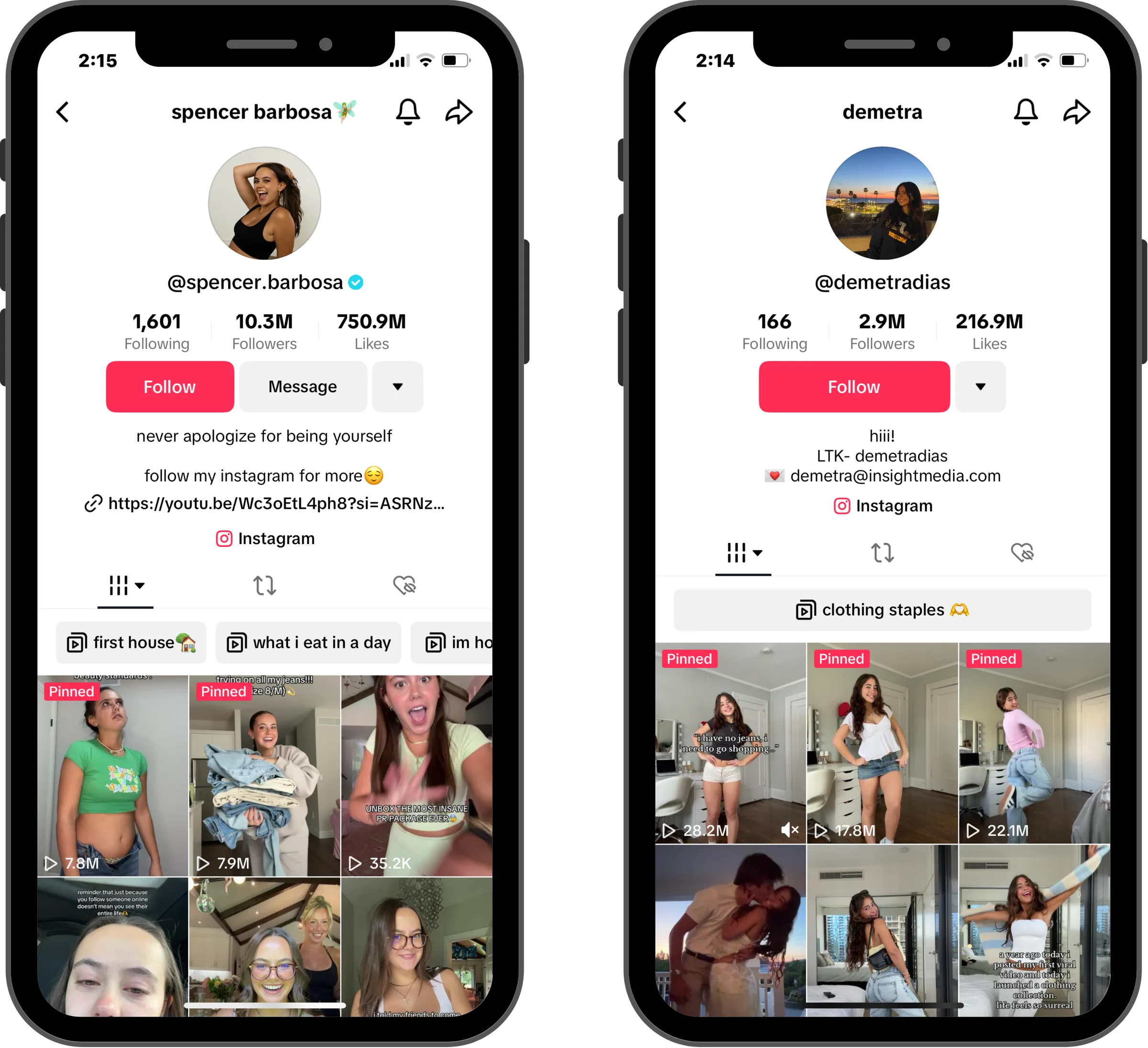
Influencer landscape

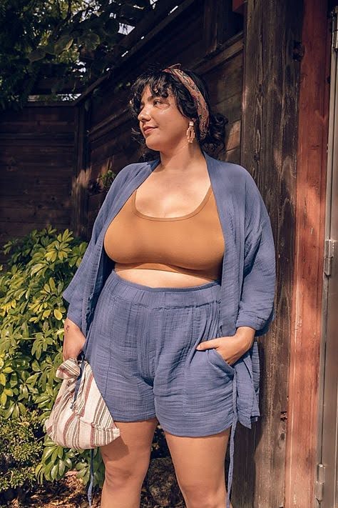
We also mapped the influencer ecosystem around our customers. The goal wasn't just reach/follower count, it was demographic fit. We wanted one creator for each end of the Hollister spectrum.

Spencer Barbosa
10.3M TikTok  ·  2.5M IG

Body positivity and youth empowerment. Her content works because she makes every viewer's body feel important and valued, not the exception.

Demetra Dias
2.9M TikTok  ·  680k IG

Fashion content built for Gen-Z teens (hauls, unboxing, Get Ready With Mes). She's already featured Hollister organically.
Scrolling Soundtrack
Moving past our early brainstorm meant splitting into two parallel tracks: fashion design and brand identity.
Process

We started with an open brainstorm, which is where the original pivot from the Blue Ivy collab happened: we kept the feeling of western-wear, but removed the dependency on her specific reference.

Direction 1 — editorial flat lay

Direction 01: editorial flat lay.

Direction 2 — brand tags and collateral

Direction 02: brand tags & collateral.

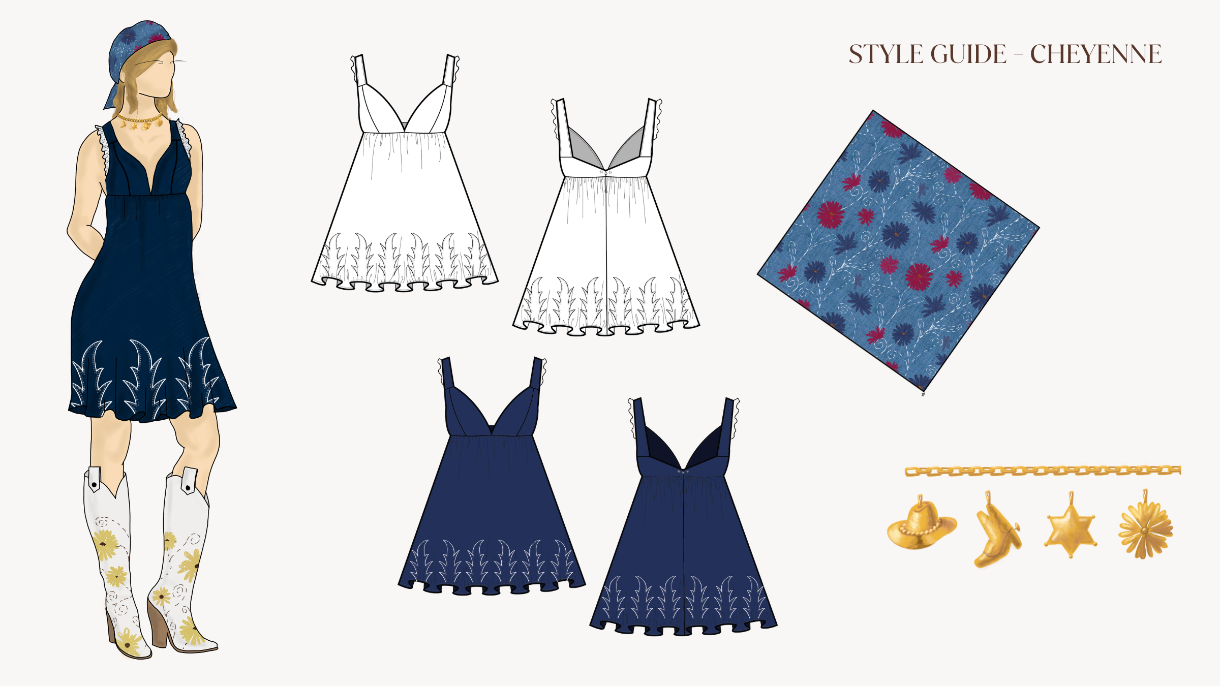
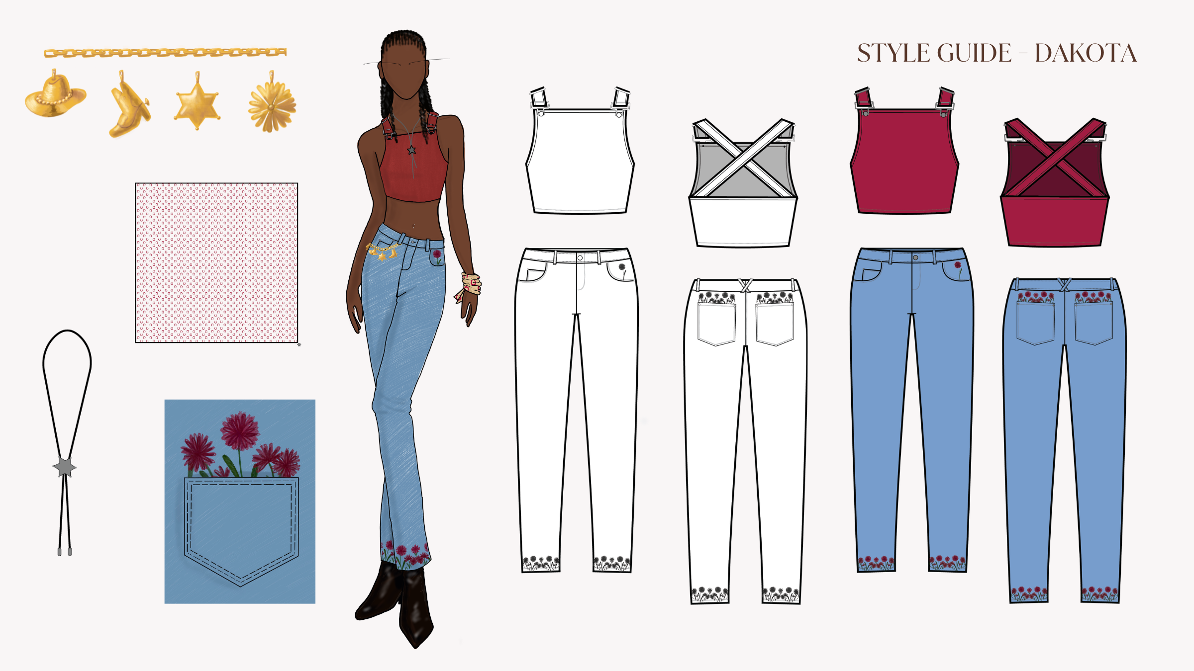
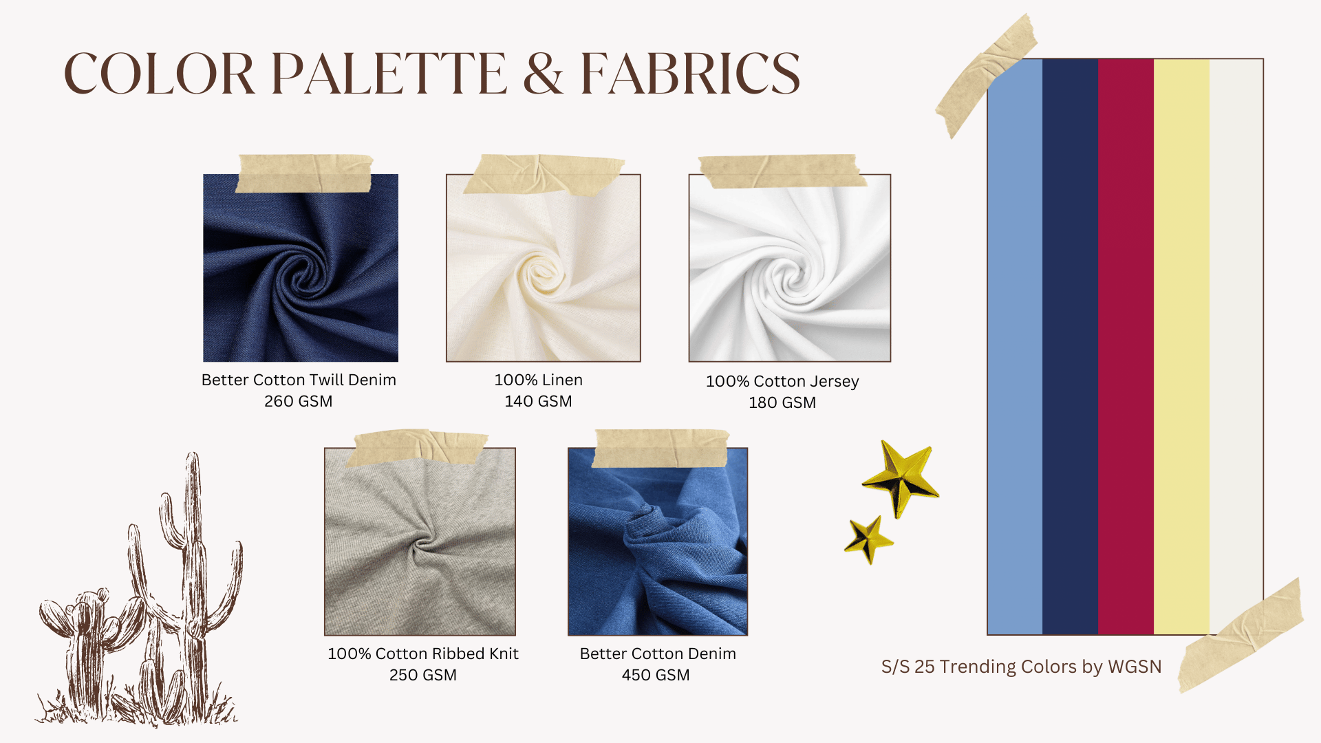
We chose a muted palette with accents of red and navy, and Better Cotton denim, wearable enough for a regular day.
Visual direction & design

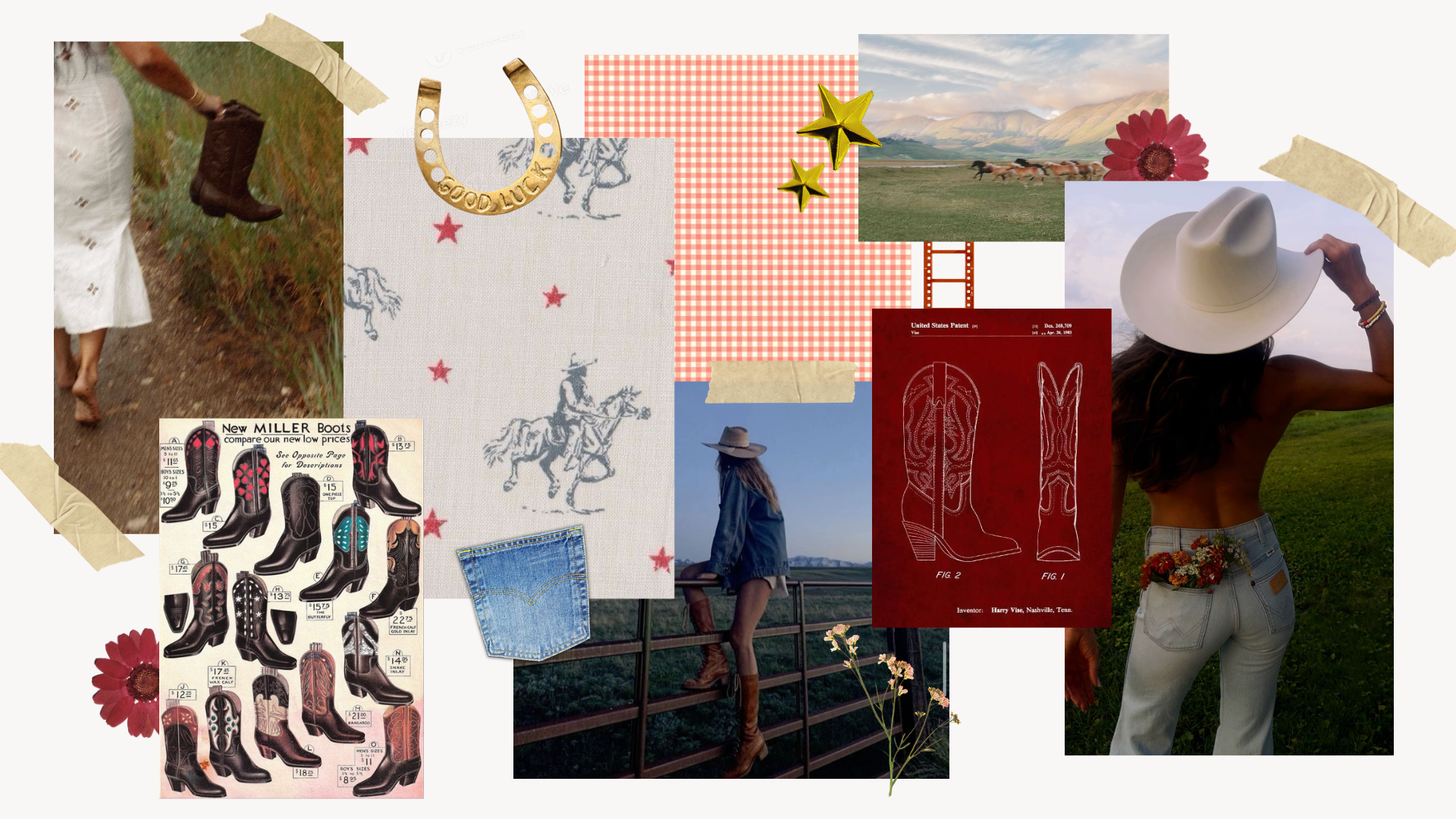
The identity had to read as western without feeling like a costume, something someone could reach for on a regular day without making a statement. To achieve this, the palette leaned into a warm and familiar "Americana" quality.

Denim Darlin' finalized moodboard

The final moodboard.

Fashion designers focused on fabric, silhouette, and what would work across the clothing pieces; marketing and UX worked on brand identity at the same time. We checked in between the two groups regularly, which is where we could identify when the clothing and the brand were starting to tell different stories, and course-correct.

Color palette & fabrics

Better Cotton Twill Denim and Better Cotton Denim gave the collection its backbone: weights that feel like something quality, that hold an intended crease, and that don't read as fast fashion. Linen and Cotton Jersey were brought in for lighter seasonal pieces.

The palette pulled from WGSN's S/S 25 colors: dusty blue, navy, crimson, cream.

Better Cotton Twill Denim
260 GSM
100% Linen
140 GSM
100% Cotton Jersey
180 GSM
Cotton Ribbed Knit
250 GSM
Better Cotton Denim
450 GSM
Denim Darlin' finalized color palette and fabric samples

The finalized color palette and material selections for the Denim Darlin' collection.

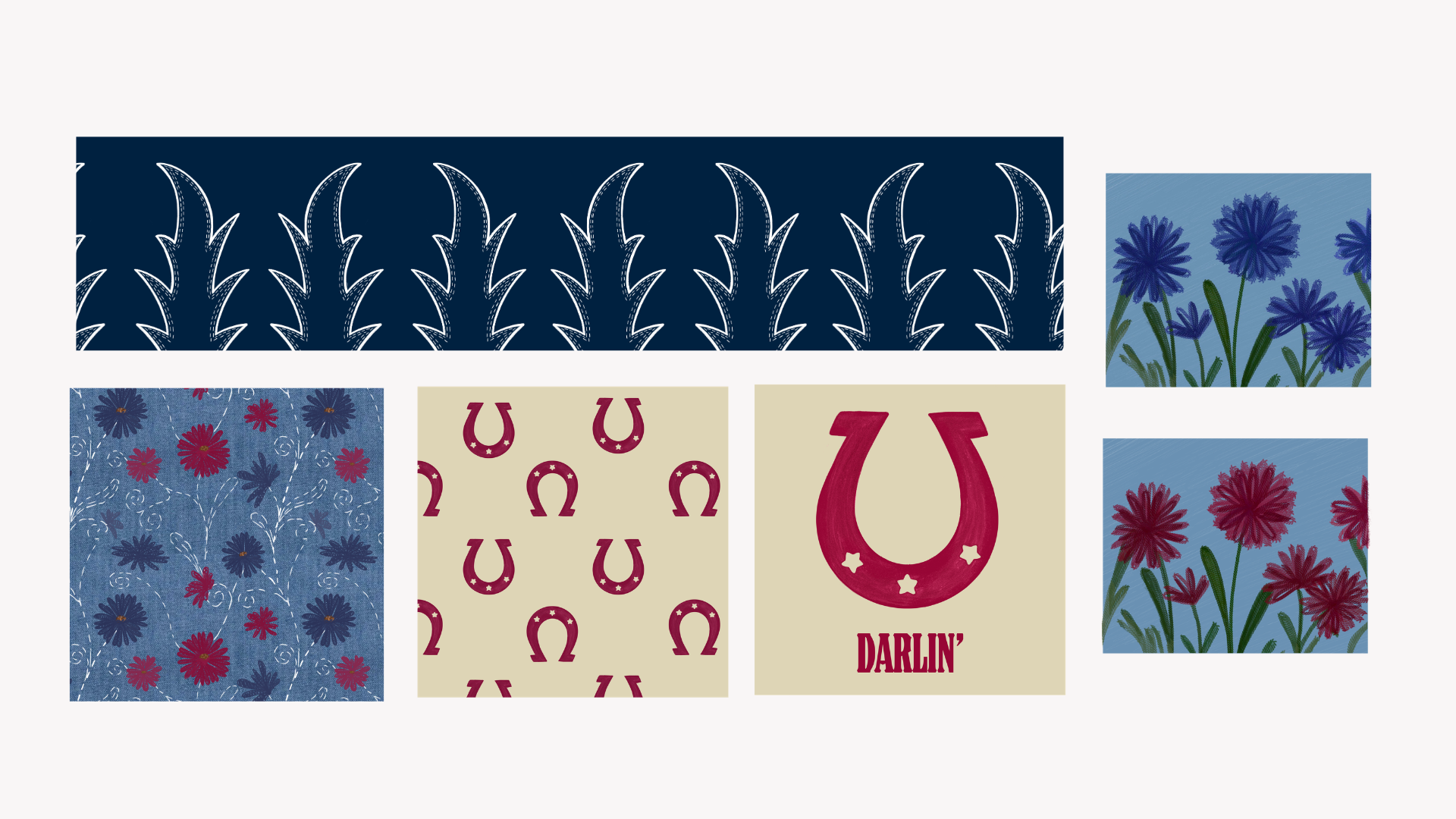
Print direction

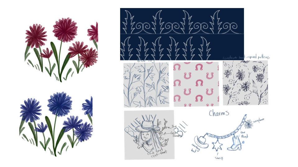
Prints were part of the brief from the start, tied to the 2008–2018 print revival we'd already flagged in trend research. Before landing on a final pattern, we sketched early ideas to test the visual language: how bold, how abstract, and how far to lean western versus something more graphic and nostalgic.

Early sketch of Denim Darlin' print patterns

Early draft: print pattern exploration.
Finalized Denim Darlin' print pattern 1
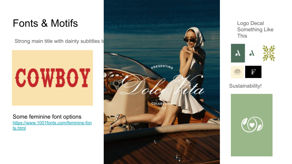
Typography & online branding

We were looking for a typeface that held the collection's western reference without tipping into cliché, something legible in a social feed and still expressive on a physical sign.

Early typography exploration for Denim Darlin'

Early type exploration.

Finalized typography for Denim Darlin' online branding

The finalized type direction for the website and digital campaign.

Choosing natural fibers over synthetic meant anchoring sustainability in Better Cotton sourcing, a design value the whole collection stood on.
Sustainability

Other synthetic fibers require 342 million barrels of oil and release 8 million tons of plastic annually. That context gave the campaign a layer of integrity that extended past the visual.

By sourcing exclusively from natural fibers and ethically proven suppliers, the collection could speak to Serena without losing JaNa. Not only was it an ethical constraint, it was a signifigant brand story worth telling.
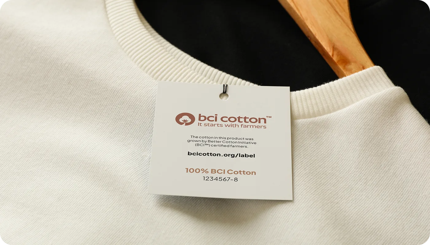
BCI Cotton label — It starts with farmers, 100% BCI Cotton certified

Better Cotton Initiative certification: the sourcing story made visible on the product itself.

Wanting something extra customers could wear and carry meant designing the charm bracelet campaign, with 15% given back to Flying Horse Farms.
Marketing & Outreach

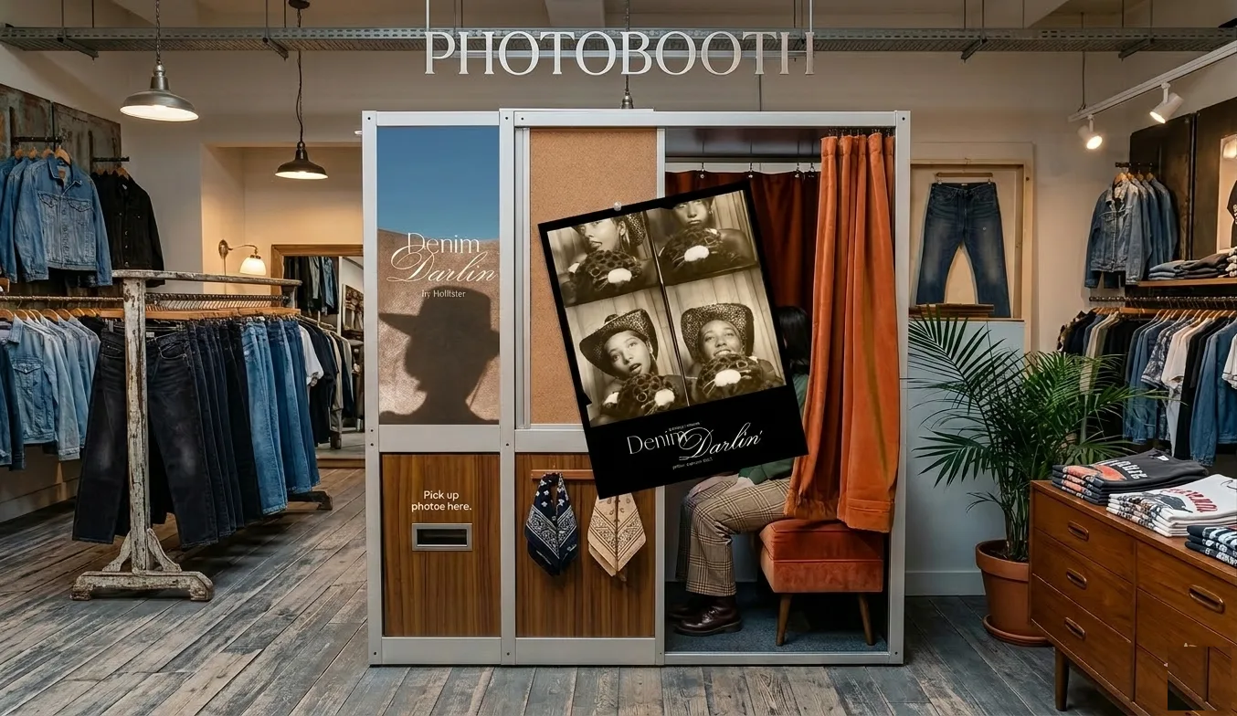
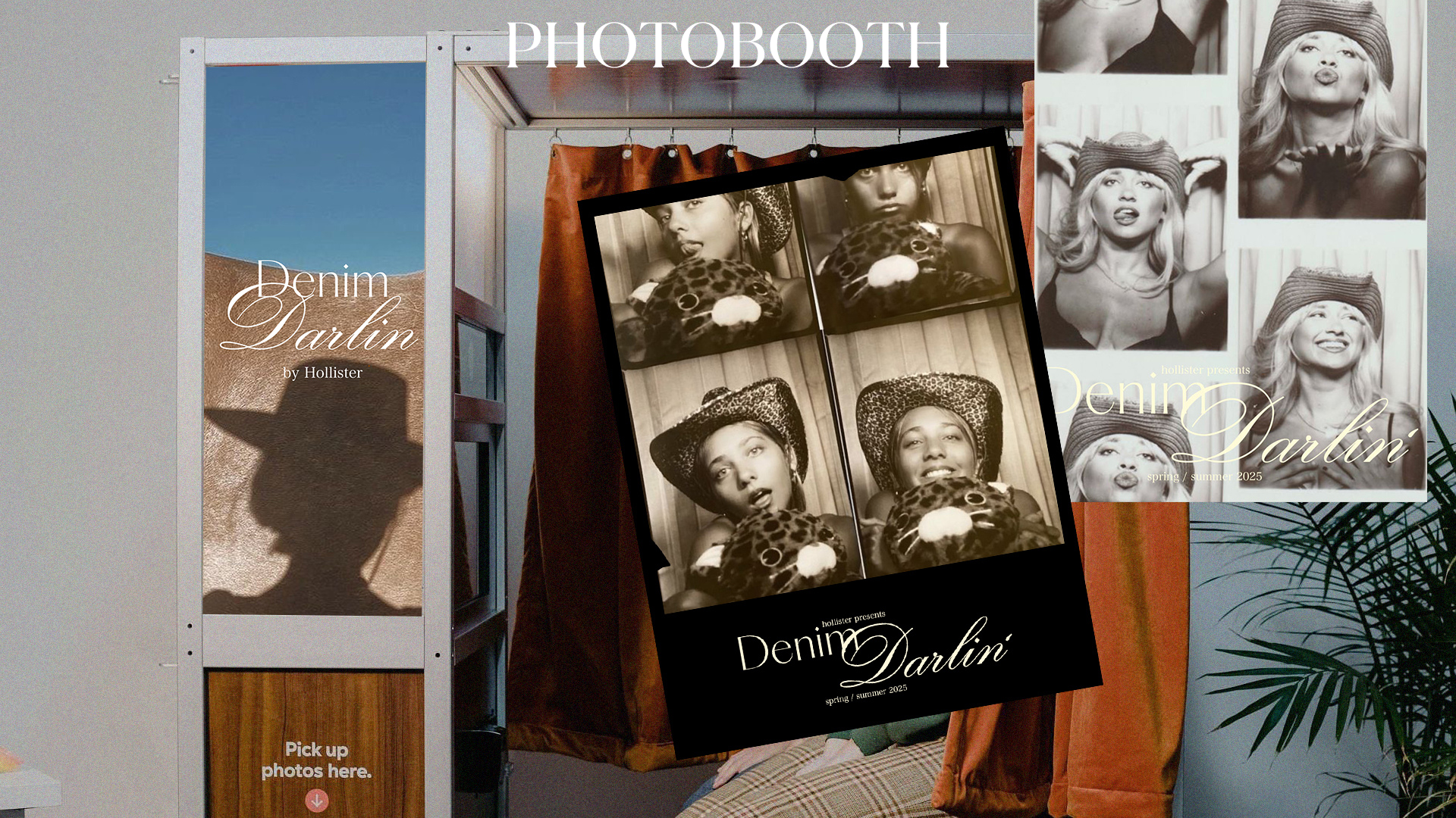
The idea I'm most proud of from this project is the charm bracelet concept (people love collecting things, and they love personalizing things). The #HollisterDarlin hashtag and the pop-up photobooth already gave customers a way to physically enter the campaign, but the charm bracelet extended that into something you could wear and carry with you. 

The #HollisterDarlin social campaign.
Denim Darlin' charm bracelet concept

Pop-up photobooth activation and printed photo strip.

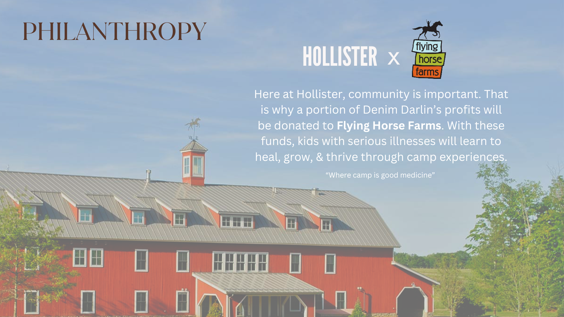
15% of each charm purchase going back to farms and agricultural spaces gave the campaign a charitable layer; the exec directors responded to it specifically. They thought it was a strong way to integrate community and conscientiousness into a campaign that could have easily just been aesthetics.
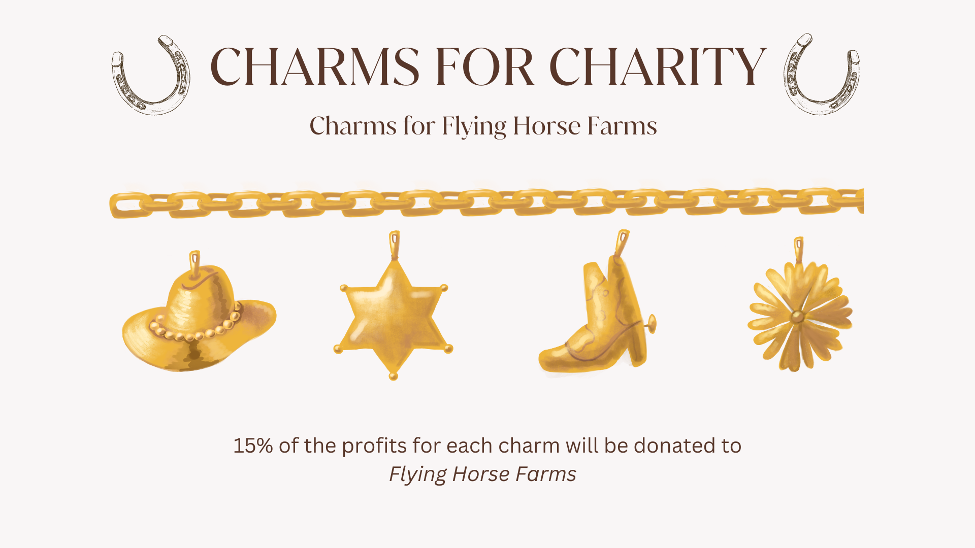
Denim Darlin' charm bracelet — cowboy hat, sheriff star, boot, daisy
Denim Darlin' charm bracelet detail
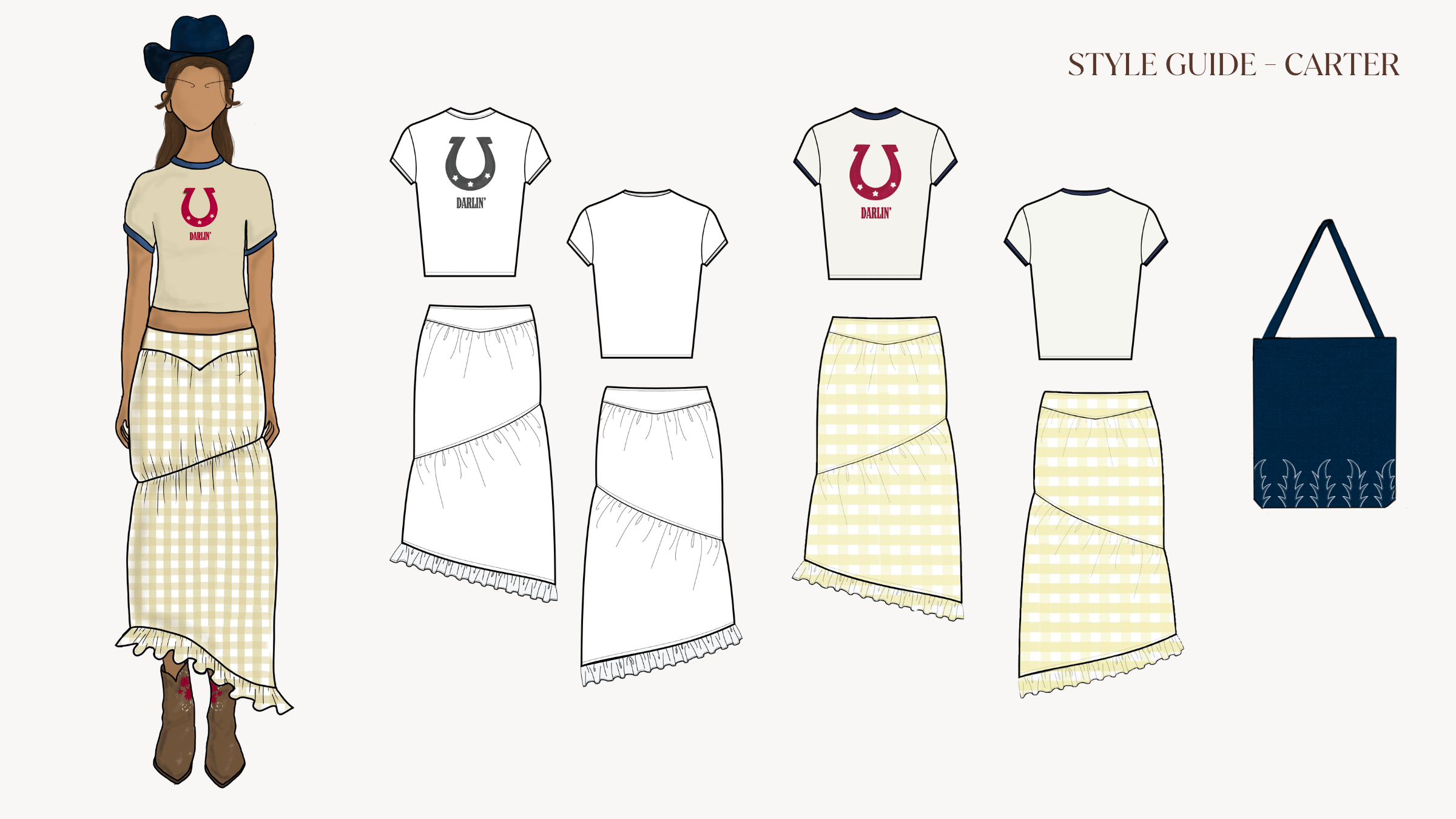
The full collection held to one balance, grounded in the western aesthetic without ever tipping into costume, so it's something you'd actually wear on a regular day.
Full collection

If this campaign were real, I'd want to push the photoshoots further away from farm settings, getting JaNa and Serena into the settings our actual customer lives in (concerts, on the street, schools/universities). You don't have to want to be a cowgirl to reach for these pieces, and I think the imagery should say that as clearly as the clothes already do.
Denim Darlin' lifestyle mockup
Pop-up photobooth activation Denim Darlin' photobooth in-store render

The community layer: collectible charms, charitable giving, and IRL activation.
Denim Darlin' community layer activation
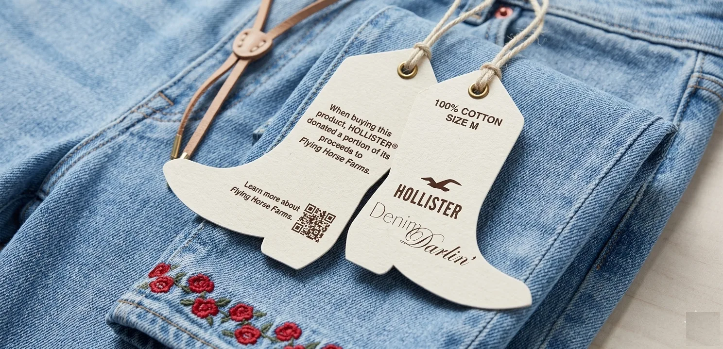
Denim Darlin' hang tag — 100% cotton, Flying Horse Farms QR code Denim Darlin' hang tag detail
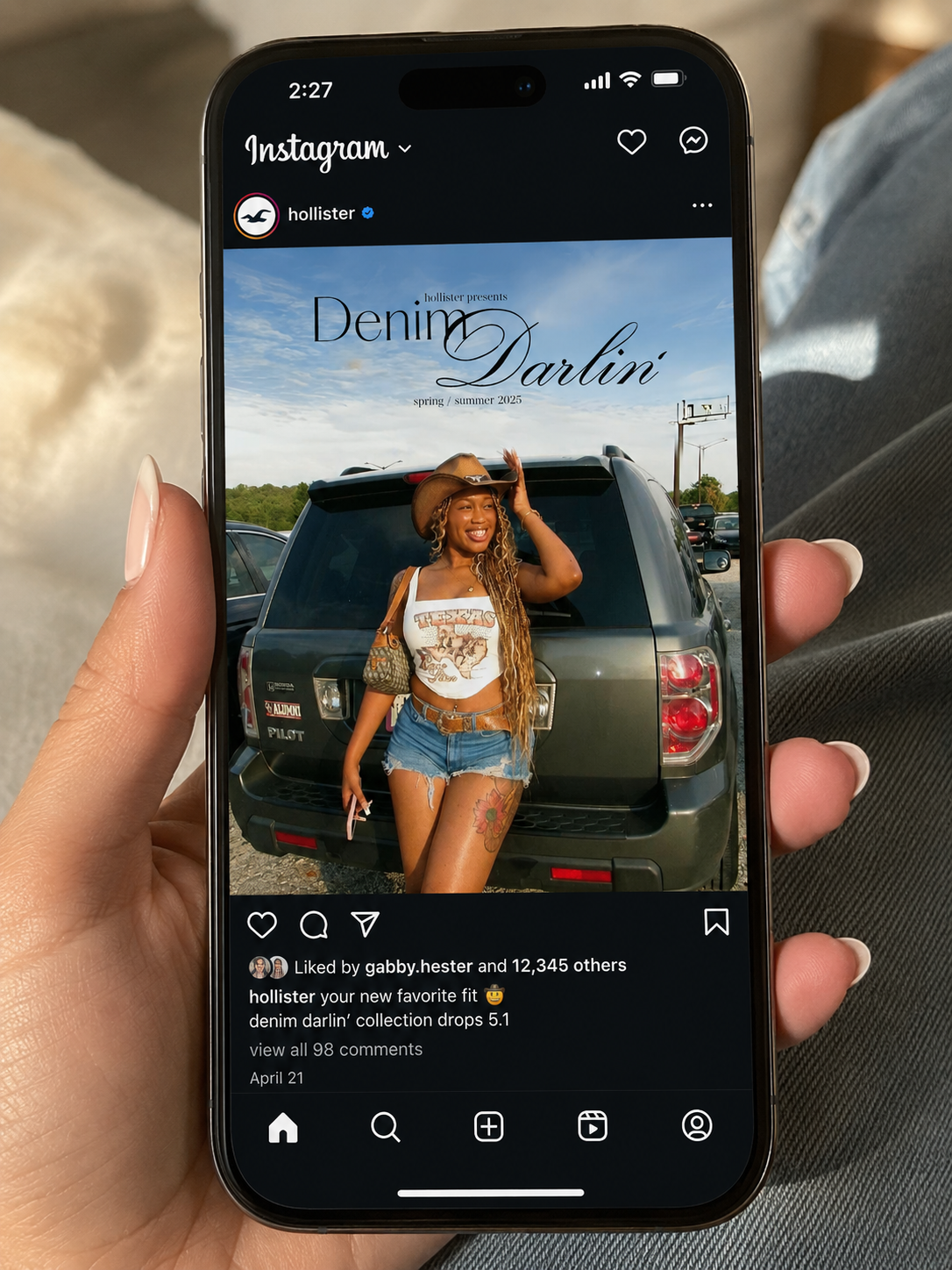
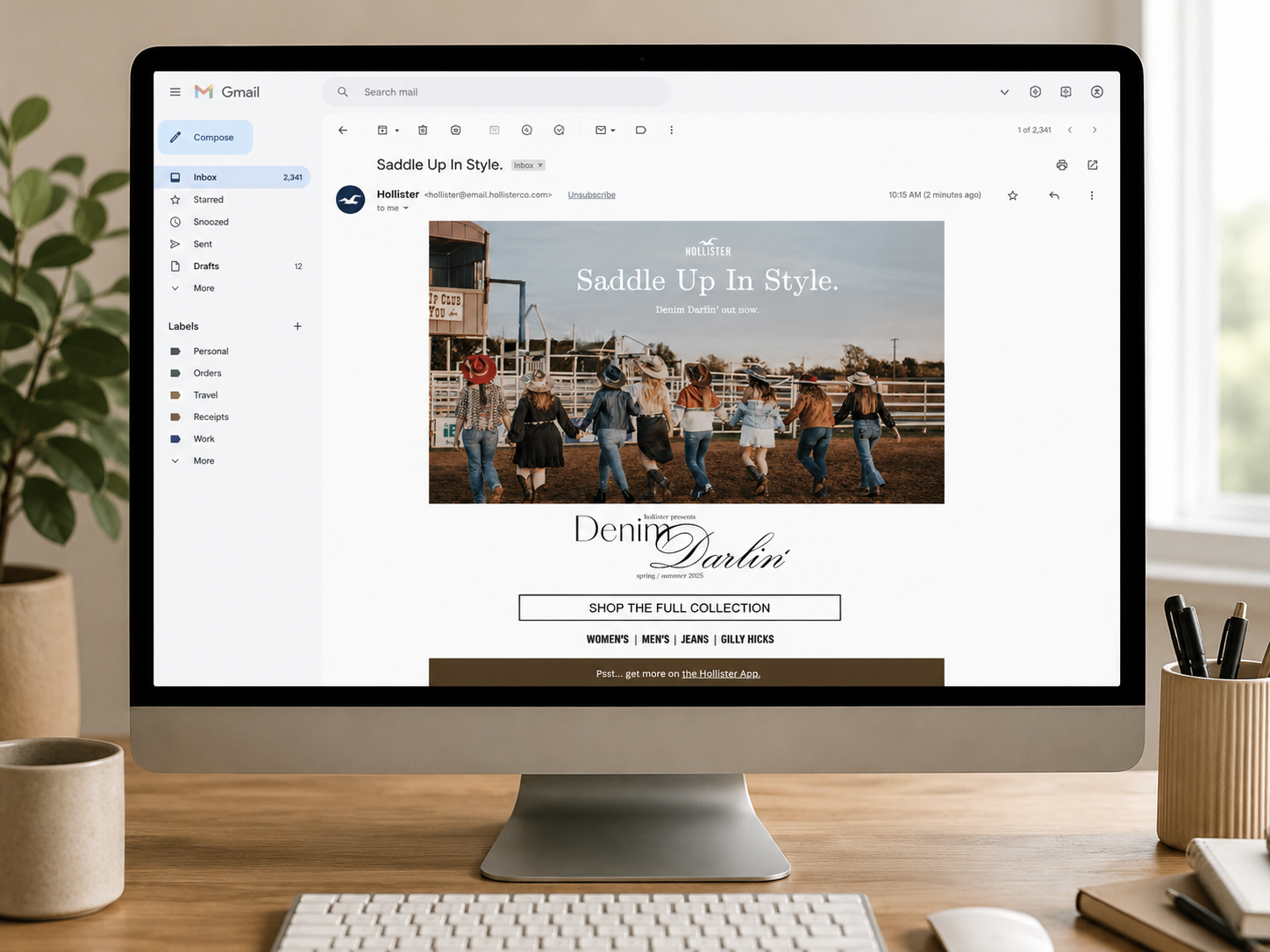
Email blast mockup Hollister Instagram mockup — Denim Darlin' feed post

JaNa and Serena's identities largely shaped specific components of our campaign.

JaNa Cole
The Social Connector

She lives her life in front of cameras and in crowds, so the #HollisterDarlin hashtag campaign and the pop-up photobooth became the centerpiece of how customers engaged with the collection.

Serena Hayes
The Self-Expressive Idealist

She reads the label, shops secondhand, decides which trends she trusts, so the collection runs entirely on natural fibers.

She's why the charm bracelet mechanic included a 15% charitable donation to Flying Horse Farms rather than just being a branded collectible. She needed the campaign to mean what it said.
Learning when to step back, take a supporting role, and see design through a new lens.
Reflection
Collaborating with strong visions.
Working on Denim Darlin' felt like stepping into design school for the first time; coming from a university with so many different majors, it was rare to be surrounded by a whole team of designers working at my exact caliber. Working alongside such like-minded people naturally created tension, as there were moments when I'd step away, come back, and find the project heading in a completely new direction. It challenged me to adapt quickly, set aside my own ego, and learn how to support a teammate's concrete vision when it best served the team as a whole.
Taking the backseat for the team.
As someone who prefers having a full grasp on creative direction, this project taught me the hard lesson of how to take a backseat and embrace a supporting role; even when I was assigned responsibilities I was not thrilled about, I focused on making the most of them to move us forward. On a high-stakes, strict timeline, finding where I was genuinely needed mattered far more than arguing for my own initial ideation, and I am incredibly proud of what we built together through that compromise.
A new lens through apparel.
Before this, I had never entered the world of fashion design, so watching the fashion students' process and seeing their sheer ingenuity was fascinating. Designing graphics for a physical body requires thinking through countless real-world user cases that go far beyond a flat 2D plane; opening my mind to that development process sparked a huge interest in fashion and luxury branding that I still carry with me today.